A beautiful scene can still make a confused photograph. The light is good, the subject is right there, and somehow the frame has no clear direction. Before buying a different lens or blaming the location, move the camera. Sometimes a small shift changes the whole picture.
The rule of thirds in photography gives you a simple place to start. Divide the frame into nine equal rectangles with two vertical lines and two horizontal lines. Try placing the subject near a line or where the lines meet. Then make a centered version. Compare them. The point is to see what changes, not to obey a grid.
This guide takes that idea beyond the little diagram: where to put a horizon, how to leave room for a moving subject, what to do with empty space, and when the strongest photograph ignores the thirds completely.
Updated October 2026.
What the rule of thirds actually asks you to do
Imagine a tic-tac-toe board across your viewfinder. The vertical lines sit roughly one-third and two-thirds of the way across the frame. The horizontal lines divide its height the same way. Their four intersections are possible places for an important detail, such as a person’s face, a small tree, or a distant boat.
You do not need to put the entire subject on an intersection. A person can stretch across several parts of the frame while the face sits near one of those points. A coastline can travel across the picture while the main bend sits near a vertical line. Think about the detail that matters, rather than squeezing a whole object into a tiny target.
The grid is a composition prompt. It can help you notice a habit of centering everything without thinking. It does not measure beauty, tell a viewer where they must look, or turn a weak subject into a strong one. There is no reason to promise that a photograph will work because its coordinates match the diagram.
Start with a subject, not an intersection
Ask yourself what made you stop. Was it the person, the shape of the waves, the color above the horizon, or the relationship between a small building and a huge landscape? That answer should guide the framing before the grid does.
If the subject is a face, placement alone will not save it from a bright sign directly behind the head. If the subject is a mountain, an oversized dark foreground may take over the frame. Simplify the competing information. Move a little left, lower the camera, or wait for a person to leave the background. Then test the thirds.
A useful question is: what is the one thing this frame needs the viewer to notice? If you cannot answer it, get closer or look for a simpler angle. Sometimes the scene contains several good photographs, but trying to put all of them into one frame produces none of them clearly.
 Save
How to use the grid in the field
Turn on the composition grid if your camera or phone offers one. The exact menu varies, so check your device’s manual. A viewfinder overlay is normally a framing aid rather than part of the recorded photograph. Make a test photo if you are unsure what your particular app saves.
Choose one subject and make a frame with it near the left third. Make another near the right third. Finally, center it on purpose. Keep the light and your distance reasonably consistent so the placement is what you are comparing. You are not conducting a scientific test. You are training yourself to recognize what space does.
Look for changes in balance and context. Does one placement bring in a useful doorway? Does another include a distracting trash can? Does the centered frame give the subject more authority? The best answer depends on the picture. Keep the version that says what you want, even if it is the one that breaks the guideline.
Do not spend so long lining things up that you miss a fleeting expression or a wave breaking. Practice on slow subjects first. With experience, the grid becomes something you can imagine rather than something you have to inspect before every exposure.
Where to put the horizon
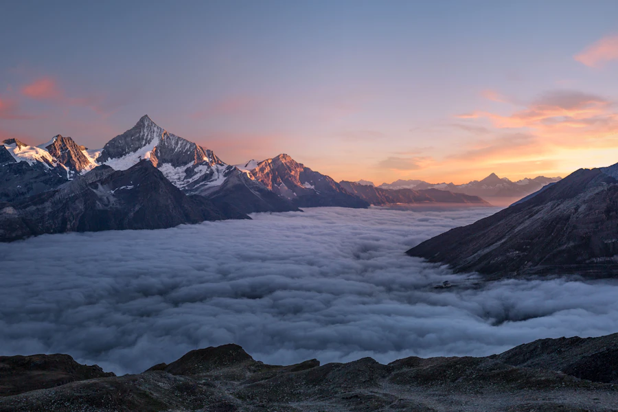
A horizon near the upper third gives more room to the foreground. This can work when the foreground has the stronger story: textured sand, a winding trail, interesting rocks, or moving water. It is less useful when that extra ground is empty and dull.
A horizon near the lower third gives more room to the sky. Try it when cloud shapes, color, or a storm front carry the photograph. A beautiful sky does not need to compete with a large section of featureless ground. At the same time, keep enough of the land to give the sky scale and context.
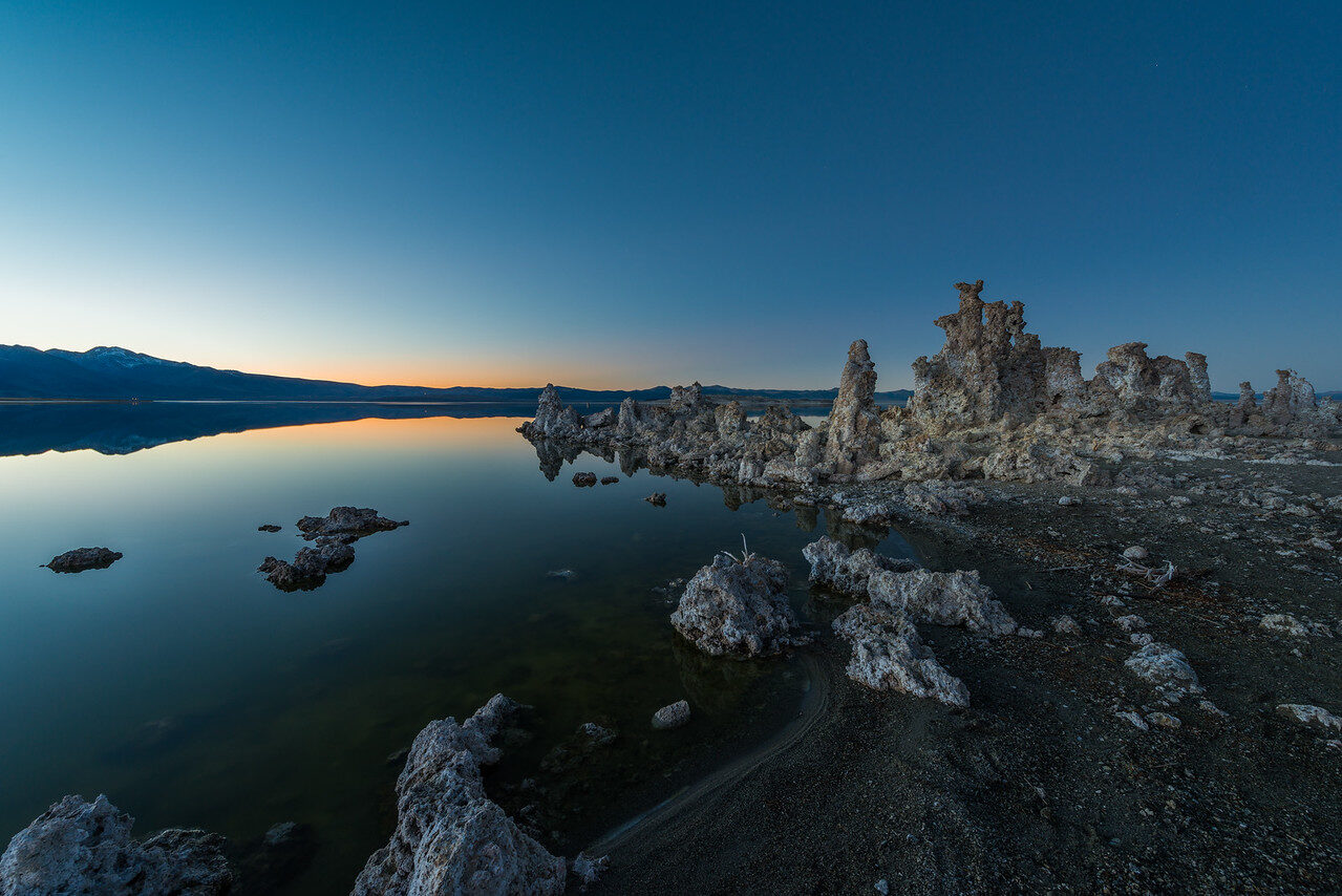
A horizon through the middle is not automatically wrong. Reflections and symmetry often benefit from a balanced split. Calm water can turn the upper and lower halves into a pair. You may also want the tension of an equal division. Decide from the scene rather than avoiding the center out of habit.
Keep an eye on level. A grid can help you judge whether the horizon is tilted, but the thirds lines themselves are not a substitute for checking it. If you choose a tilted frame for energy, make the decision obvious. A tiny accidental slant usually looks like something you missed.
 Save
Portraits: place the face, then watch the background
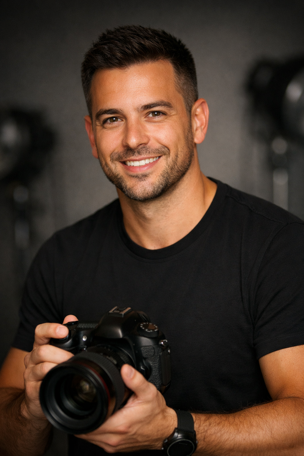
In an environmental portrait, putting a person near one vertical third can leave room for their surroundings. A musician beside an instrument or a person in a workshop may need that extra space. The surroundings should explain something, not merely fill the empty part of the frame.
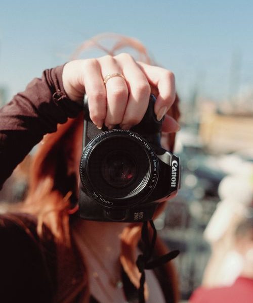
For a closer portrait, try positioning the eyes near the upper third as a starting point. Do not force this if it means an awkward crop, too much empty headroom, or cutting a gesture that matters. Faces, body language, and the edges of the photograph deserve more attention than exact grid alignment.
If the person looks to one side, try leaving room in that direction. It can give the gaze somewhere to go. But a face looking toward a tight edge can also create pressure or a sense of separation. Neither is a universal mistake. Choose the feeling rather than making every portrait follow the same recipe.
Scan behind the head before pressing the shutter. A pole, branch, or bright window can interfere with the face regardless of its location on the grid. Small changes in your position may fix the background without asking the person to move at all.
Moving subjects need somewhere to go
For a cyclist, runner, animal, or vehicle moving across the frame, try leaving more room ahead of the movement than behind it. This is often called lead room. The empty area can help communicate direction and give the action breathing space.
The rule of thirds and lead room are related choices, not the same thing. A runner on the left third might be moving left, which leaves most of the open space behind them. Watch the actual direction of the subject. The correct intersection cannot be chosen without understanding what is happening.
When the subject changes direction quickly, a looser frame can be safer than an exact composition. Leave enough room to avoid cutting off a hand, foot, wing, or wheel. You can refine a crop later, but you cannot restore a detail that never made it into the original photograph.
Composition does not freeze movement. If sharp action matters, choose your shutter speed separately. Our shutter priority guide explains how to separate that exposure decision from the framing decision.
Negative space has to earn its place
Negative space is the quieter area around the main subject. It might be sky, a plain wall, calm water, or a section of shadow. Off-center placement often creates more of it on one side. That space can make a small subject feel isolated, give a scene scale, or keep a photograph from feeling crowded.
Empty does not mean useless. The shape and tone of the space matter. A small dark subject against a clean bright background has a different relationship than the same subject surrounded by busy branches. Check whether the open area supports the subject or merely makes the picture feel unfinished.
Balance is not just a question of size. A tiny bright object can attract attention away from a much larger dark area. Color, contrast, detail, and recognizable faces can all affect what competes inside the frame. If the empty side contains a bright distraction, moving the main subject onto a third will not fix the competition.
When editing, cover the empty side with your hand for a moment. Does the picture lose something useful, or does it become clearer? This quick exercise can help you decide whether the space belongs there. Do not mistake a clean composition for one with every possible inch cropped away.
Use lines and foreground without making a mess
A road, fence, shoreline, or curve can connect parts of the photograph. A main subject near a third may give the line a useful destination. Before committing, follow the line through the whole frame. Does it lead toward the subject, past it, or straight out through an edge?
Not every line needs to point at a person or landmark. The curve itself can be the subject. In that case, placing a small unrelated object on a thirds intersection might make the picture worse. Let the strongest shape take priority.
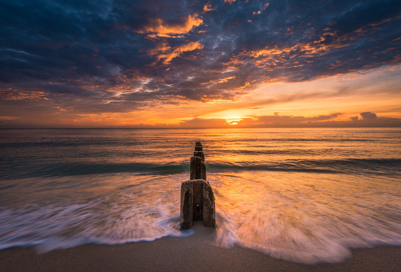
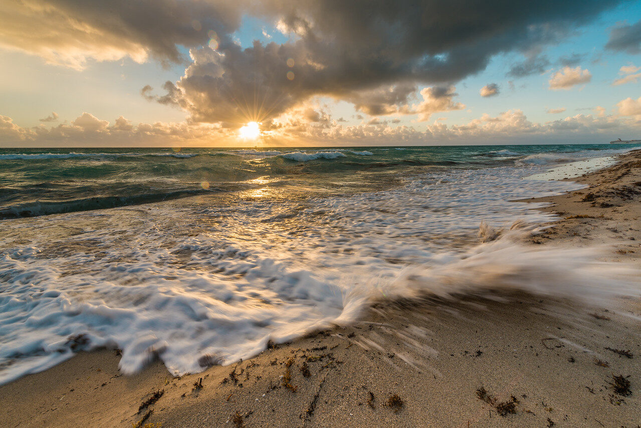
Foreground can add depth, but it can also block the picture. At a beach, a patch of wet sand or foam may help connect the bottom edge to the horizon. An oversized rock with no useful shape may dominate instead. Move your feet and change camera height before assuming a wider lens will solve it.
For moving-water scenes, choose composition and exposure together. A longer shutter speed changes the appearance of the water and therefore the shapes inside the frame. Read our moving-water photography guide for that next step.
 Save
When the center is the better choice
Symmetry is the obvious example. A doorway, a reflection, or a straight architectural view can lose its strength when you move it off-center simply to satisfy the grid. Look at the relationship between the two sides. If the repetition is the point, a centered frame may explain it more directly.
A centered portrait can feel direct. A small centered subject surrounded by a huge landscape can feel alone. Repeated shapes may work better as a pattern than as a subject on one intersection. These are useful options, not exceptions you need to apologize for.
Try making the centered photograph first when the scene clearly asks for it. Then explore an off-center version if you have time. Starting with thirds every time can become just as limiting as centering every time. The goal is to make a deliberate choice.
Crop carefully, especially for different formats
The same image behaves differently as a horizontal, vertical, or square crop. A subject near the left third in a wide frame may end up crowded against the edge in a narrow one. If you know the photograph needs several formats, allow some extra room during capture.
Use the crop grid in your editing software to try alternatives. Watch what the crop removes: a reflection, a hand, the end of a leading line, or the space ahead of a subject. A grid-aligned crop that amputates the story is not an improvement.
Heavy cropping reduces the number of pixels available for the final image. Whether that matters depends on the original file and the intended output. Do not promise yourself unlimited printing size from a tiny remaining section. Compose reasonably well in the field and use editing to refine it.
A practice session you can do today
Choose a slow subject near home. A tree, bench, doorway, or willing portrait subject is enough. Make one centered frame, one near the left third, and one near the right third. Then change camera height and repeat. Keep the session short so you spend more time looking than collecting duplicates.
Review the photographs together at the same size. Ask which makes the subject clearest, which uses the background best, and which has the cleanest edges. Notice whether your favorite is actually the one you expected. You do not need a numerical score. You need a reason for the choice.
On your next outing, use that reason. Perhaps you need less foreground, more room for a gaze, or a cleaner side of the background. Composition improves when observation carries into the next photograph. For more camera, composition, and editing lessons, explore the Shut Your Aperture Academy.
Rule of thirds questions
Is the rule of thirds mandatory?
No. It is a starting point for comparing compositions. Use a centered or different arrangement when it better fits the subject and your intent.
Where should I put a landscape horizon?
Try the upper third when the foreground matters most and the lower third when the sky matters most. A central horizon can work well for symmetry and reflections.
Should portrait eyes always sit on the upper third?
It is a useful starting point, not a requirement. Expression, background, gesture, and a sensible crop matter more than precise grid placement.
Does the grid appear in my saved photograph?
A camera viewfinder grid is normally an overlay rather than part of the image. Check your camera or app and make a test photograph if you are unsure.
Can I use the rule of thirds when cropping?
Yes. Compare crops with and without thirds placement, but protect important details and enough pixels for your intended output.
Reference: Nikon composition guidelines. The photographs illustrate framing possibilities, not a controlled comparison of identical scenes.
Want to go further? The ShutYourAperture Academy’s Mastering ISO (6 modules, 24+ lessons) is built to help you go from clean to creative with sensitivity.
Useful gear for careful composition
You can practice thirds with the camera you already own. Buy only to solve a real problem, not to unlock a composition rule.
Tripod and head: useful for refining static landscapes and keeping the frame steady. Check load capacity, plate fit, and whether a suitable head is included.
Compare on Amazon | Compare at B&H
Camera strap: choose a comfortable carry option for walking between angles. Check attachment points, weight rating, and compatibility with your camera.
Compare on Amazon | Compare at B&H
Affiliate disclosure: we may earn a commission from qualifying purchases through these links, at no extra cost to you. These are gear-search links, not promises that every listed item fits your setup.