Portrait Photography
Most photographers think a sharper lens or a wider aperture will fix their portraits. They spend $1,200 on an 85mm f/1.4 and wonder why their photos still look like everyone else’s. Here’s the uncomfortable truth: the background blur is the least important thing happening in your frame.
What makes a portrait work is connection: between subject and camera, between light and face, between the moment and the viewer. You can shoot a jaw-dropping portrait on a $300 kit lens. You can also shoot a technically perfect, emotionally hollow image on a $3,000 prime. I’ve done both. This guide is built around 15 years of real clients: nervous CEOs, reluctant teenagers, families who won’t stop looking at each other’s shoes. The lessons here come from that work.
 Save
SaveGear: The 85mm Myth and What Focal Length Actually Does
Every portrait forum will tell you the 85mm is the portrait lens. They’re not wrong, but they’re not entirely right either. The 85mm became the default because it compresses facial features pleasantly and creates smooth background separation at typical shooting distances. But it is not magic, and it is not always the right call.
50mm vs 85mm vs 135mm: When Each Wins
The 50mm is the most honest focal length — minimal compression, accurate spatial relationships. For environmental portraits where the location is part of the story, or when you’re working in a tight space, the 50mm wins. It’s also the right call for subjects with strong features who don’t need the flattering compression of longer glass.
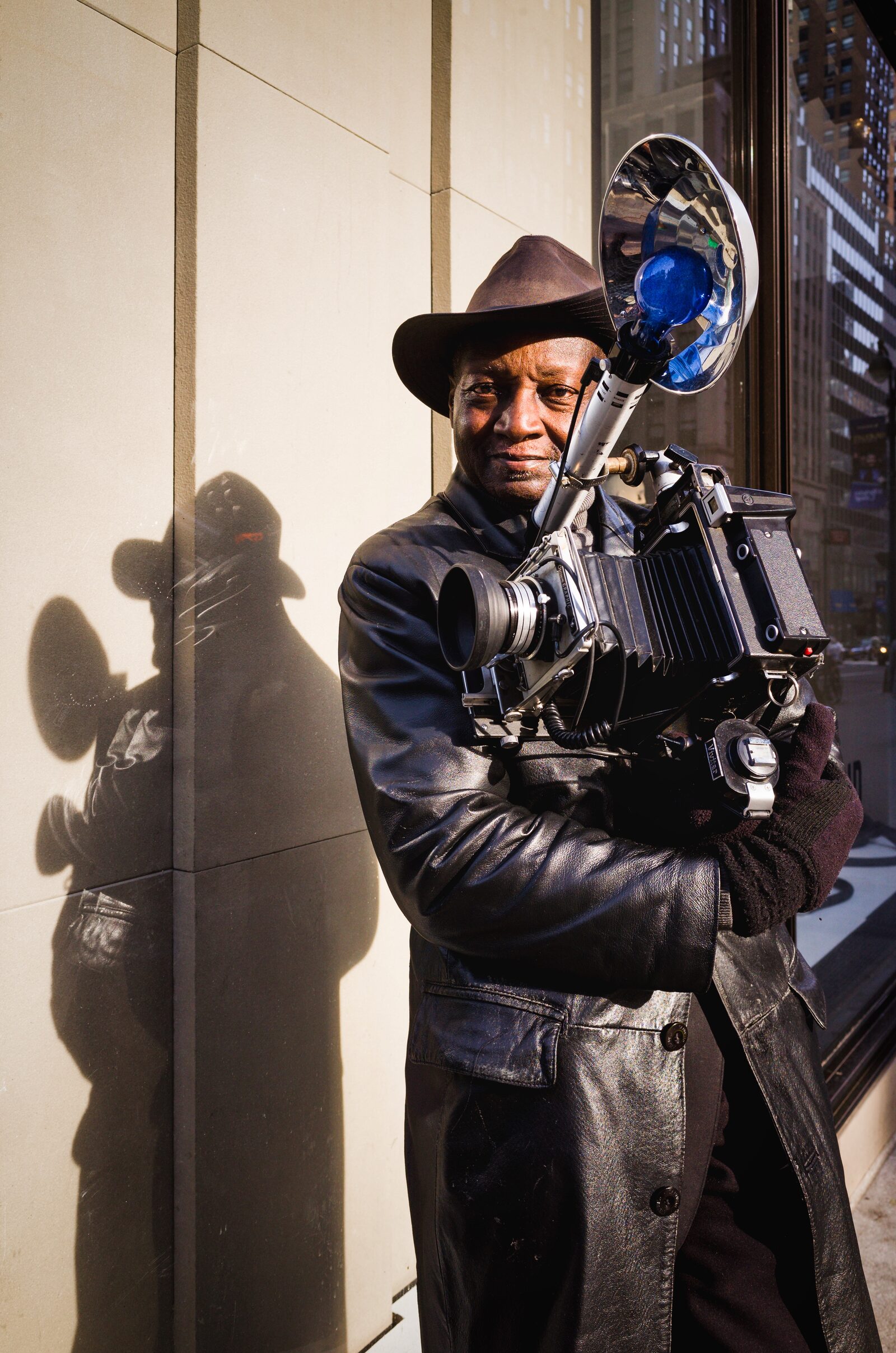
The 85mm is the workhorse for good reason. Compression at this focal length elongates the neck slightly, reduces the apparent nose size, and keeps backgrounds manageable without turning them into a void. The working distance is comfortable for both you and your subject — and that comfort matters more than people admit. If you’re buying one portrait lens, this is probably it. B&H carries a wide range of 85mm portrait lenses at every price point.
The 135mm is where things get interesting. The extra compression is genuinely flattering and the longer working distance relaxes a lot of subjects. The catch: you need space, and at wider apertures the depth of field is punishing. Miss focus by two millimeters at f/2 on a 135mm and one eye is sharp, one isn’t. Use it when you have room and time to be deliberate.
The real lesson: buy a lens that matches your most common shooting situation. A 50mm f/1.8 you use every week beats an 85mm f/1.4 that intimidates you into shooting at f/4. Understand how aperture affects your images before you buy more glass.
Light: Window Light, One-Light Strobe, and When Ambient Wins
Light sculpts a face and creates mood. Getting it right matters more than any gear decision you’ll make.
Window Light Setup
Natural window light is the most forgiving and accessible light source available. Position your subject so the window is at roughly 45 degrees to their face. Not straight on (flat), and not at 90 degrees (too dramatic for most subjects). Use a white foam board or a 5-in-1 reflector on the shadow side to bounce fill back into the shadows. Meter off the face, not the background. If the window blows out, let it. The subject matters more than the frame.
One-Light Strobe Setup
A single strobe with a 36-inch or larger octabox gets you 80% of the way to a professional studio look. Position it at 45 degrees to the subject, slightly above eye level. Add a white reflector on the opposite side to control the shadow ratio. A 2:1 ratio is flattering and approachable; 4:1 is dramatic and editorial. Complete studio strobe kits from B&H include modifier, stand, and trigger. Almost always cheaper than building it piece by piece.
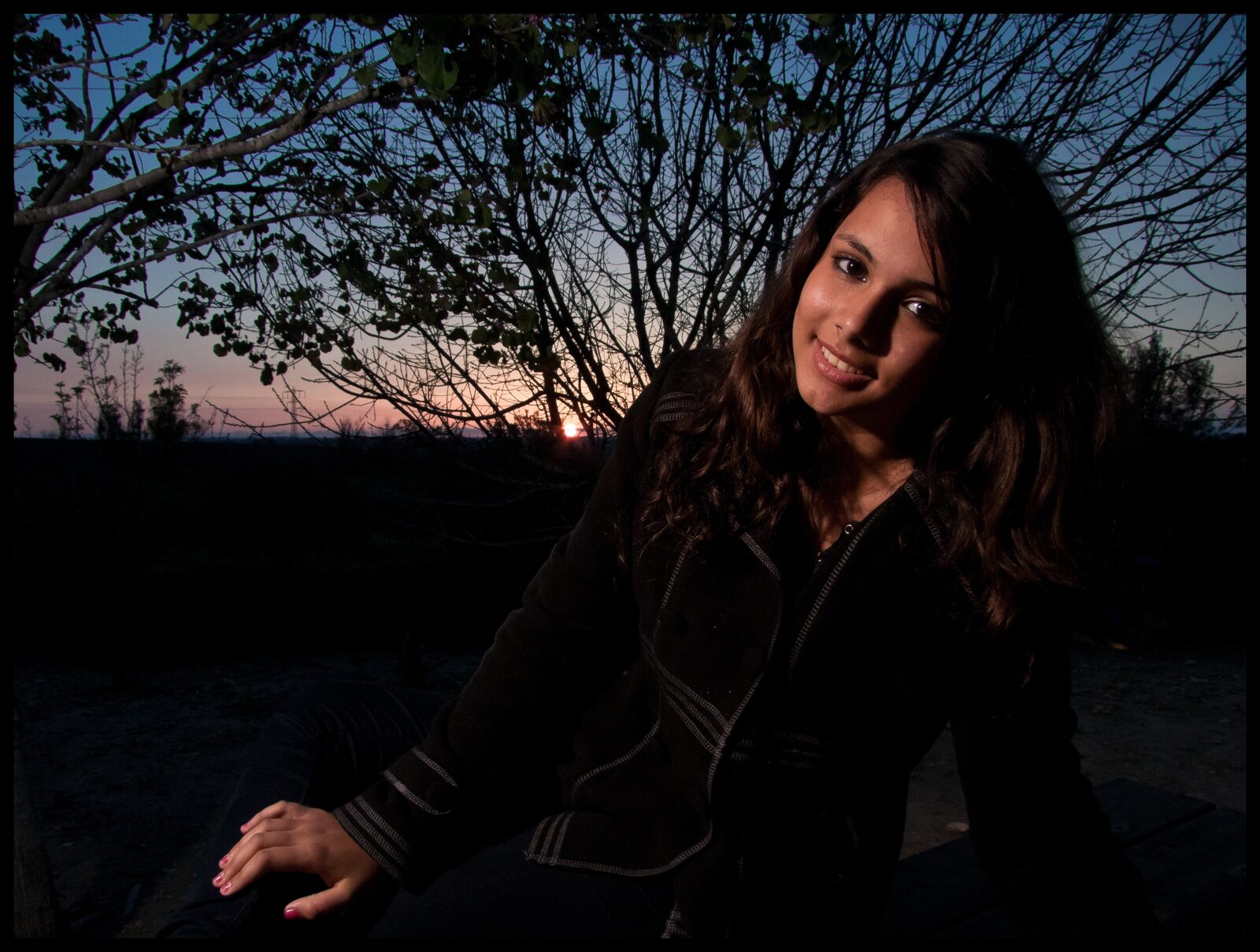
When to Use Ambient
Ambient wins when the environment is the story: golden hour, a neon-lit interior, moody overcast city light. Don’t fight it. Underexpose slightly to preserve the mood, then add a subtle fill flash to lift the face. Understanding the ISO and shutter speed relationship lets you dial in flash ratios quickly without losing the background.
Posing Fundamentals: 5 Poses That Work for 90% of Subjects
Posing is not about memorizing 50 shapes. It’s about understanding a few principles and applying them to different bodies. These five starting points work for most subjects regardless of age, size, or confidence.
- The Slight Turn: Turn the body 30–45 degrees from camera, then bring the face back toward lens. Slims the torso and creates a natural S-curve.
- Weight on the Back Foot: Shifting weight to the back foot relaxes the front knee, creates a subtle hip tilt, and kills the stiff “standing at attention” posture that ruins portraits.
- The Lean Forward: Have the subject bring their chin forward and slightly down. “Bring your forehead toward me” is the cue. It sharpens the jawline and prevents the compressed-neck look.
- Arms Away from Body: Pressed arms look wider than they are. A hand on the hip, holding something, or even a quarter-inch of air between arm and torso makes a visible difference.
- The Seated Three-Quarter: Seat the subject at 45 degrees to camera, weight on the outer hip. Elongates the torso, gives hands a natural resting place, works for virtually any body type.
Start with one of these five and modify from there. Don’t ask subjects to hold a pose. Give them a direction and shoot as they settle into it. The moment between “almost there” and “there” is often the best frame.
Directing Subjects: Scripts That Get Genuine Expressions
 Save
SaveYour voice is a tool. Most photographers nail the light and pose, then stand in silence while their subject’s face tightens into the expression of someone waiting for a bus. Use these scripts.
- To warm up: “Before we shoot anything — tell me one thing you did this week that made you feel good.” Listen to the answer. People can hear whether you care.
- For forced smiles: “Think of the most ridiculous thing that happened to you recently. Don’t tell me yet — just think about it. Now… what was it?” Shoot during the pause before they answer. That’s where the real face is.
- For the blank stare: “Look just past the left side of my camera. Now slowly bring your eyes back to me.” The movement as they return is almost always alive in a way the static stare isn’t.
- For the real laugh: Make the worst joke you know. The groan-laugh is genuine, relaxes the face, and resets the session.
The principle: give people something to think about that is not “I am being photographed.” The moment they’re thinking about the photography, you’ve lost them.
Eye Contact vs. No Eye Contact
Eye contact with the camera creates intimacy and commands attention. For corporate headshots, family portraits, and anything where the subject wants to project confidence, it’s the right call. When a subject is looking away, the viewer becomes an observer, watching a private moment rather than participating in it. This works for editorial, lifestyle, and environmental portraits where the story is bigger than the subject’s relationship to the camera.
The mistake is treating no-eye-contact as a fallback when direct gaze isn’t working. Use it as an intentional choice, and give the subject something specific to look at: “watch that window,” not just “look away.” Specificity creates focus, and focus reads on camera.
Backgrounds: Choosing, Simplifying, and Using Bokeh Correctly
Bokeh is a tool, not a default. A well-chosen background that’s slightly softened but still readable adds context and richness. A completely blown-out background is just absence. Ask yourself: does the background add something, or does it distract? If it adds, keep it readable. If it distracts, blur it or change it.
Practical background choices: seamless paper for headshots where context is irrelevant; textured walls (brick, concrete, painted wood) for character without competition; open shade with a brighter background for natural separation without shallow depth of field; the subject’s actual environment for environmental portraits, shot tighter to keep it readable without overwhelming.
Simplifying in-camera is faster than fixing in post. Move the subject forward, reframe to cut the distraction, shift two feet to your left. Solve it before you press the shutter.
Skin Tones: Color Theory and Lightroom Settings
Getting skin tones right is the difference between a portrait that feels real and one that looks processed. Most photographers push saturation too hard, or pull skin into orange territory trying to add warmth.
Start with a neutral camera profile — Camera Neutral or Faithful on Canon, Neutral on Sony and Nikon. In Lightroom, choose a Camera Matching profile rather than Adobe Standard, which tends to oversaturate reds and oranges. Then work the HSL panel: pull orange saturation back 5–10 points (most files have too much), shift orange hue slightly toward red (left) for warmth, and lift orange luminance 5–8 points to brighten skin without blowing highlights. In the Calibration panel, shift red primary hue slightly right (+5–10) to add warmth without touching saturation. Portrait-specific Lightroom presets can get you 70% of the way there, but individual skin tones will still need HSL fine-tuning.
Couples and Family Posing: Triangles, Height Differences, Hands
Group portraits fail when photographers let people stand in a line. The solution is triangles. Create high points and low points so the eye travels through the frame rather than scanning across it. Have one person sit, one crouch, one stand.
Height disparity in couples: seat the taller person, use a step for the shorter one, or lean them into each other so their heads read at similar heights. Shoot from a slightly lower angle to compress apparent height difference.
Hands are the most expressive secondary element in a portrait and the thing photographers most often leave to chance. Tell people exactly where to put them. Unguided hands tense up and look awkward. Every time. “Hold her hand with both of yours.” “Rest your hand on his shoulder.” Be specific.
The best family photos usually happen in the two seconds after you ask everyone to squeeze in a little closer — when the closeness triggers a genuine laugh and everyone forgets to perform. Build that moment intentionally.
Corporate Headshots: Pricing, Lighting, and What Clients Need
Corporate headshot work is steady, repeatable, and more lucrative than most photographers realize. Partly because most photographers undersell it.
Pricing: Single-session headshots typically run $150–$350 for 30 minutes with 2–3 edited images. On-site full-day corporate bookings (20–40 subjects) run $800–$2,500+ depending on usage rights and turnaround. Always get a signed usage agreement. Corporate clients using images across platforms for 2–3 years is commercial usage, not personal portrait use. See the photography business pricing guide for full rate structure guidance.
Lighting: Consistency is everything. When you’re shooting 30 people in a day, you cannot re-light between subjects. Use a large octabox as key at 45 degrees, a second softbox at quarter-power for fill, and mark every floor position with tape. Shoot tethered if possible. Clients who see their image immediately relax visibly for the remaining frames.
Delivery: Most clients need white or light gray background, chest-height crop, natural retouching, consistent color temperature across all subjects, and high-res JPEGs. For client gallery delivery, SmugMug handles password-protected galleries with download controls cleanly.
Editing Portraits: Skin Retouching That Doesn’t Look Plastic
Over-retouched skin is one of the most common ways to ruin a good portrait. The goal is to remove distractions so the viewer stays in the subject’s eyes, not to create perfect skin.
- Global adjustments first: Get color and exposure right before touching skin. You’ll re-do the retouching if you do it out of order.
- Spot healing: Temporary blemishes come out with the heal brush. Permanent features — moles, scars, birthmarks — generally stay unless the client requests otherwise. If you’re spending more than two minutes on healing in Lightroom, you’ve gone too far.
- Soften texture (if needed): Use Lightroom masking to select skin, then pull texture back no more than -15 and clarity no more than -10. Pulling these to -50 creates wax figures, not people.
- Dodge and burn: Use a 10–15% opacity brush to lighten the high points of the face (bridge of nose, forehead center, cheekbones) and darken the shadows (temples, sides of nose, under cheekbones). Adds dimension without altering texture.
- Eyes last: Lift exposure slightly in the whites with a targeted mask. Pull iris saturation and clarity up gently. Remove redness from whites via the HSL red channel if needed.
The benchmark: the edit should survive 100% zoom without looking processed, and look flawless at phone-screen size, which is where most clients will see it first.
Common Portrait Mistakes
- Shooting wide open as a default: f/1.8 is a creative choice, not a starting point. One sharp eye and one soft eye is a focus problem caused by thoughtless aperture selection.
- Ignoring the background in-camera: Build a background scan into your pre-shoot checklist. The telephone pole growing out of someone’s head won’t fix itself in post.
- Not talking enough: Silence reads as judgment. Keep talking, ask questions, fill the silence with something other than “okay, hold that.”
- Flat, on-axis light: On-camera flash or a light source directly in front of the subject creates no dimension. Move the light off axis.
- Cropping at the joints: Never crop at the wrist, elbow, knee, or ankle. Crop between joints — mid-forearm, mid-thigh, mid-shin. Cropping at a joint reads as amputation.
- Forgetting shutter speed on location: A moving subject in mixed light needs at least 1/200s to avoid motion blur that reads as bad focus. Raise shutter speed and compensate with ISO before slowing the shutter.
 Save
SaveFrequently Asked Questions About Portrait Photography
What aperture should I use for portraits?
For single subjects, f/2–f/2.8 gives background separation while keeping both eyes sharp. For two people, f/4. For groups of five or more, f/8. The goal is sharpness where it matters — the eyes — not the widest aperture available.
Do I need a prime lens for portraits, or will a zoom work?
A 70-200mm f/2.8 zoom is excellent for portrait work — arguably more versatile than a prime because you adjust focal length without moving. Modern f/2.8 zooms are extremely sharp. Buy the lens that matches how you work, not the one with the most forum approval.
How do I get natural-looking skin tones?
Shoot RAW, use a neutral camera profile, nail white balance at capture with a gray card or color checker, and expose for the face. In post, check orange hue and saturation in the HSL panel before touching anything else. Most bad skin tones are a white balance problem, not a camera problem.
How many photos should I deliver to a portrait client?
For a 30–60 minute session, 10–20 fully edited images is professional and appropriate. Delivering 200 lightly processed images shifts the editing burden to the client and signals you haven’t curated your work. Do the editing, make the choices, deliver a tight gallery.
How do I pose someone who has never been photographed professionally?
Start with movement rather than a static pose. Walk them to a spot, have them step forward and stop naturally — shoot during the stop. Give their hands something to do. Keep talking. The first ten frames are warm-up frames; budget for them and don’t expect them to make the final edit.
Step 2: Master Portrait Lighting
You've learned composition. Next, master the lighting and direction that elevate portraits from snapshots to professional work.