Definition and History of Nude Colors
The term "nude colors" traditionally referred to pale tones that blend white and brown, resembling Caucasian skin. Originating from a Western-European perspective, these colors predominated fashion and beauty ideals for decades. The hex code #E3BC9A embodied its versatile application across various design spectrums. However, this color defined notions of color norms in fashion and design, leaning on an ethnocentric bias.
As multicultural influences bloomed in the design industries, the definition of 'nude' evolved to include a diverse array of skin tones, reflecting the spectrum of human colors across global populations. Designers in fashion and beauty began embracing palettes that cater to an expansive array of skin tones. This inclusivity aligned better with social consciousness and brought a richer palette into realms of everyday use.
The beauty sector has demonstrated appreciable strides in conceptualizing 'nude' in a multidimensional context. Makeup lines now regularly offer products in an inclusive range from dark to light, enriching consumer choices. This expansive view extends into the lingerie and hosiery sectors, where a singular 'nude' now represents inclusivity.
Nude colors blend seamlessly with multiple color combinations. In seasonal fashion releases and interior color trends, neutral palettes merge these understated tones with rich browns, serene beiges, and energetic greyscale accents.
Nude colors create a critical balance in decor, illustrating the power of unassuming subtlety in creating soothing environments without overshadowing personality. They excel in minimalism-driven styles, where concentrations on material textures and form take precedence over saturated colors.
From its inception as a narrow, exclusive shade to its present status as an ensemble of globally-resonant skin colors, the understanding and application of nude tones exemplify the evolution of design. This color story extends beyond aesthetics; it fosters the essence of unity through diversity.
 Save
SavePsychological Impact of Nude Colors
The psychological effects of nude colors in art and design are profound. These colors, encompassing shades from soft beiges to rich tans, evoke feelings of calmness and warmth, making them a popular choice in both product design and spatial planning. The subdued nature of these tones implies neutrality, aiding in crafting environments that feel inviting and balanced.
In interior design, nude colors create an atmosphere of expansive calm. They act as a subtle backdrop that extends the perceived dimensions of a room without visual clutter. These hues can help highlight bolder colors or design features when used as complementary backdrops, showcasing their versatility.
Fashion designers harness the psychological appeal of nude tones similarly. In clothing, these colors offer a warm, almost second-skin feel that speaks to comfort and minimalism. Often associated with understatement and sophistication, nude hues provide a canvas that complements natural human skin tones, promoting inclusivity while emphasizing the wearer.
In art, painters and digital artists use nude shades to convey serenity and rawness. Portraits utilizing a nude palette can seem more lifelike and intimate, inviting viewers into a deeper contemplative engagement with the artwork. The psychological underpinning leans towards fostering connectedness between the subject depicted and the audience.
Considering modern environments filled with stimuli, the call to these inherently calming shades becomes clearer. Surrounding oneself with nude colors can serve to steady the mind, restrain overstimulation, and approximate the organic, easing transitions into relaxation and well-being.
The strategic deployment of nude colors in design emphasizes not only physical aesthetics but also aligns with a psychologically enriched palette that seeks to nurture and restore the human psyche amidst modern intricacies.
Nude Color Trends in 2024
Leading the charge in the 2024 color landscape, nude color trends have demonstrated an adaptive and culturally attentive progression that reflects broader societal shifts toward inclusive design. As the concept of 'nude' stretches further to encompass an assorted mix of skin-adjusted tints around the globe, it both mirrors and instigates modern design subtleties.
In interior design, Earth-toned neutrals anchor the trend. Shades like 'Peach Fuzz', Pantone's Color of the Year for 2024, ignite interiors with undemanding warmth and soothing undertones. This gentle peach hue beckons a comforting, nearly therapeutic ambiance—ideal for spaces aiming to be sanctuaries of solace in one's bustling everyday life. Designers approach these tones with an orchestral sensibility, balancing them against pops of energizing colors to boost the vivacity and dynamic personality of living spaces.
Fashion sees an equally strategic yet liberating deployment of nude hues. With a leaning towards 'Peach Fuzz', fashion design in 2024 speaks to a synthesis between accessibility and luxury. This shade and its similar kin—flexible beiges, warm tans, and discreet khakis—are staging a striking appeal on runways and city streets alike, transforming everyday apparel into statements of refined, understated elegance that compliments a plethora of complexions.
Digital art rides the wave of flexibility and broad outreach offered by nude shades. Digital artists wield palettes like 'Peach Fuzz' to create artworks that speak to universality while respecting personal narratives. Used either as subtle backgrounds or as primary focal points, these hues harmonize elements within a piece, encouraging emotions that resonate with wider audiences.
This prevalent usage bespeaks a deeper cultural movement, an acknowledgment and celebration of diversity and flexibility. As global societies become more integrated and socially aware, the art and design communities proactively reflect these evolving dynamics. Nude hues stand no longer as static or monolithic but evolve fluidly, championing a configurability that allows individual identities to beam through universally appreciative designs.
As we traverse through 2024, it becomes evident that the draping of nude colors across diverse platforms extends beyond mere trend-following; it is a concerted nod to placidity, inclusion, and the human touch within the intertwined realms of aesthetics and function.
Complementary Colors for Nude Palettes
Expanding on the harmonious interplay of colors, understanding complementary colors that position themselves adeptly against nude shades is crucial in intensifying aesthetic interactions. Nude palettes, lauded for their versatile subtlety and warm undertones, provide a splendid backdrop for integrating contrasting yet complementary colors, such as:
- Warm browns
- Greys
- Assertive hues like navy blue
Warm browns, when paired with nude tones, foster a resonant depth cherished in both interior and fashion design. This combination channels a restorative, rustic charm that feels both ancient and freshly inviting. In a homely space, furniture or textiles featuring this rich, comforting alliance can make areas like living rooms or bedrooms appear more sumptuous and grounded.
Greys offer a sleek counterbalance to the softness of nudes, bringing in elements of modern sophistication without overwhelming the muted tranquil tone. In corporate or personal office spaces where concentration and task efficiency are key, integrating grey furnishings against nude walls can foster an environment that promotes cognitive clarity while keeping the atmosphere gently engaging.
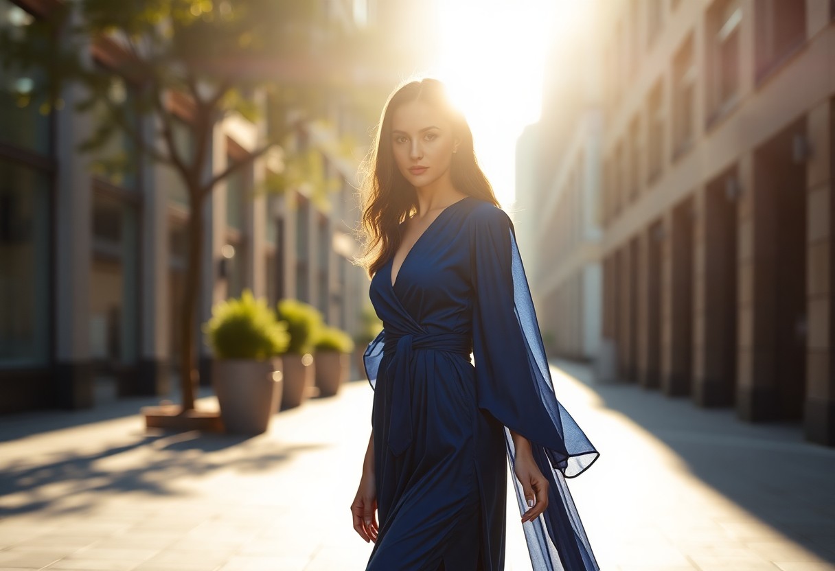
Navy blue interacts subtly with lighter nude tones to create an air of regal sophistication ideal for expressive pursuits. This powerful yet refined palette is seen prominently in sartorial choices where it summons a silent authority. Art parties or gallery settings authenticate its creator's bold modern intentions when this nautical hue cues the background or primary colors.
In the domain of weddings or festive decor, this articulate triplet of nude, blushes of browns, gradational greys, fleshed out with stints of navy provide an anchor to thematic expressions that wish to whisper timeless elegance. Transitional zone designing within open-concept homes or workplaces can leverage these palettes to sculpt space that subtly shifts in purpose without needing partitions.
Meeting the warmth of engaging browns, the clarifying subtleness of greys, and navy's intrusive depth creates a uniquely balanced chromatic dialogue. Each hue serves as a perfect counterfoil to others, accentuating aspects that might go unnoticed if presented monochromatically yet achieving an aesthetic synchrony that retains individualistic strengths prominently.
 Save
SavePhoto by stefanoemme on Unsplash
Application of Nude Colors in Various Media
Nude color palettes possess remarkable adaptability, seamlessly harmonizing with countless materials and settings across diverse industries such as fashion, beauty, and interior design. Their underlying strength lies in their versatility—sublime enough to enhance features without overpowering, yet distinct to assert subtle style statements. This chameleon-like quality allows nude shades to be foundational yet dynamic in various applications.
In the fashion industry, designers utilize nude tones to sculpt apparel that speaks to an intimate connection with the human form. Materials like silk, satin, and fine cotton shimmer subtly in nude, reflecting light and shadow in a ballet of nuances. On suede and velvet, the colors permeate a textured depth that enriches its wearer with an aura of understated luxury. These fabrics are just as prominent in haute couture as they are in everyday wardrobes, showcasing the broad, unifying appeal of nudes.
Similarly transformative, the beauty industry harnesses nude palettes to evoke and enhance natural beauty. Beyond the extensive range of foundations, nude colors influence powders, eyeshadows, lipsticks, and an array of styling products seeking to amplify innate allure. A unique attribute of nude tones in cosmetics is their transferral quality—how they blend between various skin types. On the canvas of skin, these hues shift slightly, interacting with undertones to highlight a customized glow.
The influence of nude colors extends robustly into interior design where their adaptability shines diverse across varied furnishings and finishes. Wallpaper, large upholstery items, drapes, and accents in these tinted hues accentuate the architectural features of space. Wood, stone, and textiles billet these tones differently:
- Wood exudes warmth in sandy blush taupes
- Stone renders a room contemplative with cool ecru
- Textiles weave coziness using fibrous creams and beiges
Moreover, the interaction with light further cements the role of nudes in interiors. These colors have the ability to expand areas or offer intimacy, galvanized by the amount of natural or artificial light a room volunteers to the tones. The strategic placement of lighting fixtures in spaces festooned in nude palettes can turn a nondescript area into a vignette teeming with elegant warmth or create spacious austerity suited for minimalistic aesthetics.
Aggregate views from all these textures, materials, and modalities observe nude colors not just filling roles but enhancing the inherent qualities of the mediums they imbue. As industries evolve their notions of color and design inclusivity, nude palettes will continue to stretch generously, captivating new dimensions of consumer interaction reshaping beauty norms and interior charm alike.
 Save
SaveIn conclusion, the redefinition of nude colors to include a wider array of skin tones is a profound acknowledgment of diversity. This evolution in design philosophy enhances both aesthetic appeal and cultural sensitivity, making it a pivotal aspect of the contemporary color narrative. As the world continues to embrace inclusivity in all facets of life, the transformative power of nude palettes will remain an indispensable tool for creators seeking to resonate with global audiences.
References
- Eiseman L, Recker K. Pantone on fashion: a century of color in design. Chronicle Books; 2014.
- Bleicher S. Contemporary color theory and use. Cengage Learning; 2012.
- Geboy L, Moore KK. Interior design: a practical guide. Routledge; 2019.


