

Landscape photography seems easy on paper. You find a beautiful mountain, you point your camera at it, and you press the shutter. Done, right? Not quite. If it were that simple, every tourist with a smartphone would be selling prints at fine art galleries.
We’ve all been there, standing in front of a breathtaking sunset, feeling the wind on our faces, and capturing what we think is a masterpiece, only to get home and realize the photo looks flat, cluttered, or just plain boring. The disconnect between what you see and what your camera records usually comes down to one thing: composition.
Composition is the language of photography. It’s how you tell the viewer where to look and how to feel. If your "visual grammar" is off, the message gets lost. At Shut Your Aperture, we see these mistakes all the time. The good news? They are incredibly easy to fix once you know what to look for.
Here are the seven most common landscape composition mistakes and the simple tweaks you can make to level up your game.
1. The "Kitchen Sink" Syndrome (Including Too Much)
One of the biggest mistakes beginners make is trying to fit everything into a single frame. You see a beautiful lake, a jagged mountain range, a cool-looking tree, a flock of birds, and a rustic barn. You try to cram them all in because they’re all "pretty."
The result? Visual chaos. When everything is important, nothing is important. The viewer's eye wanders around the frame with nowhere to land, eventually getting tired and moving on.
The Fix: Simplify and Subdivide
Before you even touch your tripod, ask yourself: What is the one thing that made me stop the car? If it’s the mountain, make the mountain the star. If it’s the barn, get closer to the barn.
Keep your compositions clean. If an element doesn't help tell the story of your main subject, crop it out or change your angle. Sometimes, less truly is more. Check out some of the minimalist approaches at PhotoGuides.org to see how simple subjects can carry a heavy emotional weight.
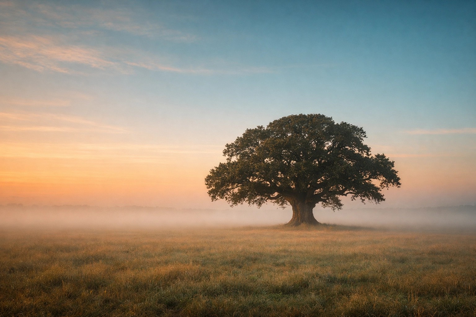
2. Neglecting the Foreground
When we look at a landscape, our eyes naturally gravitate toward the "big" stuff, the peaks, the clouds, the horizon. Because of this, many photographers forget the ground right in front of them. This is especially problematic when using a wide-angle lens.
Without a strong foreground, your image loses its sense of scale and depth. It ends up looking like a flat, two-dimensional postcard rather than an immersive experience. You want the viewer to feel like they could step right into the frame.
The Fix: The Three-Layer Rule
Think of your landscape in three distinct layers:
- Foreground: Something close (rocks, flowers, ice, a path) to lead the eye in.
- Middle ground: The bridge between the front and the back (a lake, a forest, rolling hills).
- Background: The "hero" element (the mountain, the sun, the sky).
By including a detailed foreground, you create a visual path for the viewer to follow. If you’re struggling with finding the right balance of depth, browsing the galleries at edinfineart.com can give you a great sense of how professional landscape artists use foreground elements to anchor a scene.
3. The "Drunken" Horizon
There is nothing, and I mean nothing, that ruins a professional-looking landscape faster than a crooked horizon. It’s a tiny detail that screams "amateur." Humans have a built-in internal level; when we see a tilted ocean or a leaning mountain range, it creates a subconscious sense of unease. It feels like the water is about to slide right out of the frame.
The Fix: Use Your Tools
Most modern cameras have a built-in electronic level (often called a "virtual horizon"). Turn it on and use it. If you’re shooting on a tripod, make sure the legs are stable, but don't trust your eyes alone, trust the sensors.
If you still mess it up in the field, don't sweat it. You can easily fix it in post-processing. Programs like Luminar have incredible AI-driven tools that can automatically detect the horizon and straighten it for you without losing too much of your edges.
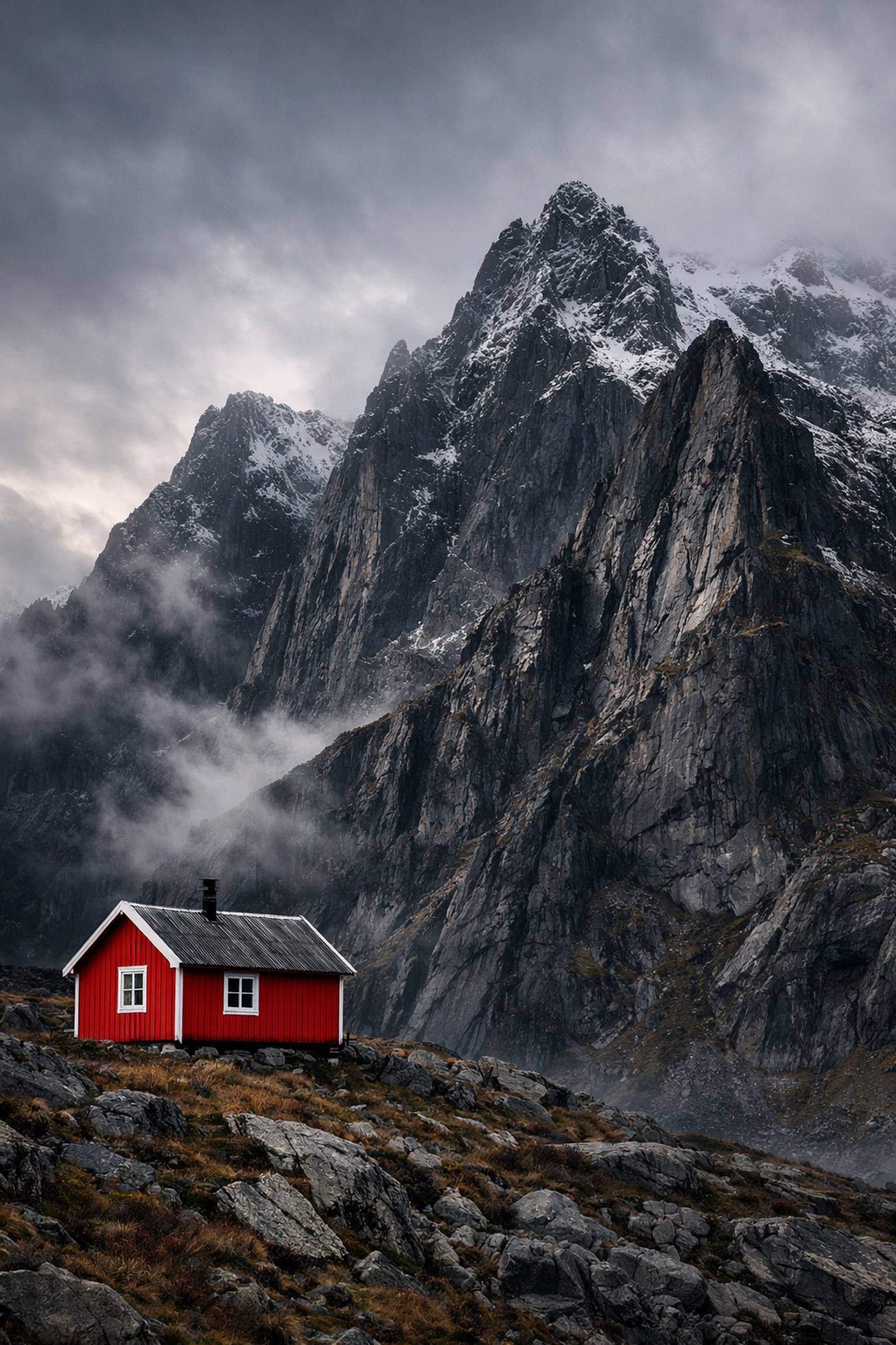
4. No Clear Focal Point
This ties back to the "Kitchen Sink" syndrome but with a twist. Sometimes a photo is clean, but it’s still boring because there’s no "hook." A landscape needs a focal point, a place for the eye to rest. Without a clear subject, the viewer’s gaze just bounces around until they lose interest.
Think of it like a story. If you have a setting (the landscape) but no protagonist (the focal point), you don't really have a plot.
The Fix: Find Your Protagonist
Your focal point doesn't have to be massive. It could be a single red leaf on a grey rock, a lone hiker on a ridge, or a specific peak caught in a "god ray" of light. Use the Rule of Thirds to place this focal point off-center to create a more dynamic and pleasing balance.
If you’re moving from landscape work into other fields, like corporate work, you'll notice this principle stays the same. Just look at how focus is handled in professional corporate headshots; the subject is always the undeniable King of the frame. Landscapes should be no different.
5. Mismanaging Negative Space
Negative space is the "empty" part of your photo, the clear blue sky, the vast field of snow, or the dark shadows of a canyon. A common mistake is either having too much negative space that feels empty and purposeless, or not having enough, which makes the photo feel suffocating.
If you place your subject too close to the edge of the frame, you "choke" the composition. The subject needs room to breathe.
The Fix: Give it Air
Use negative space to balance the "weight" of your subject. If you have a massive mountain on the left side of the frame, a large expanse of open sky or a quiet lake on the right can provide the necessary balance.
Don't be afraid of "empty" areas. They provide a place for the viewer's eyes to rest before returning to the main subject. If you want to see how to use space effectively in a commercial setting, check out proshoot.io for examples of clean, balanced imagery.
6. Fighting the Light and Shadows
Landscape photography is, at its core, the study of light. Many photographers compose their shot based on the shapes they see, but they ignore where the light is coming from.
The mistake often happens when shadows and highlights are placed randomly. For example, if the sun is coming from the left, but your strongest shadows are also on the left, the image will look "off" and unnatural to the human brain. Or worse, shooting at high noon when the light is flat and the shadows are harsh and vertical, killing all the texture of the landscape.
The Fix: Follow the Sun
Directional light is your best friend. It creates highlights and shadows that reveal the texture and "bones" of the land. Before you set up, look at where the sun is. Side-lighting is usually the most dramatic for landscapes because it emphasizes the peaks and valleys.
If the light isn't cooperating, you can enhance the natural "flow" of light in post-production. Using tools like Luminar, you can emphasize the glow of the sun or deepen the shadows to create a more painterly, three-dimensional look.

7. The Flat Earth Effect (Ignoring Atmospheric Perspective)
In the real world, things that are far away look different than things that are close. Due to dust, moisture, and particles in the air, distant objects appear lighter, bluer, and less detailed. This is called atmospheric perspective.
A common mistake in digital photography is trying to make everything, from the blade of grass at your feet to the mountain fifty miles away, look equally sharp, dark, and saturated. This kills the sense of scale and makes the mountain look like a small cardboard cutout right behind your subject.
The Fix: Embrace the Haze
Don't fight the natural "fade" of the distance. Let the background stay a little softer and less saturated than the foreground. This visual cue tells the viewer’s brain, "Wow, that mountain is huge and really far away."
When editing, you can actually enhance this. Keep your foreground colors warm and intense, and let your background colors drift into cooler, paler tones. This creates a massive sense of space. For more technical deep dives on capturing these subtle details, blog.edinchavez.com is a goldmine of information.
Bonus: Stop Shooting From Eye Level
The final "hidden" mistake isn't necessarily about where you put things in the frame, but where you stand. Most people walk up to a viewpoint, hold the camera at eye level, and click. This results in the same perspective everyone else has.
The Fix: Get Low (or High)
Change your physical perspective. Get the camera six inches off the ground. This makes your foreground elements loom large and look much more imposing. Alternatively, find a higher vantage point to look down into a valley to reveal patterns that aren't visible from the ground.
If you're looking for professional help with high-end production or unique angles, edinstudios.com shows how changing your perspective can transform a standard scene into something extraordinary.
Putting It All Together
Photography is a journey, and landscape photography is perhaps the most meditative part of that journey. It requires patience, a bit of hiking, and a keen eye for detail.
By avoiding these seven common pitfalls: simplifying your scene, using the foreground, leveling your horizons, defining your focal point, balancing space, following the light, and respecting atmospheric perspective: you’ll start seeing a massive shift in the quality of your work.
You don't need the most expensive camera in the world to take a great photo. You just need to understand how to arrange the world inside that little rectangular box. So, grab your gear, head out to the nearest park or mountain range, and start practicing.
And remember, if you find yourself struggling with the "flatness" of your raw files, don't be afraid to give them a little help. Using a powerful yet simple editor like Luminar can help bring out the soul of the landscape that your camera might have missed.

Composition isn't just a set of rules; it’s a toolkit. Sometimes you’ll break these rules on purpose to create something truly unique. But before you can break the rules effectively, you have to master them.
Keep shooting, keep experimenting, and most importantly, keep your aperture shut until the light is just right. Happy shooting!


