Selecting a Color Palette
Choosing the right color palette is vital for ensuring everyone in the family looks their best and fits harmoniously into the photo's overall aesthetic. Pulling off a visually cohesive family photo requires harmonizing the colors with the shoot's location and season, as well as considering each person's complexion and individual style.
Consider the backdrop of your chosen photo location. An autumn setting with rich, earthy tones like deep reds, warm oranges, and golden yellows might suggest a complementary palette of burgundy, burnt sienna, and mustard. Conversely, a spring blossom park scene calls for softer tones such as pastels—think pale pinks, delicate blues, and mint greens.
Factor in the season not only for scenery but for the appropriate wardrobe choices that will keep the family comfortable and looking seasonal. Choosing light fabrics and colors such as pale blues, lavenders, and soft yellows can match perfectly with a warm summer day, whereas cooler shades like forest greens, navy, and rich browns will suit a winter scene well.
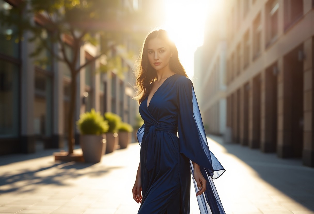
Alongside the environmental context, considering each family member's skin tone ensures that the colors enhance their natural features rather than clash. People with cooler undertones look stunning in shades like emerald green or cobalt blue while those with warmer undertones are complemented by earthy shades such as olive or deep yellows.
For families aiming to reflect their personal style while maintaining a unified look, a key approach is to build around a central neutral base—perhaps shades of gray, beige, or navy—and then accent these with pops of coordinated colors based on individuals' favorite hues. This method allows for personal expression without straying from the cohesive feel of the group aesthetic.
Taking each family member's opinion into consideration isn't just prudent for ensuring color uniformity; it fosters a fun pre-photo shoot involvement, allowing everyone to feel connected to the process and more comfortable during the photography session itself—this could make all the difference in achieving natural and happy expressions in the final shots.
 Save
SaveCoordinating Outfits, Not Matching
Coordinating outfits rather than opting for an exact match among all family members allows individual personalities to shine through and enhances the visual interest and sophistication of the family portrait. This approach moves away from the outdated concept of wearing identical outfits, avoiding the monotonous look that can often result from such uniformity.
For instance, if the selected base color is navy, instead of mandating that everyone wear navy tops and khaki bottoms, family members could vary their garments within this color spectrum. One might choose a navy blazer over a light blue shirt, while another might select a floral dress that features navy and light blue amidst other complementary colors. This method introduces variation and depth into the photographic composition.
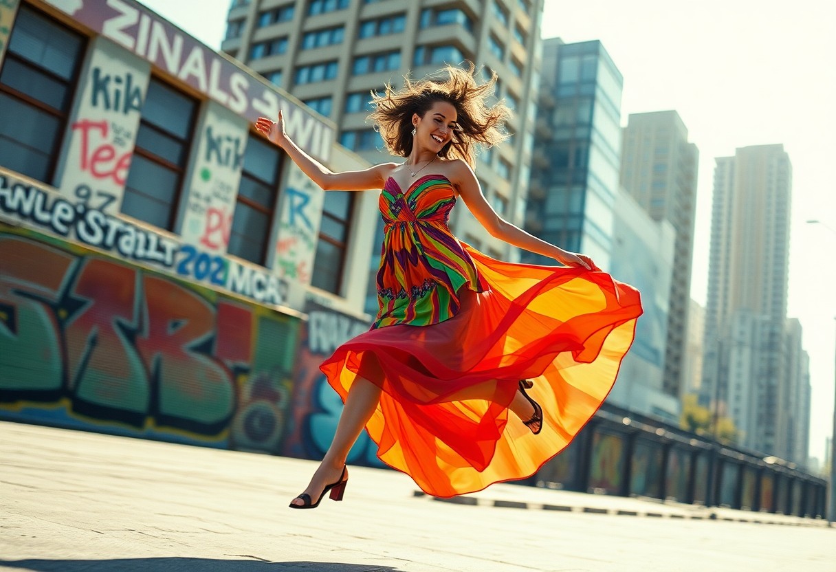
The layers and textures involved in coordinated but distinct outfits bring a richness to photo compositions that matched outfits do not offer. Cable knits, linens, silks, and tweeds not only feel different to the touch, but they respond differently to light and shadow, offering a tactile quality even within a two-dimensional photo.
This technique of coordinating offers flexibility that is often necessary when dressing a varied age range or different body types. Children might be more comfortable and look more appropriate in more casual attire compared with adults who may lean toward a polished look. Coordinating allows for these differences while maintaining an overall cohesive visual story.
By allowing each family member to express their fashion tastes, it encourages enthusiasm for the photoshoot since individuals are more likely to feel self-confident and engaged in outfits they enjoy wearing. It transforms preparation for a family photo from a one-person dictated scenario into a collaborative creative endeavor that respects each person's input.
Incorporating Textures and Layers
Incorporating various textures and layers into your family's outfits strategically elevates the photographs to a new dimension. Each material has its unique quality and way of interacting with light, which can significantly enhance the richness and depth of your photographs.
A chunky knit sweater on dad can add a warm, inviting texture that's perfect for fall or winter photo sessions. It contrasts beautifully with a smooth, silk dress worn by mom, contributing to photographic contrast that catches the eye and appeals aesthetically. Young children might be dressed in denim or corduroy, materials that offer durability and texture while maintaining comfort and mobility.
These varied textures interact differently under lighting conditions, creating engaging shadows and highlights in the photos. Soft fabrics like cashmere or fleece absorb light, giving off a gentle, subdued look, while shinier fabrics such as satin or silk reflect light, lending a subtle glow to the attire. This interaction of textures with light enhances depth and helps in highlighting the features of individual family members.
Adding layers to the outfits should be thought of strategically — not just in ensuring comfort for varying weather conditions but also in enhancing the overall style of the picture. Layering a simple vest over a long sleeve shirt can add sophistication to a casual look, and using complementary colors in these layers can visually tie different members of the family together without making it look overly matched.
Accessorizing is another pivotal aspect when integrating textures and layers. Accessories like hats, scarves, belts, and eyewear play significant roles in executing a rounded look for each individual. A felt hat might introduce a rustic touch, suitable for outdoor shoots in natural settings, while vibrant patterned scarves can add a pop of color and intricacy to an otherwise minimalistic outfit.
The goal is to create an ensemble where both differentiation and harmony exist simultaneously. By skillfully utilizing the wealth of options in textures and layers, each family portrait can thread together narratives of unity while respecting individuality, resulting in a cohesive yet multifaceted depiction that's both memorable and visually enchanting.
- Eiseman L. Pantone Guide to Communicating with Color. Grafix Press, Ltd.; 2000.
- Samara T. Design Elements, Color Fundamentals: A Graphic Style Manual for Understanding How Color Affects Design. Rockport Publishers; 2011.
- Henderson V, Henshaw P. Color Me Beautiful: Discover Your Natural Beauty through the Colors That Make You Look Great and Feel Fabulous. Ballantine Books; 1987.