
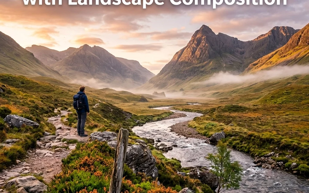
You’ve seen the shots. You know the ones: the sweeping vistas that make you feel like you could step right into the frame, smell the mountain air, and feel the cold splash of a waterfall. Then you look at your own photos from last weekend’s hike and… they’re fine. Just fine. They’re flat, a bit boring, and they don't capture the "wow" factor you felt when you were standing there.
The truth is, landscape photography isn't just about being in a beautiful place. It’s about how you organize that beauty within four corners. Most of the time, the difference between a "meh" photo and a "whoa" photo comes down to composition.
Since this is the third post in our series on leveling up your outdoor photography, let’s get into the nitty-gritty. We’re going to look at the seven most common mistakes people make with landscape composition and, more importantly, how to fix them so you can start taking photos like a pro.
1. The "Empty Middle" (Forgetting the Foreground)
This is easily the #1 mistake I see. You find a massive mountain range, you pull out your wide-angle lens, and you click. When you get home, the mountains look tiny, and there’s a giant, empty patch of grass or dirt taking up the bottom half of the frame.
When you use a wide-angle lens, it pushes everything away from the camera. If you don't have something right in front of you to "anchor" the shot, the viewer's eye has nowhere to land. It feels like looking into a void.
The Fix: Find a "hero" for your foreground. It could be a jagged rock, a patch of wildflowers, or even a leading line in the sand. Get low and get close to it. This creates layers: a foreground, a middle ground, and a background: which gives your photo a sense of three-dimensional depth.
For a deep dive into how to handle these elements, check out The Ultimate Guide to Landscape Photography Tips.
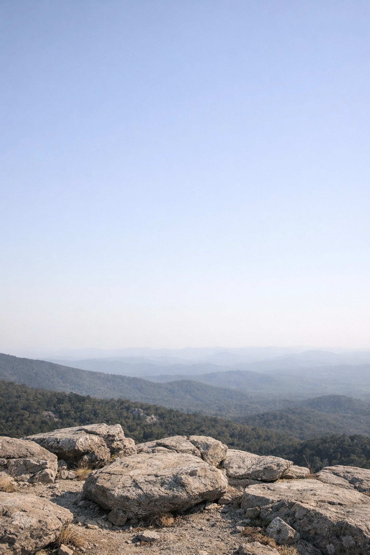
2. Letting a Boring Sky Dominate
We’ve all been there. You’re waiting for an epic sunset, but the clouds don’t show up. You’re left with a flat, hazy, or plain blue sky. A common mistake is still following the "rule of thirds" and giving that boring sky the top third (or more) of the image.
If the sky isn't doing anything interesting, why are you giving it so much real estate? A large, empty sky kills the mood and drains the energy from your composition.
The Fix: If the sky is boring, move your horizon line up. Give the interesting landscape 80% of the frame and leave just a sliver of sky to provide context. Conversely, if the sky is exploding with color and crazy cloud formations, drop the horizon line and let the sky be the star.
If you absolutely need to save a shot where the sky was a total letdown, tools like Luminar have incredible AI sky replacement features that can help, but always try to compose for the conditions you actually have in front of you.
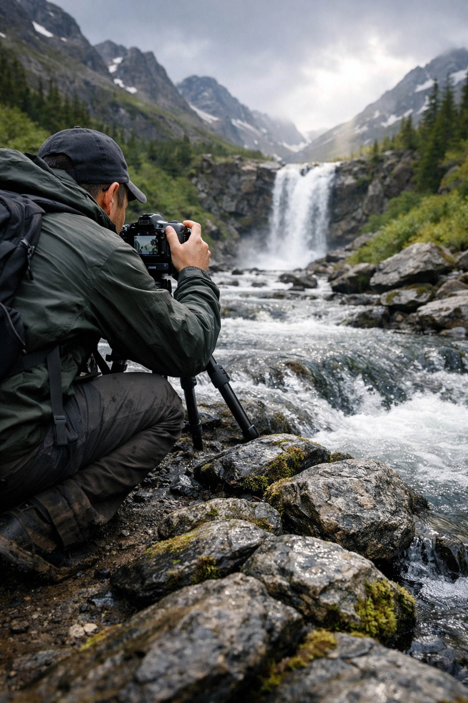
3. The "Tripod at Eye Level" Syndrome
Most people walk up to a scene, extend their tripod to its full height, and start shooting. This is "eye-level" photography, and it’s usually the least interesting perspective because it’s how everyone sees the world every single day.
When you shoot from five or six feet up, you lose the intimacy of the textures on the ground and you often create an awkward "tilt down" angle that distorts the horizon.
The Fix: Change your altitude. Get that tripod down to six inches off the ground. Suddenly, those small rocks look like massive boulders, and the leading lines in the mud become powerful visual paths. Or, if you’re in a forest, try getting higher up on a ridge to look through the canopy.
Changing your camera height is the fastest way to make a common location look like one of those hidden gem locations for travel photography.
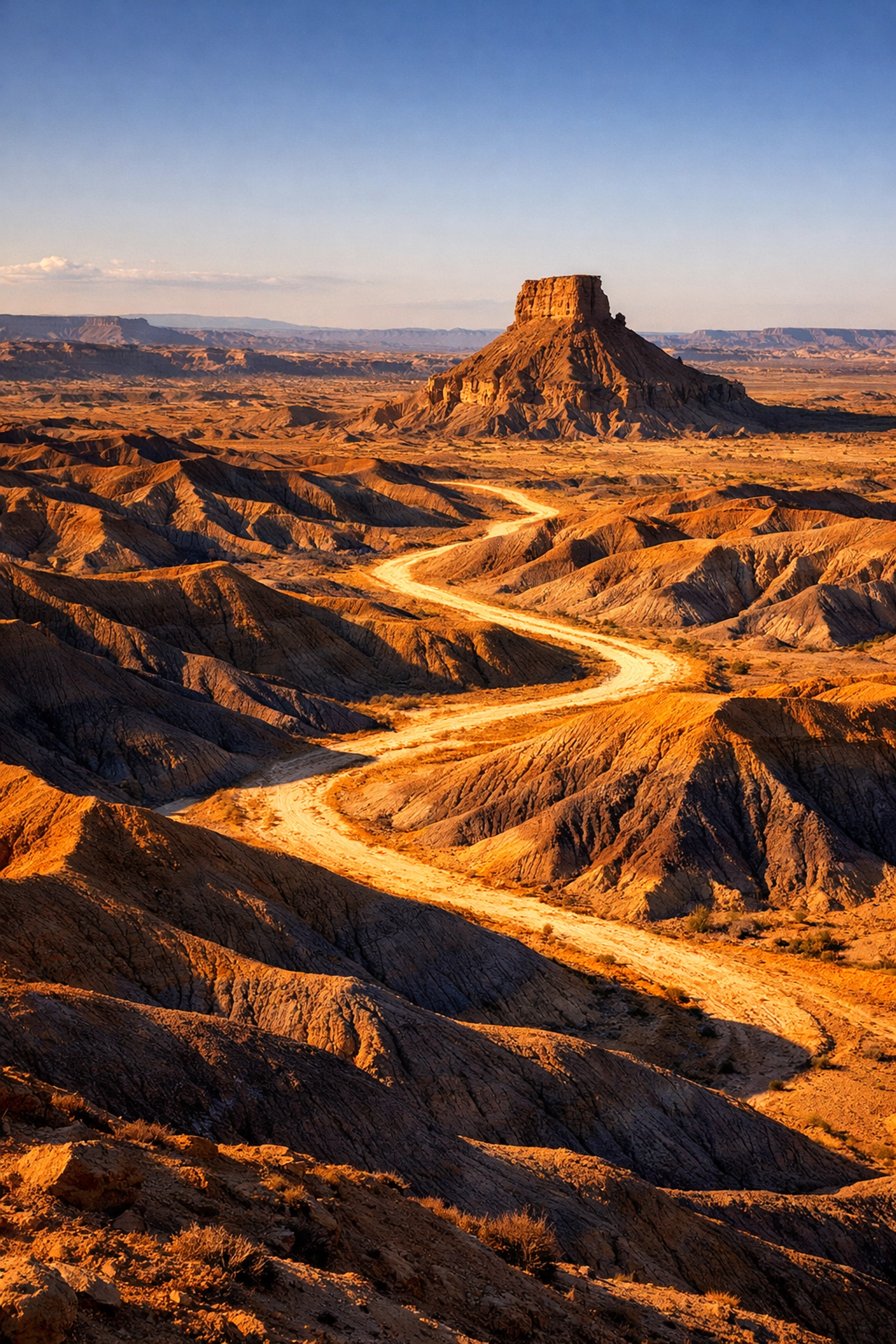
4. Creating "Visual Walls"
Have you ever looked at a photo and felt like you were being blocked from entering the scene? This happens when you place a large, dark, or cluttered element directly in the lower foreground that spans the entire width of the frame. It acts like a wall, stopping the viewer's eye from moving into the rest of the landscape.
Think of a dense bush or a large, flat rock that cuts off the bottom of the photo. It creates a "barrier" rather than a "gateway."
The Fix: Use your foreground elements as "pointers" or "frames" instead of walls. Instead of a bush that blocks the view, find a gap between two bushes that creates a natural window. If you’re stuck, check out some professional galleries at www.edinfineart.com to see how pros use elements to lead the eye rather than block it. You want to invite the viewer in, not keep them out.
5. Ignoring the Power of Light and Shadow
Composition isn't just about where you put the mountains and trees; it's about where you put the light. Beginners often focus on the objects, while pros focus on the light hitting the objects.
A common mistake is shooting in "flat" light (like mid-day sun) where everything is equally bright. This makes your composition feel cluttered because there’s no hierarchy. The human eye is naturally drawn to the brightest part of an image. If you have bright spots scattered all over the place, the viewer's eye will bounce around like a pinball.
The Fix: Use shadows to simplify your composition. Shadows can hide distracting details, leaving only the important parts of the scene visible. Look for "rim lighting" or "side lighting" that defines the shape of the land.
If you’re struggling with lighting in the field, you can refine these patterns in post-processing. I often use Luminar to dodge and burn specific areas, emphasizing the natural flow of light that I might have missed in the heat of the moment. You can also find great lighting tutorials on PhotoGuides.org.
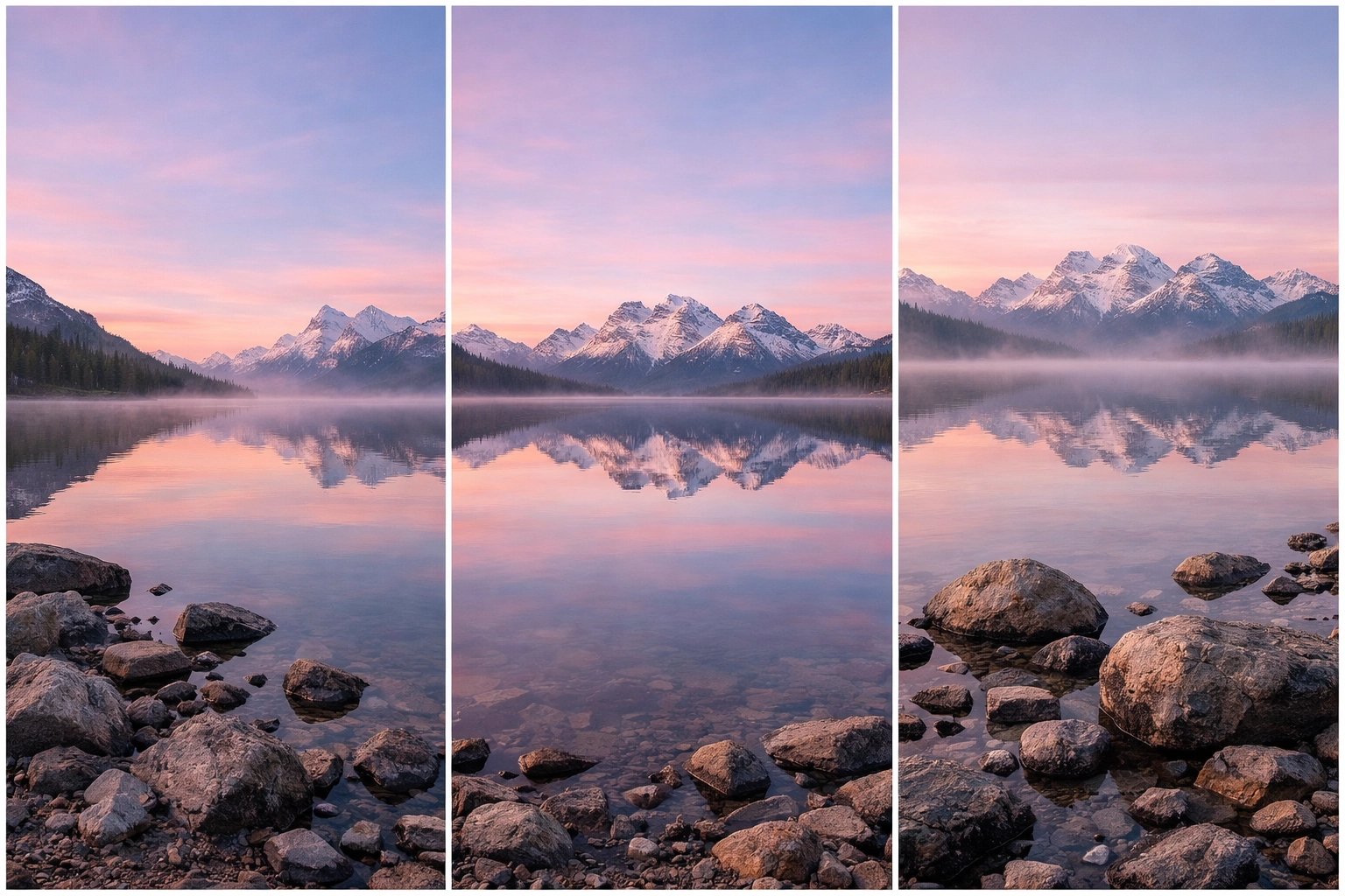
6. No "Breathing Room" for Your Elements
Visual tension is a real thing. When the peak of a mountain is touching the very top edge of your frame, or a tree branch is just barely clipped on the side, it creates a "tangent." This makes the viewer feel claustrophobic and uneasy, even if they can't quite put their finger on why.
Cramming too many things into the frame without enough space between them makes the photo feel messy and disorganized.
The Fix: Give your subjects room to breathe. If you have a lone tree, don't put it right against the edge of the frame. Give it some space. If you’re shooting a mountain, make sure there’s a comfortable gap between the peak and the top of the photo.
Think of it like furniture in a room. If you push everything into one corner, the room feels small. If you space things out, it feels intentional and grand. This is especially important when you are trying to discover ethereal landscapes for captivating shots; the "ethereal" feeling usually comes from a sense of space and simplicity.
7. Following the "Rules" Too Literally
The Rule of Thirds is great. It’s a solid foundation. But if every single one of your photos has the horizon on the bottom third and the subject on the right-side vertical line, your portfolio is going to get real boring, real fast.
Some of the most powerful landscape photos break every rule in the book. They might be perfectly symmetrical, or they might have a massive subject dead-center to create a sense of power and scale.
The Fix: Use the rules as a starting point, not a cage. Once you’ve lined up a "safe" shot using the rule of thirds, challenge yourself to break it. What happens if you center the horizon? What if you put the subject right at the bottom edge?
Intentionality is the key. Breaking a rule on purpose looks like art; breaking a rule because you didn't know it existed looks like a mistake. For more inspiration on breaking traditional photography norms, take a look at the work on blog.edinchavez.com.
Putting It All Together
Landscape photography is a marathon, not a sprint. You aren't going to fix all these mistakes in one afternoon. The best way to improve is to pick one of these "mistakes" every time you go out and focus entirely on avoiding it.
Maybe next Saturday you spend the whole day focusing just on Mistake #3: Camera Height. Don't take a single photo from eye level. Get on your knees, lay in the dirt, and see how the world changes.
If you’re looking for more technical gear advice or want to see how the pros handle complex shoots, head over to www.proshoot.io. They have some killer resources for taking your technical game to the next level.
Quick Checklist for Your Next Shoot:
- Foreground: Is there something interesting within 3 feet of my lens?
- Sky: Does this sky deserve the space I’m giving it?
- Height: Have I tried this shot from 1 foot off the ground?
- Edges: Are any mountains or trees "touching" the edge of the frame?
- Light: Where is the brightest spot in the frame? Is that where I want the viewer to look?
Don't forget that textures play a huge role in how we perceive these compositions. Using rare textures for tangible aesthetic photography can turn a flat landscape into something people feel like they can reach out and touch.
Landscape photography is about more than just "capturing" a view. It’s about creating a view. You are the director of the scene. You decide what stays in, what stays out, and where the eye goes. By avoiding these seven common pitfalls, you’re well on your way to moving past the "vacation snapshots" and into the realm of true landscape art.
If you’re looking for more inspiration or want to see some of these principles in action at lesser-known vistas for enigmatic photos, keep exploring our site. We’re constantly updating our maps and guides to help you find the best spots.
Now, grab your gear, get out there, and remember: if your knees aren't dirty by the end of the day, you probably didn't try enough angles! Happy shooting.


