
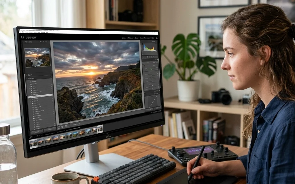
Let’s be real for a second: we’ve all been there. You come home from a killer shoot, you’re hyped, you fire up your computer, and you start sliding those bars in Lightroom like you’re playing a high-stakes game of Tetris. You finish, post it to Instagram, and think you’ve just created a masterpiece.
Then, you look at it the next morning.
Yikes. The sky looks like radioactive Gatorade, the model’s skin looks like a plastic mannequin, and there’s enough artificial sharpening to cut glass.
Editing is where your photos come to life, but it’s also where they can go to die a quick, digital death. Over-editing is the most common trap for photographers in 2026, especially with all the high-powered AI tools at our fingertips. At Shut Your Aperture, we believe in keeping things simple and impactful.
Here are the seven most common photo editing mistakes people make and, more importantly, how you can fix them right now.
1. The "Crunchy" Look: Over-Sharpening
We all want our photos to look crisp. When you’ve just invested in a top-tier mirrorless camera (check out why everyone is talking about mirrorless cameras in 2026), you want to see every single detail. But there’s a fine line between "sharp" and "crunchy."
Over-sharpening happens when you crank that slider too far. It creates weird white "halos" around the edges of objects and makes your digital noise look like sand. It doesn't make a blurry photo sharp; it just makes a blurry photo look bad.
How to Fix It:
Stop editing from a distance. Always zoom in to 100% (the 1:1 view) when you’re sharpening. This allows you to see exactly when those nasty halos start to appear. If you’re using Luminar, try using their "Structure AI" sparingly rather than a blanket sharpen.
A pro tip from PhotoGuides.org: use masking. Hold down the Option/Alt key while moving the masking slider in Lightroom; the white areas show where the sharpening is being applied. Keep it on the edges, not the flat surfaces like the sky or skin.
2. Nuclear Landscapes: Over-Saturation
We get it. You were at a majestic sunset spot and the colors were insane. You want the world to see what you saw. But our eyes are actually pretty sensitive to "fake" colors. When the grass is neon green and the ocean looks like blue ink, the viewer’s brain immediately flags it as "fake."
Over-saturation is the quickest way to make a professional shot look like a cheap postcard.
How to Fix It:
Step away from the Saturation slider and reach for the Vibrance slider instead. Saturation boosts every color equally, which usually results in "clipping" (where you lose detail in the brightest colors). Vibrance is smarter: it boosts the duller colors while leaving the already-saturated ones alone.
If you’re working on water photography, try to keep the blues natural. A good rule of thumb? Once you think the photo looks perfect, pull the saturation back by 10%. Your eyes usually adjust to the bright colors as you edit, tricking you into thinking you need more than you actually do.
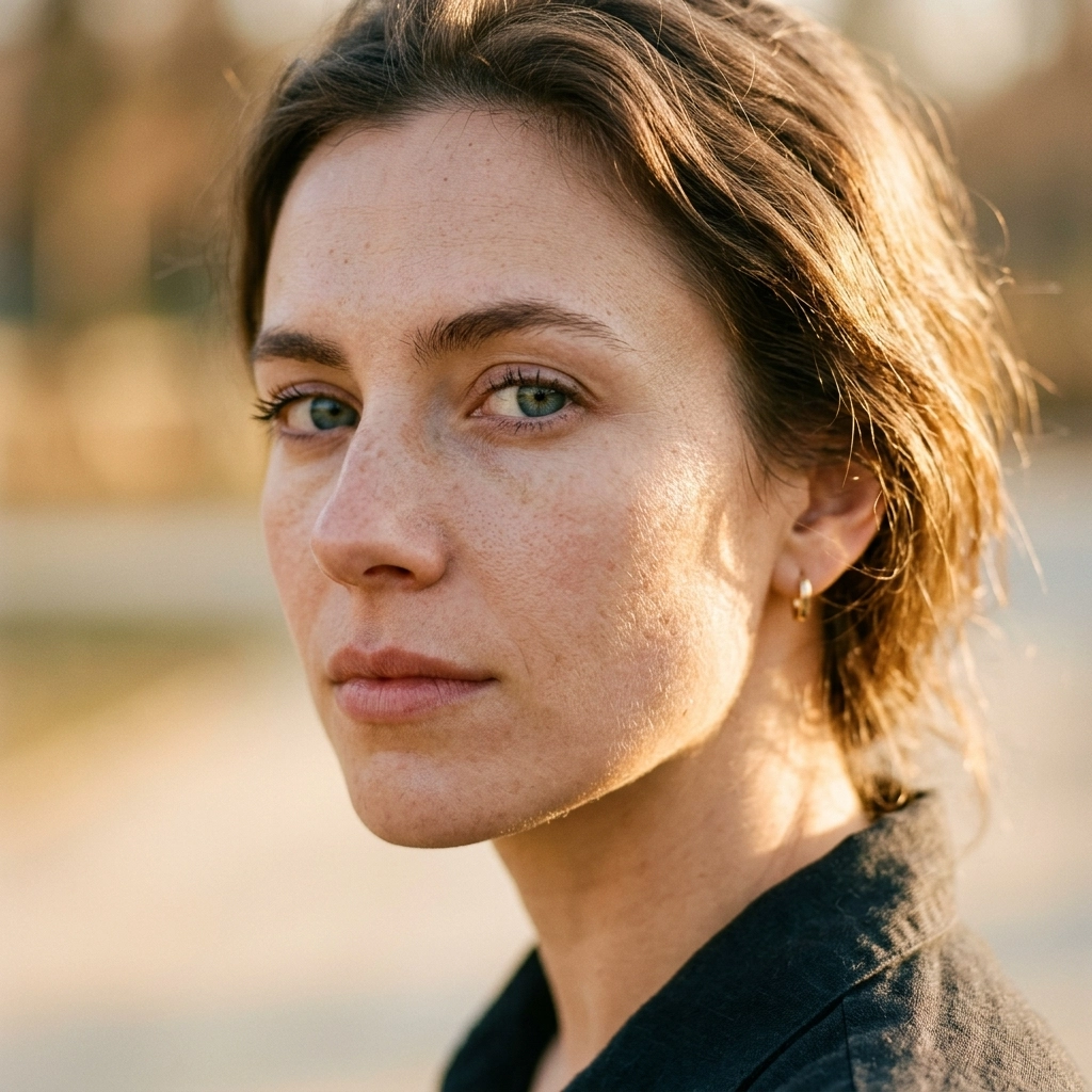
3. The "Uncanny Valley": Over-Smoothing Skin
Retouching portraits is an art form. But somewhere along the way, people started thinking that "beautiful skin" meant "zero texture." If your subject looks like they were 3D-printed from liquid silicon, you’ve gone too far.
When you remove every pore, wrinkle, and fine line, you remove the humanity from the photo. This is especially tempting when you’re trying to unlock secrets to enchanting urban photography and want your street portraits to look "polished."
How to Fix It:
The goal isn’t to erase skin; it’s to clear up temporary distractions (like a blemish). If you’re using AI tools in Luminar, keep the "Skin Defects Removal" high but the "Skin Smoothing" low.
If you want to go deeper, learn about "Frequency Separation." It sounds fancy, but it just means editing the color and the texture on two different layers. This way, you can fix a red patch of skin without losing the natural pores. Check out some advanced techniques over at ProShoot.io to master this.
4. Clarity and Contrast Overload
Clarity is a dangerous drug. It adds mid-tone contrast, making everything look "gritty" and "detailed." In small doses, it’s great for adding a bit of pop to a landscape or an ethereal landscape shot. In large doses, it makes your photo look like a dirty HDR mess from 2012.
Too much contrast does the same thing: it kills your highlights and buries your shadows in pure black.
How to Fix It:
Use the "Dehaze" tool or "Texture" slider instead of Clarity for a more natural look. If you need more "punch," use the Tone Curve. Adding a slight "S-Curve" (lifting the highlights slightly and dropping the shadows slightly) gives you way more control than the basic Contrast slider ever will.
For more insight on how to balance these elements, Edin Chavez often posts deep dives into his specific "clean" editing style on blog.edinchavez.com.
5. The "Black Hole" Vignette
A vignette is supposed to subtly lead the viewer's eye toward the center of the frame. It shouldn’t look like the viewer is looking through a cardboard tube. If the corners of your photo are pitch black, you’ve made a classic mistake.
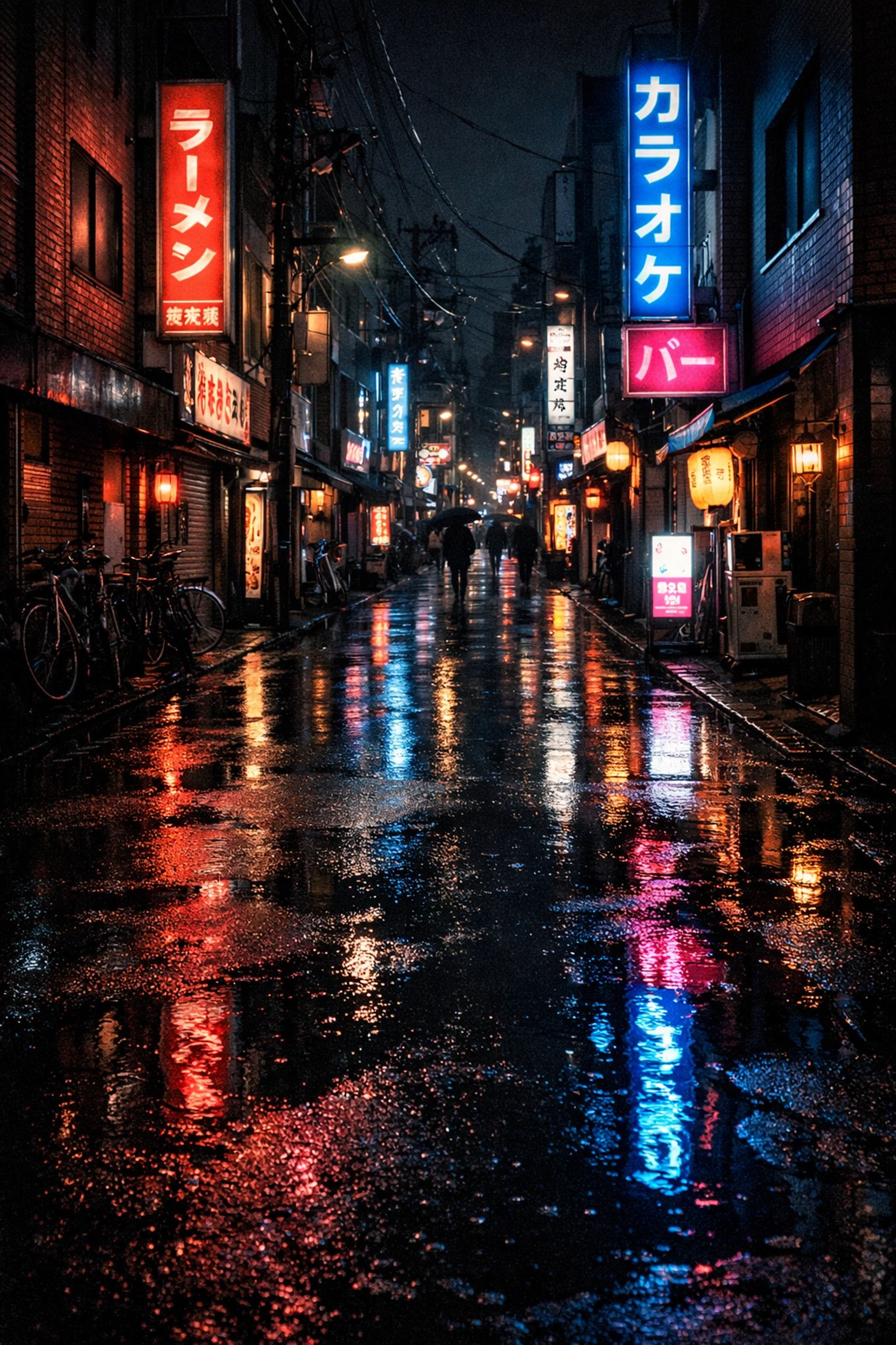
We see this a lot in travel photography. People want to focus on a central landmark, so they darken the edges until the rest of the world disappears.
How to Fix It:
The best vignette is the one you don't notice. When applying a vignette, increase the "Feather" to 100. This makes the transition from dark to light super smooth. Also, try moving the "Midpoint" slider to see how far into the image the darkness reaches. If you can clearly see where the vignette starts, it’s too strong.
6. Fear of the Dark: Cranking the Shadows
Modern cameras have incredible dynamic range. You can take a photo that looks almost black and "recover" it to look like daylight. Just because you can doesn't mean you should.
When you pull the shadows up to +100, you introduce two things: digital noise (grain) and a very flat, muddy look. Shadows are important! They provide depth, mood, and a sense of three-dimensionally. Without shadows, your photo has no "weight."
How to Fix It:
Embrace the blacks. If you’re shooting secluded paradises, let the dark areas be dark. It creates a sense of mystery. Instead of lifting all the shadows, try lifting the "Blacks" slider slightly to give it a "faded" look, or use a local adjustment brush to only brighten the parts of the shadows that actually matter.
If you’re struggling with high-contrast scenes, check out our Photo Editing Tutorials 101 for a step-by-step on balancing light.
7. Noise Reduction Mush
High ISO is a reality of photography, especially if you’re shooting at night or in low-light urban environments. Noise (that grainy texture) is often seen as the enemy. But the "fix": heavy noise reduction: is often worse than the problem.
Over-applying noise reduction turns your photo into a watercolor painting. It smudges away all the fine details, leaving you with a "mushy" image that lacks any crispness.
How to Fix It:
A little bit of grain is okay. In fact, many photographers actually add grain back into their photos to give them a filmic feel. If you must use noise reduction, apply it selectively. You don't need noise reduction on a sharp edge; you need it in the flat, out-of-focus areas like the sky.
Newer AI-based noise reduction tools (like those in Luminar or Lightroom’s Denoise AI) are significantly better than the old sliders, but even then, don’t set them to 100%. Aim for a balance where you still see some texture.
The "Morning After" Rule
The biggest mistake isn't a slider: it's a lack of perspective. When you edit for hours, your eyes get tired. Your brain starts to accept weird colors and harsh contrast as "normal."
The ultimate fix for every editing mistake? The "Morning After" Rule.
Never export and publish a photo immediately after a long editing session. Walk away. Go get a coffee. Sleep on it. When you open that photo again with fresh eyes the next morning, the mistakes will jump out at you instantly. You’ll see that the coastal escape you edited looks a bit too purple, or the sharpening on your nature imagery is making the leaves look like needles.
Editing should be the "seasoning" on your photo, not the main course. You want to enhance what’s already there, not hide it under layers of digital makeup.
If you want to see how these principles look in practice, take a look at the fine art prints at EdinFineArt.com. You’ll notice that while the images are striking, they maintain a sense of reality and texture that only comes from disciplined editing.
Now, go back to your catalog, find an old photo you thought was "finished," and see if you’ve fallen into any of these traps. Happy editing!


