Lightroom Presets: Complete Guide for Working Photographers (2026)
Last updated June 2, 2026 by Edin Chavez — 15+ years shooting weddings, corporate events, and landscapes. We use these presets on every paid shoot.
 Save
SaveWhat a Lightroom preset actually does
A Lightroom preset is a saved set of slider positions — exposure, contrast, shadows, color grading, sharpening, the whole panel — that you apply to a photo in one click. Instead of moving 40 sliders for every image, you apply a preset, then make small adjustments. That’s it. There’s no AI, no magic, no secret formula — just experienced photographers’ settings, bottled.
The reason presets are worth using comes down to time. A wedding photographer delivers 500-800 edited photos per wedding. A landscape shooter might process 50-100 keepers from a single trip. If each photo takes you four minutes to edit from scratch, you’re at 30+ hours per wedding. With a tuned preset as your starting point and 20-30 seconds of per-image adjustment, you’re done in eight hours.
The reason most photographers give up on presets is they buy generic packs and find the look doesn’t match their style or their light. The fix isn’t to keep buying packs — it’s to pick a small set of well-designed presets and learn to adjust them.
The shortlist — what we recommend
| Pack | Style | Best for | Price |
|---|---|---|---|
| Ultimate Collection | 100 presets across all styles | All-purpose, full kit | $49 |
| Wedding pack | Warm, film, classic neutral | Weddings, engagements, families | $29 |
| Landscape pack | Punchy color, dramatic sky | National parks, travel, golden hour | $29 |
| Portrait pack | Skin tone first, soft contrast | Headshots, fashion, lifestyle | $29 |
| Street pack | High contrast, film grain | Urban, documentary, BW | $29 |
| Free starter pack | 10 essentials | Try before you commit | Free |
If you only have time for one decision: start with the free starter pack. If you like the look, the Ultimate Collection at $49 is the better long-term value than buying individual packs.
How presets actually fit a working photographer’s workflow
Here’s how a paid wedding day flows through Lightroom in our studio:
- Import. All 2,500 RAW files into a new catalog. Camera Calibration profile set to Adobe Color or Camera Standard.
- Cull. Mark keepers with X-pick flags. Usually 600-800 out of 2,500 make it.
- Apply base preset. Select all keepers, apply the wedding pack starting preset. Every photo now has 80% of the editing done.
- Adjust by scene. Ceremony shots (one light condition), reception shots (another), portraits (a third). For each batch, micro-adjust exposure and white balance to nail the look.
- One-by-one cleanup. Crop, straighten, spot-heal, minor tweaks. 30-60 seconds per image.
- Export. JPEGs at 2048px long edge for client preview gallery, full-res for prints.
The preset saves you somewhere between 50 and 70 percent of the per-image editing time. The remaining time goes to the per-photo creative decisions — which is where you should be spending your attention anyway.
What separates great presets from junk
 Save
SaveMost preset packs on Etsy and Creative Market are bad. They were built on one photo, in one lighting condition, by someone who shot one specific camera body. Apply them to your photos and skin looks orange, skies clip, shadows turn green.
Real preset packs are built across hundreds of source images, on multiple camera bodies, in different lighting. The slider positions are conservative enough to work as a starting point — they pull the image 80% of the way to a look, then expect you to push it the last 20%.
Five things to check before buying any preset pack:
- Sample photos shown both before and after. If you only see “after” shots, the seller is hiding what the preset actually does.
- Compatible formats. XMP for Lightroom Classic and Lightroom CC, DNG for Lightroom Mobile. Avoid old LRTEMPLATE-only packs.
- Tested across camera brands. Sony, Canon, Nikon, and Fuji render colors differently. Good packs accommodate.
- Pack size that makes sense. 20-30 well-tuned presets covers more ground than 200 mediocre ones.
- Documentation included. The pack should ship with a PDF or video showing how each preset was built and which scenarios it suits.
How to install Lightroom presets (5 minutes)
Lightroom Classic (desktop)
- Open Lightroom Classic.
- Switch to the Develop module (D).
- In the Presets panel on the left, click the + button and choose Import Presets.
- Select the XMP files from the pack and click Import.
- The new presets appear in the Presets panel, organized by folder.
Lightroom CC (cloud/desktop)
- Open Lightroom CC and select any photo.
- Click the Presets icon in the right-side toolbar.
- Click the three-dot menu in the Presets panel and choose Import Presets.
- Select the XMP or zip file from the pack.
- Presets sync to all your devices automatically.
Lightroom Mobile (iPhone, iPad, Android)
- Open the DNG file the pack provides in Lightroom Mobile (tap to import).
- Tap the three-dot menu and choose Create Preset.
- Name the preset and tap the checkmark.
- Repeat for each DNG in the pack. They’re now available on every photo.
If you bought presets and they came as LRTEMPLATE files only (older format), Lightroom Classic 7.3+ can still import them via the same Import Presets dialog. They’ll auto-convert to XMP on import.
Lightroom presets by photography type
Wedding and engagement presets
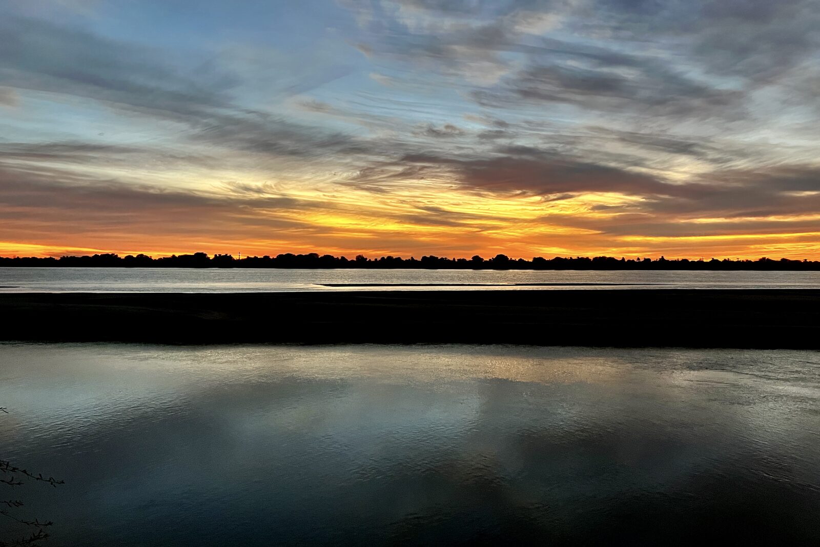
The wedding look has converged on a few specific aesthetics: warm film (creamy whites, soft contrast, gentle shadows), light and airy (lifted shadows, soft highlights, pastel skin tones), and moody dark (crushed shadows, desaturated greens, rich blacks). Most wedding pros own all three and switch based on the venue and the couple’s vibe.
Our Wedding pack includes 25 presets across all three looks, tuned for Sony, Canon, and Nikon raw files.
Portrait and headshot presets
Portrait presets prioritize skin tone above everything. A great portrait preset adjusts saturation in the orange channel specifically, sharpens with masking to avoid texturing the skin, and adds a touch of clarity to the eyes without touching the rest of the face. Bad portrait presets blow out the skin and call it “creamy.”
Our Portrait pack includes 20 presets covering business headshots, fashion editorial, lifestyle, and family.
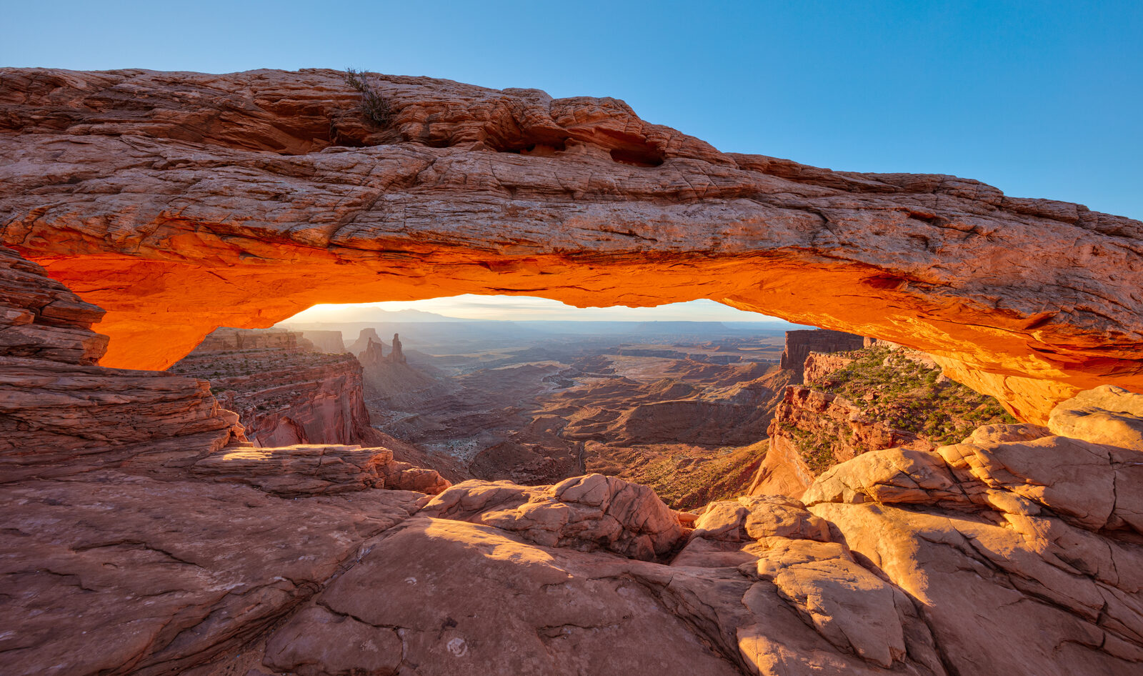
Landscape and travel presets
Landscape presets earn their keep on the orange and blue channels — pulling more from sunsets, adding teal to skies, separating greens from yellows in foliage. The strong landscape presets are the ones built around the standard Adobe Color profile rather than Camera Standard, because they’re rendered consistently across raw files from different brands.
Our Landscape pack is built around 30 national park source images shot across Sony A7R, Canon R5, and Nikon Z8 bodies.
Street and documentary presets
Street photography presets lean into contrast, texture, and often film emulation. Tri-X, HP5, Portra 400 — these are the looks that built the genre. Modern presets simulate the grain structure and tonal response of those films while keeping enough digital flexibility for color work.
Our Street pack includes 15 black and white film emulations plus 10 high-contrast color presets.
Real estate and architecture presets
Real estate work needs presets that handle mixed lighting — incandescent in the kitchen, daylight through the window, blue cast from the TV in the living room. The strong real estate presets neutralize white balance per zone and brighten shadows without crushing windows.
Free presets — when they’re worth trying
Free presets are a fine way to test whether you like a creator’s style before committing. Avoid any free pack that requires entering a credit card or signing up for a “free trial.” Reputable free packs are no-friction downloads from a photographer’s site. Our free starter pack includes 10 of our most-used presets, no card required.
How to build your own Lightroom presets
Once you’ve used a few packs, building your own is the natural next step. The process:
- Pick a representative photo. Not your most beautiful — your most typical. The look you’re saving needs to work on average files, not just hero shots.
- Edit the photo to your final look. Spend time. The preset will only be as good as this one edit.
- Save as preset. In Lightroom Classic, hit the + in the Presets panel and choose Create Preset. Uncheck “White Balance” and “Exposure” — those should never be in a preset because they vary by photo.
- Test on 20 photos in different lighting. If 17 of them look good, the preset is solid. If only 5 look good, the preset is over-tuned to one scenario.
- Refine and re-save. Adjust the sliders that broke on the failed test photos and save the new version.
After 3-5 rounds of this, you’ll have a preset that works for 80%+ of your work and a deep understanding of why each slider does what it does. That second outcome is more valuable than the preset itself.
Common preset mistakes
- Bundling exposure and white balance into the preset. Both vary by photo and shouldn’t be touched by a preset. Use the “Don’t include” option when saving.
- Trying to use one preset for an entire shoot. Different scenes need different presets. A ceremony preset is not a reception preset.
- Buying too many packs. Five well-tuned presets beat 200 mediocre ones. Pick one pack, master it, then expand.
- Skipping the manual adjustment step. A preset gets you 80% of the way. The last 20% — exposure, white balance, crop — has to be done per image. Skipping this is why photos look “preset-y.”
- Not making your own. The most valuable presets are the ones you build from your own shooting. Spend a weekend building five and you’ll never need to buy a pack again.
Lightroom presets and the exposure triangle
A preset is a post-processing tool, but it can’t fix in-camera mistakes. A photo shot at the wrong aperture, wrong shutter speed, or wrong ISO won’t be saved by a preset.
The fastest workflow comes from getting the in-camera exposure right (aperture priority + auto-ISO for events, manual + bracketed for landscape) and then using presets to standardize the post-processing look. Photographers who try to fix bad exposures in Lightroom spend 10x longer per image than photographers who nail it in camera.
 Save
SaveFrequently asked questions
What are Lightroom presets?
A Lightroom preset is a saved set of slider positions — exposure, contrast, color grading, sharpening — that you apply to a photo in one click. Instead of moving 40 sliders per image, you apply a preset as a starting point and then make small adjustments. Presets save working photographers 50-70 percent of editing time.
How do I install Lightroom presets?
In Lightroom Classic, open the Develop module, click the plus icon in the Presets panel, choose Import Presets, and select the XMP files. In Lightroom CC, open the Presets panel, click the three-dot menu, choose Import Presets, and select the file. In Lightroom Mobile, open the DNG file the pack provides, tap the three-dot menu, and choose Create Preset.
Are paid Lightroom presets worth it?
Yes, if the pack is from a working photographer and includes sample before-and-after photos. A $29-$49 preset pack from a reputable creator pays for itself the first wedding or shoot you edit with it. Avoid generic packs from Etsy or stock marketplaces — those are usually built on one photo and don’t transfer to other lighting conditions.
Can I use Lightroom presets on my phone?
Yes. Lightroom Mobile (free, with optional Adobe subscription) supports presets via DNG files included in most modern preset packs. Open the DNG in Lightroom Mobile, tap the three-dot menu, choose Create Preset, and the preset becomes available for any photo. Presets you create in Lightroom CC on desktop also sync to mobile automatically.
What’s the difference between XMP and DNG presets?
XMP files are pure preset files — slider positions only — used by Lightroom Classic and Lightroom CC on desktop. DNG files are tiny raw files with the preset baked in, used for installing presets on Lightroom Mobile. Good preset packs include both formats so the preset works across every Lightroom version you use.
Why do my photos look different from the preset samples?
Two reasons. First, your white balance, exposure, and camera body are different from the sample photo — every preset needs small per-image adjustments after applying. Second, the camera profile (Adobe Color, Adobe Standard, Camera Standard) affects how the preset renders. If your photos look completely different from samples, check that your camera profile in the Camera Calibration panel matches what the pack recommends.
Related guides
- Aperture in photography — get your exposures right before editing
- ISO in photography — manage noise at the source
- Shutter speed in photography — freeze or blur intentionally
- Best cameras to buy in 2026 — the gear behind every preset
Get started
The fastest way to find your preset style is to try a few and see what fits. Start with our free 10-preset starter pack — no credit card, instant download — and if the look fits, the Ultimate Collection at $49 covers every type of photography with 100 presets.
If you want structured training on the editing decisions behind these presets, Shut Your Aperture School walks through every Lightroom panel with hands-on exercises. 1,200+ students, 4.9/5 stars, 30-day money-back guarantee.