

Over time, photographers have recognized the profound impact that color can have on their images. By understanding the principles of color theory, you can elevate your photography, making it not only visually stimulating but also emotionally resonant. This post will guide you through various aspects of color theory, helping you to create striking compositions that draw the viewer in and convey the intended mood of your work. Discover how the right color combinations can breathe life into your photographs, engaging your audience in a truly captivating way.
The Psychological Impact of Color in Photography
Color does more than make your photographs visually appealing; it can evoke powerful emotions and alter perceptions. Different hues and shades can create feelings of joy, sadness, warmth, or tension. As a photographer, being aware of how color affects your audience allows you to design images that resonate on a deeper level, transforming ordinary scenes into extraordinary expressions of emotion. Understanding the psychological impact of color can help you tell a compelling story through your visuals.
Emotional Resonance: How Color Influences Mood
The colors you choose can significantly impact the mood of your photograph. For instance, warm colors like red and orange can evoke excitement and passion, while cooler hues like blue and green create calmness and tranquility. By strategically employing these colors, you can guide viewers’ emotions and enhance the narrative within your images. The atmosphere you create through color can leave a lasting impression, influencing how your audience connects with your work.
Cultural Significance: Colors and Their Symbolism
Colors carry deep cultural significance and symbolism, often varying across different societies. Understanding this can enhance the storytelling aspect of your photography, as colors might represent love, mourning, prosperity, or peace depending on the context. Integrating culturally significant palettes can create layers of meaning, making your images resonate not only on an emotional level but also in relation to specific cultural narratives.
For instance, red symbolizes good fortune in Chinese culture, while in many Western societies, it can represent love and passion. Similarly, white is often associated with purity and peace in the West, but in some Eastern cultures, it signifies mourning. By acknowledging these cultural connotations, you can make informed decisions that elevate your composition. Using culturally significant colors not only enriches the narrative of your photographs but also shows sensitivity to the diverse backgrounds of your viewers, enhancing their emotional connection to your work.
Mastering the Color Wheel: A Photographer’s Essential Tool
The color wheel serves as your compass in the vibrant world of photography, guiding you to combine hues, create stunning compositions, and manipulate viewer perceptions. By understanding the relationships between colors, you can highlight subjects, set moods, and steer emotions in your images. Familiarize yourself with primary, secondary, and tertiary colors, as well as their positions on the wheel to unlock endless creative possibilities in your work.
Complementary Colors: Creating Contrast and Interest
Complementary colors, those opposite each other on the color wheel, offer striking contrasts that command attention. By strategically positioning these colors in your frame, you can evoke heightened emotional responses and draw your audience’s eyes directly to the focal point of your photograph. For instance, pairing vibrant oranges with deep blues can not only energize your frame but also create an exceptional visual impact that lingers in memory.
Analogous Colors: Crafting Fluid Harmony
Analogous colors, which sit next to each other on the color wheel, bring a sense of unity and coherence to your photography. Using these colors allows you to blend hues seamlessly, fostering a calming and enriched visual experience. For example, a sunset scene with warm reds, oranges, and yellows can evoke feelings of nostalgia and warmth, while a composition of cool greens, blues, and purples may elicit tranquility and serenity. This harmonious use of similar colors creates a layered depth to your images, enhancing their aesthetic allure.
To effectively utilize analogous colors, think about the mood you want to convey in your photography. Each color combo can evoke a different feeling: the gentle transition from warm yellows through soft oranges can stimulate happiness, while blending shades of blue can inspire calmness. When composing your shots, spotlight one dominant color, allowing the others to softly support it, making your images not just visually captivating but emotionally resonant as well. Experimenting with various combinations will deepen your understanding of how these colors interact and the feelings they can invoke in your audience.
Techniques for Applying Color Theory in Your Shots
Utilizing color theory in your photography transforms average images into captivating visual narratives. By employing specific techniques, you can create stunning visuals that resonate emotionally with your audience. Experiment with the bold contrasts of complementary colors or create harmonious images with analogous schemes. Each technique provides a unique way to engage viewers, drawing attention to your subject matter while enhancing overall composition.
Color Blocking: Making Bold Statements
Color blocking is an effective method to make strong visual statements, using blocks of contrasting colors to create dynamic compositions. By isolating a primary color against a neutral backdrop, you emphasize your subject matter and create a more impactful image. Implement this technique in portrait photography by dressing your subject in bright, vibrant clothes and placing them in a stark environment, instantly capturing attention and adding depth.
Monochromatic Schemes: Emphasizing Texture and Form
Monochromatic schemes focus on a single hue, allowing you to explore various tints and shades. This technique eliminates distractions and draws attention to shapes and textures within your image. By varying the intensity and tone of one color, you create a visual journey that highlights intricate details, lending a sophisticated elegance to your photos.
When employing monochromatic color schemes, consider the impact of lighting and context on your chosen hue. For instance, a deep blue palette can evoke feelings of calmness and serenity, while a warm red can convey passion and energy. To truly showcase texture and form, experiment with different lighting techniques—side lighting intensifies shadows, while soft, diffused light flattens them. This not only enhances the three-dimensional feel of your subjects but also allows subtle variations in your chosen color to emerge beautifully, providing viewers with a rich, layered visual experience.
The Role of Lighting in Color Perception
Lighting significantly influences how colors appear in your photographs, affecting mood, depth, and clarity. The interplay between shadows and highlights can alter your subject’s colors, revealing or concealing details. Whether you’re shooting in natural light or controlled studio conditions, understanding the characteristics of light will help you manipulate color perception effectively. Different light sources can completely transform a scene, giving you the creative tools to enhance your storytelling through vivid color contrasts or harmonious palettes.
Natural vs. Artificial Light: How It Alters Colors
Natural light casts colors in a way that can suggest warmth or coolness, influenced by the time of day and atmospheric conditions. For instance, sunlight during midday can create rich, saturated colors, whereas overcast skies can produce softer, muted hues. In contrast, artificial lighting, such as fluorescents or tungsten, often has specific color temperatures that influence color balance. Being mindful of these differences enables you to produce photographs that match your intended artistic vision.
Timing and Temperature: The Golden Hour and Beyond
Photographers commonly seek out the ‘golden hour’—the time shortly after sunrise and before sunset—when the sunlight is softer and casts a warm golden hue. This natural lighting creates captivating contrasts and enhances colors, leading to dreamy imagery. Beyond the golden hour, transitions into twilight present a cool color palette, introducing blues and purples that can evoke calmness and serenity. The understanding of these lighting conditions allows you to fine-tune your color game, ensuring your images resonate with the intended viewer’s emotions.
| Golden Hour | Soft, warm tones dominate, enhancing faces and landscapes. |
| Midday Light | Harsh, direct light may create stark shadows but offers vibrant contrasts. |
| Twilight | Cool colors emerge, providing dynamic shades that enhance mood. |
During the golden hour, skin tones are more flattering as the light behaves more forgivingly, tending to minimize blemishes while enriching the vibrancy in the surroundings. The color temperature ranges from approximately 3000K to 5000K, providing a spectrum of rich ambers to gentle warm whites. Similarly, as you move into twilight and the blue hour, dramatic shifts in hues set the stage for different artistic expressions. Knowing when to shoot and understanding these subtleties can drastically elevate your photography, transforming a mundane scene into an enchanting visual story.
| Warm Light (3000K – 4000K) | Produces inviting, energetic images with enhanced warmth. |
| Neutral Light (4000K – 5000K) | Ideal for accurate color representation and versatility. |
| Cool Light (5000K – 7000K) | Introduces shades of blue, creating centered and moody atmospheres. |
Color Grading: Enhancing Your Photographic Vision
Color grading elevates your photographic work by refining the mood and tone of your images to align with your artistic vision. This process involves adjusting the colors and tones in your photos, adding depth and character that draw viewers in. You have the power to transform a simple scene into something extraordinary, evoking specific feelings through strategic color selection. By experimenting with different grading styles, you can create unique narratives and ambiance that distinguishes your work from others.
Post-Processing Techniques: Software that Helps
Accessible software options like Adobe Lightroom, Capture One, and DaVinci Resolve allow you to implement color grading seamlessly in your workflow. With various tools at your disposal, including sliders for hue, saturation, and luminance, you can fine-tune your color choices. These programs often feature color grading presets and advanced techniques like split toning that can be used to quickly achieve desired effects, enabling you to express your creative vision efficiently.
Creating a Cohesive Palette: Maintaining Visual Consistency
Establishing a cohesive color palette across your work contributes to a recognizable style and strengthens your photographic narrative. By selecting a specific range of colors to use consistently, you can create harmonious images that connect visually. Think about your subject matter and the emotions each color elicits to cultivate a visual voice that resonates across your portfolio, whether it’s the serene blues of a landscape series or the vibrant reds of urban street photography.
A well-defined color palette not only ensures consistency but also enhances viewer engagement. For example, if you photograph nature, using shades that reflect seasonal changes can create a compelling ongoing narrative. You can reference color harmony principles, such as complementary or analogous color schemes, to guide your selections. By aligning your images with a thoughtful palette, you strengthen the overall impact of your work, inviting viewer reflection and connection on a deeper level. Cohesion invites familiarity, making your photographic style instantly recognizable and engaging to your audience.
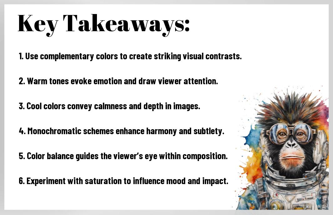
Summing up
Presently, by harnessing the art of color theory, you can elevate your photography to new heights. Understanding how colors interact—through concepts like complementary and analogous hues—will enable you to create visually striking compositions that resonate with viewers. Additionally, using color schemes effectively helps to evoke specific emotions and set the mood of your images. As you experiment with color palettes, always keep your subject and intention in mind, allowing your creative vision to guide your choices. Embrace the limitless potential of color to make your photographs truly captivating.


