
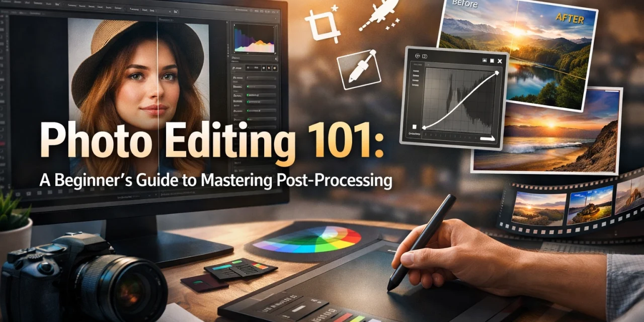
Let’s be real for a second: the "I don't edit my photos" flex is a bit of a myth. Even the pros you see on Instagram or hanging in high-end galleries spend a significant amount of time behind a screen. Taking the photo is only half the battle; post-processing is where you actually finish the story.
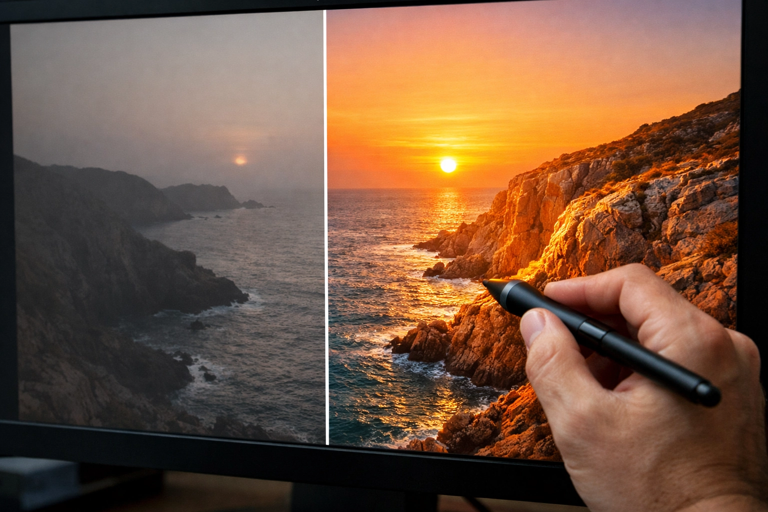
If you’ve ever looked at a photo you just took and thought, “This looked way better in person,” you’re not alone. The human eye is a lot more advanced than any sensor on the market. Post-processing isn’t about "faking" a shot; it’s about bringing the image back to what you actually saw: or how you felt: the moment you pressed the shutter.
In this guide, we’re going to break down the basics of photo editing. No confusing jargon, no technical gatekeeping. Just the essential steps to make your shots go from "meh" to "wow."
The First Rule: Start with a Good Base
Before we even touch a slider, we have to talk about the source material. You can’t turn a blurry, out-of-focus mess into a masterpiece. To get the best results in the digital darkroom, you need to know how to master your camera's manual mode in 5 minutes. The better the data you capture in-camera, the more magic you can perform during editing.
Why You Need to Shoot in RAW
If you’re still shooting in JPEG, we need to have a talk. A JPEG is a "finished" file. Your camera takes the data, applies its own contrast, saturation, and sharpening, and then throws away the "unnecessary" information to save space.
A RAW file, on the other hand, is exactly what it sounds like: raw data. It’s the digital negative. It looks a bit flat and dull out of the camera, but it holds a massive amount of information in the highlights and shadows. When you use tools like Adobe Lightroom or Luminar, you can pull detail out of a dark shadow in a RAW file that would be pure black in a JPEG.
Trust us, once you go RAW, you never go back. For more on setting yourself up for success, check out these mastering photography 10 essential tips.
Choosing Your Software
The "best" software is the one you’ll actually use. You don’t need to drop a fortune on a suite of tools right away. Here are the big players:
- Adobe Lightroom: The industry standard. It’s great for organizing thousands of photos and has a very logical workflow.
- Luminar: If you want powerful AI-driven features that do a lot of the heavy lifting for you, Luminar is a fantastic choice. It’s particularly popular for landscape photographers who want to swap skies or enhance foliage quickly.
- Capture One: Often preferred by studio and portrait photographers for its superior color grading tools.
- Mobile Apps: Snapseed and Lightroom Mobile are surprisingly powerful if you’re editing on the go.
Regardless of what you choose, the principles of editing remain the same.
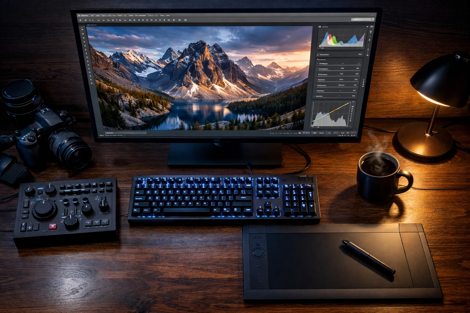
The Step-by-Step Workflow
When you first open an editing program, the number of sliders can be overwhelming. Don't just start clicking things at random. Follow this logical flow to keep your process clean and efficient.
1. The Global Adjustments: Setting the Stage
Start with the "Global" tab. These are changes that affect the entire image at once.
- Exposure: This is your overall brightness. If the whole photo is too dark (underexposed), slide it to the right. Too bright? Slide it to the left.
- Contrast: This increases the difference between the light and dark parts of the image. A little bit of contrast usually makes an image "pop."
- Highlights and Shadows: This is where the RAW magic happens. If the sky is too bright and white, pull the Highlights down to reveal the clouds. If the foreground is too dark, push the Shadows up to see the detail.
2. Getting the Colors Right: White Balance
Ever take a photo indoors and everything looks orange? Or a snowy landscape that looks blue? That’s a White Balance issue.
Most editors have a "Temperature" (Blue vs. Yellow) and "Tint" (Green vs. Magenta) slider. Your goal is to make white objects in the photo actually look white. You can also use the eyedropper tool and click on something neutral gray or white in your photo to let the software do it for you.
3. Adding Texture and Presence
This is where you give the photo some character.
- Clarity: This adds "punch" to the mid-tones. Use it sparingly, especially on skin, or people will start looking like they’re made of stone.
- Dehaze: Perfect for landscape shots. It cuts through atmospheric fog or smog to reveal distant details. It’s a game-changer for those lessons in landscape photography from Peter Lik style shots.
- Vibrance vs. Saturation: Saturation cranks up every color in the photo. Vibrance is smarter: it boosts the duller colors while leaving the already-saturated ones (and skin tones) alone. Usually, Vibrance is the better choice for a natural look.
4. Composition: Crop and Straighten
Even the best photographers don't always get the horizon perfectly level. Use the crop tool to straighten that horizon line. You can also use cropping to remove distracting elements at the edge of the frame or to better follow the "Rule of Thirds."
5. Cleaning Up: Spot Removal
Sensor dust is the enemy of every photographer. If you see a tiny dark spot in the sky of every photo, that’s dust on your sensor. Use the "Heal" or "Clone" tool to click those spots away. This tool is also great for removing a stray piece of trash on the ground or a temporary blemish on a subject's face.
Advanced-ish Techniques for Beginners
Once you’ve mastered the basics, you can start playing with more specific tools to elevate your work.
Using Presets
Presets are basically "recipes" of saved settings. You click one, and it applies a specific look to your photo instantly. They are great for maintaining a consistent "vibe" across a series of photos. You can find plenty of free ones online, or buy professional packs. Just remember: a preset is a starting point, not a finish line. You’ll almost always need to tweak the exposure and white balance after applying one.
Local Adjustments
Sometimes you only want to change a part of the photo. Maybe the sky is perfect, but the person standing in front of it is too dark.
- The Brush Tool: Lets you "paint" adjustments (like exposure or saturation) onto specific areas.
- The Linear Gradient: Great for darkening skies or brightening foregrounds in a smooth, natural-looking way.
If you’re interested in how professional real estate photographers use these techniques to make rooms look bright and airy, you might find the role of luminosity in real estate photography pretty eye-opening.
The "Less is More" Philosophy
The biggest mistake beginners make? Over-editing. It’s very easy to get "slider happy." You push the saturation, then the contrast, then the clarity, and suddenly your photo looks like a neon nightmare.
A good rule of thumb: When you think you’re finished, walk away from the computer for ten minutes. When you come back with fresh eyes, you’ll usually realize you went a little too far. Try pulling the sliders back by about 10-20% for a more realistic, professional look.
For more technical deep-dives into high-end processing, check out resources like PhotoGuides.org or see how it's done in a professional environment at ProShoot.io.
Specialized Editing: Landscapes vs. Real Estate
Depending on what you’re shooting, your editing goals will change.
If you are following the techniques behind Peter Lik’s landscape photography, you’re likely focusing on high contrast, deep colors, and dramatic light. You want to evoke a sense of awe.
However, if you're working in the property market, your goal is accuracy and space. You’ll focus more on vertical lines and making sure the light feels natural. For more on that, read about distinctive elements of real estate photography.
Organizing Your Library
Editing is only part of post-processing. Organization is the other. If you can't find your photos, you can't edit them.
- Keyword your images: Use tags like "Sunset," "New York," or "Portrait."
- Rate your shots: Use a star system or flags to separate the "keepers" from the "garbage."
- Back everything up: Hard drives fail. It's not a matter of if, but when. Use cloud storage or a secondary physical drive. Edin Chavez often talks about the importance of protecting your work on blog.edinchavez.com.
Finding Your Personal Style
The most important thing to remember is that there is no "right" way to edit. Photography is art. Some people love dark, moody, desaturated shots. Others love bright, airy, and colorful images.
Don't feel like you have to follow every rule to the letter. Use these steps as a foundation, but don't be afraid to experiment. Play with the HSL (Hue, Saturation, Luminance) sliders to change how specific colors react. Maybe you want your greens to look a bit more "foresty" or your blues to look more "teal."
The more you edit, the more you’ll start to see a pattern in your choices. That pattern is the beginning of your personal style. For inspiration on how world-class artists develop their "look," see how Peter Lik's iconic works have evolved over time.
Putting It Into Practice
Now it's your turn. Pick five photos you’ve taken recently. Import them into your editor of choice (give Luminar a try if you want to see what AI can do) and follow the workflow:
- Check Exposure
- Fix White Balance
- Adjust Highlights/Shadows
- Add a touch of Contrast and Vibrance
- Crop and Clean
You’ll be surprised at how much of a difference five minutes of work can make. Post-processing isn't a chore: it’s the final step in the creative process that allows you to truly own your images.
If you’re looking to showcase your final, edited masterpieces, check out the fine art standards at EdinFineArt.com or see how high-end production happens at EdinStudios.com.
Photography is a journey, and mastering the edit is one of the most rewarding parts of that trip. Keep shooting, keep sliding those bars, and most importantly, keep having fun with it. Your best photo is always the next one you take (and edit).


