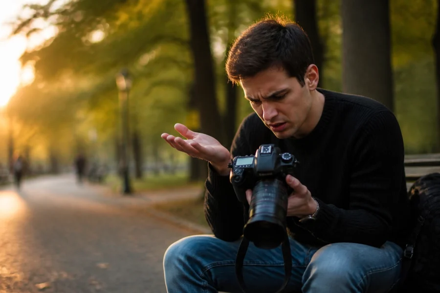
You’re standing on the edge of a cliff. The sun is dipping below the horizon, the clouds are turning a ridiculous shade of pink, and you’ve got your camera ready. You snap the shot, look at the back of your screen, and… it’s just okay. It doesn’t feel like the epic moment you’re actually witnessing.
What went wrong? You’ve got a great camera: maybe you even picked up a deal at the latest Nikon lens sale: and the light was perfect. The missing ingredient is almost always composition.
Composition is the difference between a "snapshot" and a "photograph." It’s how you tell the viewer’s eye where to look, how to feel, and how to move through the frame. If you want to stop taking "meh" photos and start creating art that people actually want to hang on their walls (or at least stop scrolling for), you need to master these principles.
In this guide, we’re going to break down everything you need to know about landscape composition. No fluff, no "Shakespearean" art-speak: just the good stuff.
1. The Mindset: Stop and Stare
Most people jump out of their cars, tripod in hand, and start clicking away like they’re being paid by the shutter actuation. This is the fastest way to get average photos.
Great composition starts before you even touch your Sony Alpha a6000 or your high-end Nikon D4s. You need to engage with the scene.
I call this the "Stop and Stare" method. Give yourself 10 to 30 minutes to just exist in the space. Look at how the light hits the ridges. See how the wind moves the grass. Look for patterns, textures, and lines. Ask yourself: What do I actually love about this view?
If it's the jagged peaks of the mountains, make them the star. If it’s the way the river curves, don't bury it in the corner. Once you know what the "hero" of your photo is, assembling the rest of the pieces becomes a lot easier.
2. The Rule of Thirds (and Why to Break It)
If you’ve spent five minutes on a photography blog, you’ve heard of the Rule of Thirds. But there’s a reason it’s the first thing everyone teaches: it works.
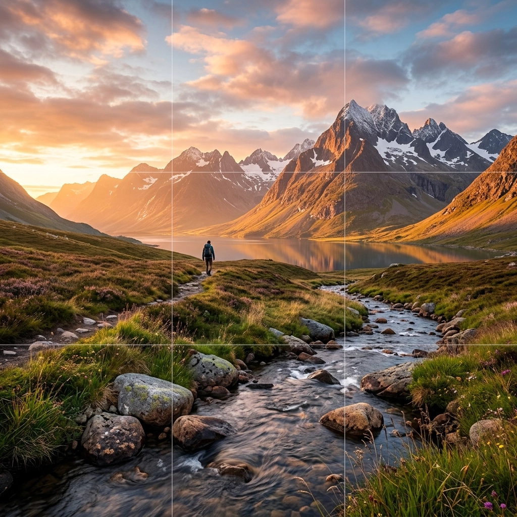
Imagine your frame is divided into nine equal rectangles by two vertical and two horizontal lines. The idea is to place your most important elements along these lines or at the points where they intersect.
For example, instead of putting the horizon right in the middle (which often splits the photo in a way that feels boring), try putting it on the bottom third to emphasize a dramatic sky, or the top third to emphasize an interesting foreground.
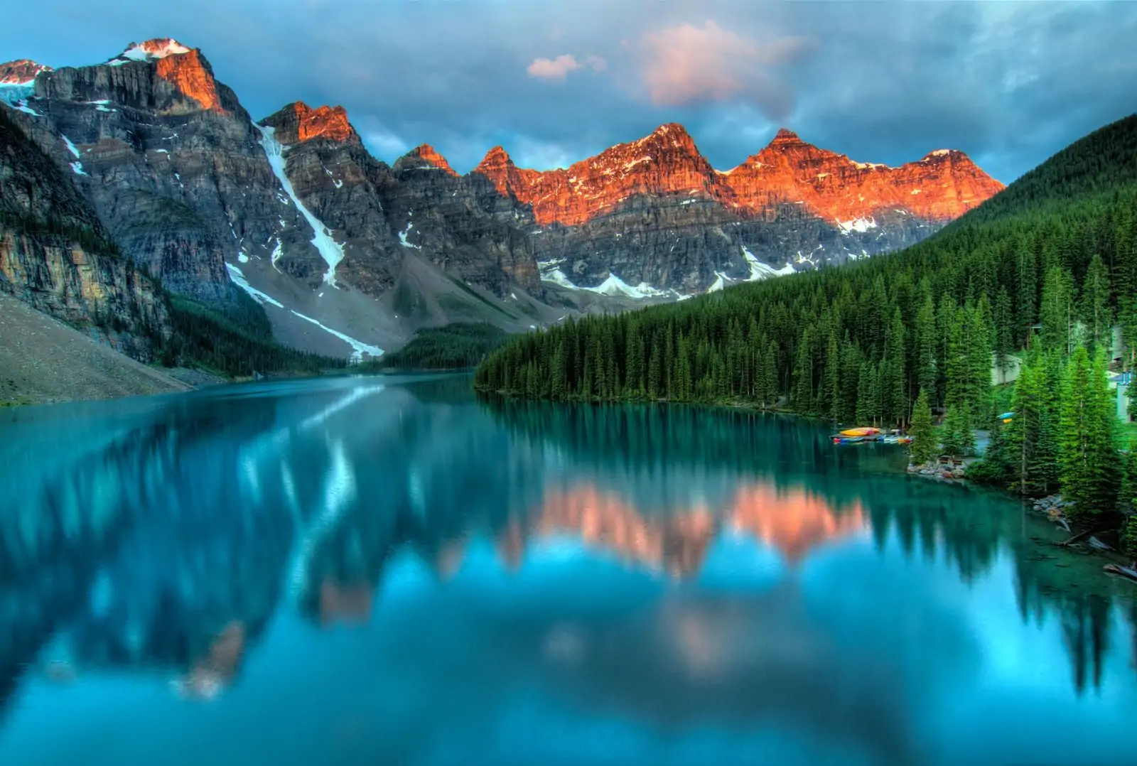
But here’s the secret: the Rule of Thirds is more of a suggestion. Once you understand balance, you can break it. Symmetrical compositions: where you put the subject right in the center: can be incredibly powerful, especially with reflections in a still lake or when you’re shooting something like classical sculptures. Symmetry suggests formality and stillness. Asymmetry (Rule of Thirds) suggests movement and energy.
3. Leading Lines: The Visual Roadmap
One of the most common mistakes in landscape photography is having no "path" for the eye. The viewer looks at the photo and doesn't know where to go. They get lost, get bored, and move on.
Leading lines are your visual roadmap. They are lines within the image that lead the viewer's eye toward the main subject. These don't have to be literal straight lines like a road or a fence (though those work great). They can be:
- A curving shoreline.
- A row of trees.
- The ridge of a mountain.
- The flow of a stream.
Think about how these lines enter the frame. Lines coming from the corners often feel more dynamic. A line that zig-zags (an "S" curve) creates a sense of depth and keeps the eye in the frame longer. If you’re out on one of those best USA road trips, use the road itself to pull the viewer into the horizon.
4. Creating Depth: The Three Layers
A photograph is a 2D representation of a 3D world. To make a landscape feel "big," you have to trick the eye into seeing depth. The easiest way to do this is to think in layers: Foreground, Middle ground, and Background.
The Foreground is King
Most beginners ignore the foreground. They see a mountain and point the camera at the mountain. But without something in the front, the mountain looks small and far away.
Find a rock, a patch of flowers, or some interesting ice. Get low: really low. Putting something interesting in the bottom 25% of your frame gives the viewer an entry point. It anchors the image.
The Middle Ground
This is where the transition happens. It could be a forest, a lake, or a rolling hill. It bridges the gap between your "anchor" in the foreground and the "hero" in the background.
The Background
This is usually your main subject: the mountain range, the sunset, or the massive canyon.
When all three layers work together, you get that "window" effect where it feels like you could step right into the photo. This is a technique often used by pros like Poliana Devane to create immersive scenes.
5. Framing and Scale
Sometimes the landscape is so vast it actually becomes a problem. Everything looks like a tiny speck. To fix this, you can use "natural framing."
Look for overhanging tree branches, sea caves, or even gaps in rock formations. By shooting "through" something, you create a frame within your frame. This focuses the viewer's attention and adds an extra layer of depth.
Scale is also huge. A massive waterfall doesn't look massive if there’s nothing to compare it to. This is where adding a human element (or even a car) can help. Just look at how drones have changed this: seeing a tiny person on a massive cliff edge from above immediately tells the story of how grand the landscape is.
6. Color and Texture
Composition isn't just about where you put the mountains; it's also about how you organize colors.
Warm colors (reds, oranges, yellows) tend to "advance" or come forward toward the viewer. Cool colors (blues, greens, purples) tend to "recede." If you have a bright orange sunset behind a cool blue mountain range, you’re already creating depth through color alone.
Texture is another tool. Use a fast shutter speed to freeze the texture of crashing waves, or a long exposure to turn those waves into a smooth, misty texture. Contrast between textures: like a jagged rock sitting in smooth water: creates instant visual interest.
7. The Gear Factor
While composition is mostly about your eyes, your gear does play a role in how you execute it.
- Wide-Angle Lenses: These are the bread and butter of landscapes. They let you get close to foreground elements while still capturing the massive background. If you're looking for a mirrorless setup, the Fujifilm X-T1 or an Olympus E-M10 are great, portable options for hikers.
- Telephoto Lenses: Don't sleep on these for landscapes. A long lens compresses the scene, making distant mountains look massive and "stacking" layers on top of each other.
- Tripods: You can't fine-tune a composition if you're wobbling around. A tripod lets you make micro-adjustments to the edges of your frame to make sure no distracting branches are poking in.
If you’re really serious, moving into medium format with something like a Phase One IQ250 or a Hasselblad will give you the dynamic range to capture every detail in those complex compositions.
8. Refining in Post-Processing
Sometimes you get the shot, but the composition is almost there. Maybe there’s a distracting trash can in the corner, or the horizon is slightly crooked.
This is where software comes in. I’m a big fan of using Luminar for quick, powerful edits. Their AI tools can help you enhance the "aerial perspective" (making the distant parts look slightly hazier or lighter) which naturally boosts the sense of depth you worked so hard to create in the field.
Cropping is also your best friend. Don't be afraid to crop a horizontal photo into a vertical one if the vertical movement feels stronger. Vertical formats are great for emphasizing height: think redwood trees or steep waterfalls.
9. Avoid the "Empty Space" Trap
Large areas of "nothing" can kill a photo. Usually, this happens in the sky or the foreground. If the sky is a flat, featureless blue, don't give it half the frame. Tilt the camera down and focus on the textures of the land.
Conversely, if the ground is just messy brown dirt with no interest, tilt up and let the clouds tell the story. Every inch of your frame should have a purpose. If it doesn't add to the story, it’s taking away from it. This is a concept often discussed in depth on sites like Shut Your Aperture.
10. Practical Exercises to Improve
You can read about composition all day, but you won't get better until you go out and do it. Here are three exercises for your next outing:
- The Single Lens Challenge: Go out with only one prime lens (like a 35mm). Since you can't zoom, you have to "zoom with your feet." This forces you to think more about your perspective and how moving six inches to the left changes the relationship between foreground and background.
- The Vertical Landscape: We naturally want to shoot landscapes horizontally. Force yourself to take 50 vertical shots. Look for ways to lead the eye from the very bottom of the frame to the very top.
- The "No Subject" Texture Shot: Try to take a compelling photo that has no clear "subject" like a mountain or a tree. Focus entirely on patterns, colors, and textures. This will train your eye to see the building blocks of composition.
Final Thoughts
Landscape photography is a journey, not a destination. Even the pros have "off" days where the composition just doesn't click. The key is intentionality.
Stop taking snapshots. Start building images. Think about your layers, find your leading lines, and don't be afraid to get your boots muddy to find that perfect foreground element.
Whether you’re shooting the historic streets of Varanasi or just a local park, these rules apply. And remember, the goal isn't just to document a place: it's to capture a photographic memory that feels as real as the moment itself.
For more tips on gear and techniques, check out ProShoot.io or see some of my latest work over at EdinFineArt.com. Now, get out there and shut your aperture!
Luminar Neo’s Sky AI, atmosphere AI and SuperSharp are designed for landscape work — replace flat skies, add depth, and recover detail in seconds. Tagged as affiliate per FTC.