
Updated October 2026
Katherine Young turns architecture into something you can feel. A tower becomes a dark grid against the sky. An escalator becomes a set of lines pulling you into the picture. Steel, glass, concrete, and empty space do the work that a face might do in a portrait. This feature first appeared in July 2015. The original twelve photographs remain here, alongside a closer look at the choices that make this architecture photography worth studying.
I like a photograph that gives my eye somewhere to go without telling it everything at once. This gallery does that through symmetry, shadow, reflection, and a careful relationship between the edges of a frame. The discussion below is editorial analysis and a practical shooting workflow. It is not an account of a London shoot I made, and the photographs are not my own work.
Katherine Young: the original profile, in context
The 2015 profile described Young as an amateur photographer based in London who had lived on three continents. It traced her early interest to her father and the time they spent looking through negatives in his darkroom. She bought her first digital camera in 2006, returned to photography after moving to Singapore in 2008, and acquired a Nikon D800 in 2012. Those details belong to the historical feature, not a claim about her current home or equipment.
Her early travel photography concentrated on urban landscapes and people. Singapore’s contemporary architecture helped shift her attention toward cityscapes, building surfaces, and the interplay of light with polished materials. The original text also described an interest in HDR and a particular attraction to black and white. Rather than treating these as competing styles, look at what both approaches can reveal: structure, separation, and the character of a surface.
Later public records add useful context without changing the date of this gallery. An International Photography Awards interview identifies her as the 2019 non-professional Architecture Photographer of the Year and discusses her Elements work. In that interview, she describes studying building facades, texture, light, and shadow. A 2019 Dodho feature discusses her London Underground photographs. These later sources support a continuing architectural interest; they do not establish when or how every photograph below was made.
What matters here is the way the pictures ask you to look. Contemporary buildings can seem impersonal when photographed as inventory. Young’s frames make them specific through viewpoint and selection. The subject is sometimes an entire tower, sometimes a stairway, sometimes a shape created where surfaces meet. You do not need to know the exact address to read that structure, although location and subject should always be recorded accurately when you make your own work.
 Save
Save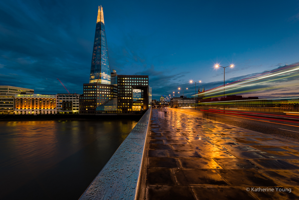 Save
SaveFind the frame before choosing the settings
Architecture is not going anywhere, but your first viewpoint is rarely your only viewpoint. Look from the center, then move sideways. Lower the camera and see whether the foreground becomes useful. Step back when access allows. Each position changes the overlap between surfaces and the amount of sky. You can spend a long time adjusting exposure to improve a composition that would become stronger with one small move.
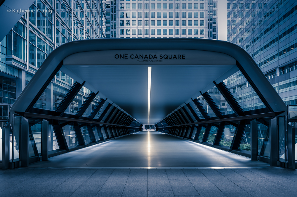
The entrance photograph is a good place to study that idea. The canopy and its supports make a container around the center. The brightest point gives the viewer a destination. The sides do not need to be perfectly identical to create a sense of balance. What matters is that neither edge introduces a distraction strong enough to break the central pull. Before making your own frame, check all four borders rather than only the impressive feature in the middle.
Keep your composition decisions specific. Instead of saying a building looks epic, ask what makes it look that way. Is it the scale against the sky, the repeated windows, a bright edge, or the contrast between a curved surface and a straight one? That question tells you what to keep. It also tells you what can leave the frame. A photograph becomes more deliberate when you know which relationship you are trying to preserve.
 Save
Save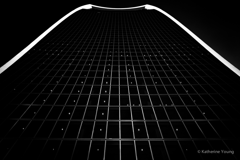 Save
SaveConverging lines can be a choice
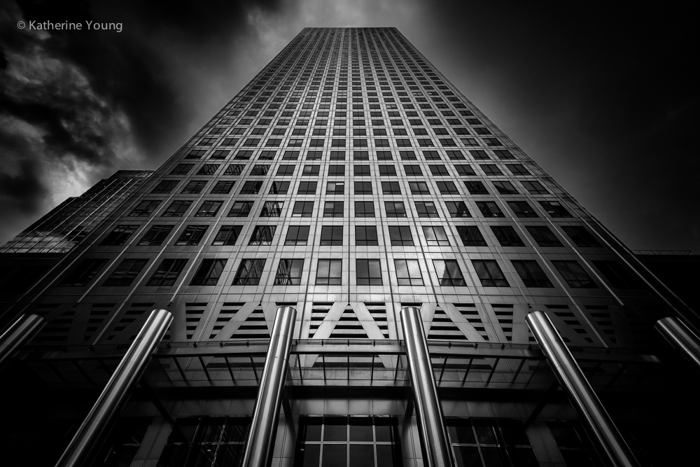
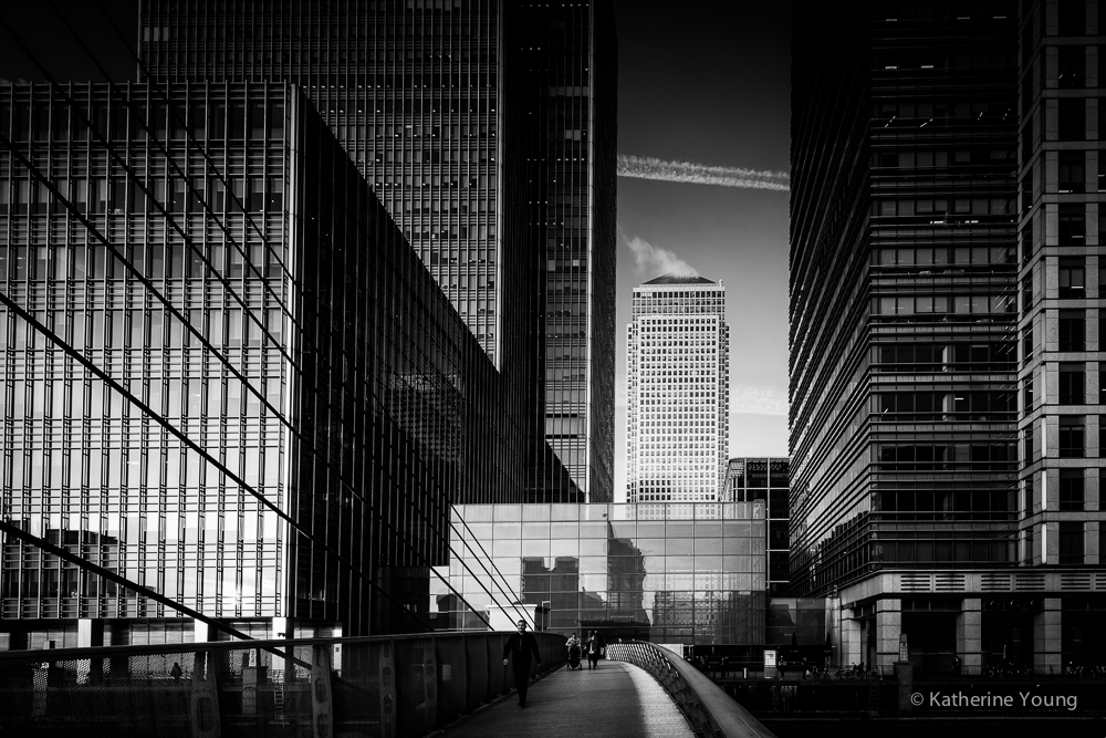
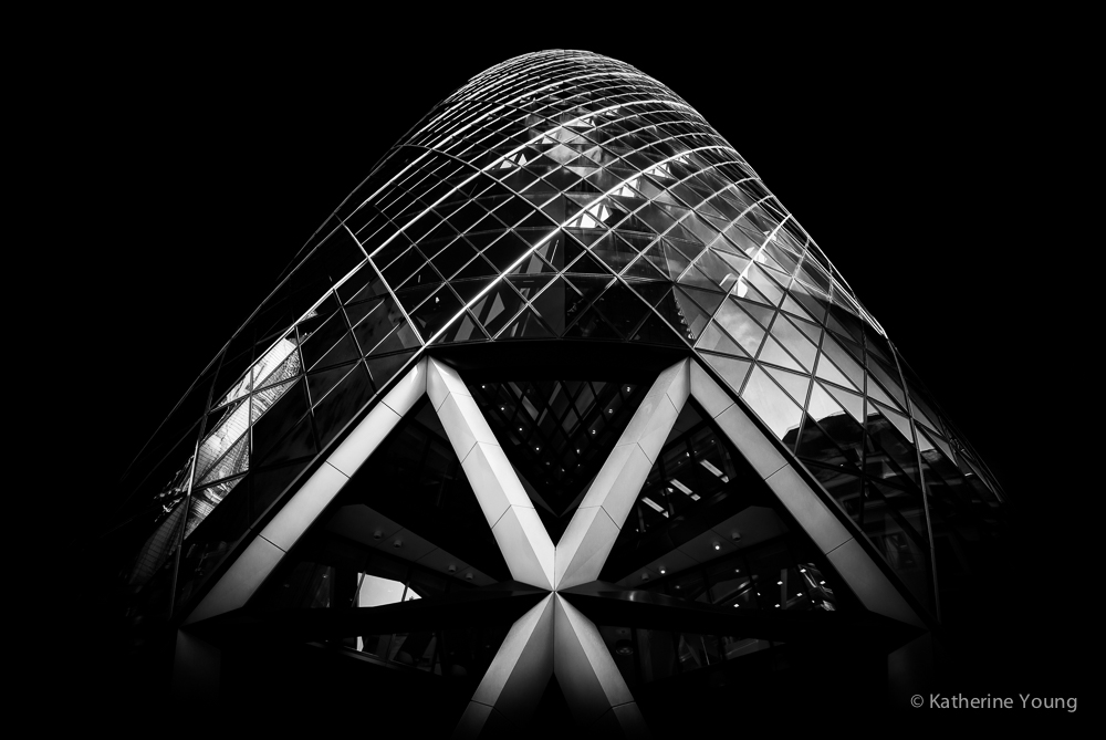
An upward view of a tall building makes vertical lines appear to converge. That is not automatically a fault. It can express height and make the viewer feel small beside the structure. In this gallery, the towers’ window grids become part of the composition rather than background detail. The camera angle helps those lines gather into a strong shape. Correcting every photograph until all walls stand parallel would change that visual idea.
For a descriptive architectural photograph, you may want a more neutral view. Nikon School suggests standing farther back or finding a higher permitted viewpoint to reduce how much you need to tilt the camera upward. Its architecture tips also distinguish correcting convergence from exaggerating it for a more dynamic picture. Choose the approach to fit the purpose. A building record and a personal fine-art interpretation do not have to look the same.
If you plan to correct perspective later, leave room around the building. The adjustment can stretch parts of the image and require a crop. Check important rooflines, corners, and foreground details before you commit to a tight frame. Do not assume software will recover something you cut off at capture. A small margin may be less dramatic on the camera screen but gives you more room to finish the photograph carefully.
Use black and white to separate forms
Black and white is not a shortcut around distracting light. It changes how forms separate. Two surfaces with different colors may become nearly the same gray. A patch of bright sky may pull harder than the building itself. Before converting, look at the brightest and darkest areas and ask whether they support the subject. The result should remain readable even when you view it small.
The dark tower with its bright upper outline shows how little information you sometimes need. The edge establishes a boundary, the grid suggests depth, and the darkness removes much of the surrounding noise. That does not mean every architectural picture needs crushed blacks. In the stairway photographs, middle tones and surface texture carry important information. Choose contrast for the image rather than applying one hard preset to the whole folder.
Work from a restrained version first. Keep the original file, compare the conversion, and inspect smooth walls for harsh transitions after large adjustments. Look at the whole frame between close-up checks. A crisp window at full resolution is useful only if the building still reads well as a photograph. Good processing reinforces the relationships you saw; it should not replace them with halos and sharpness.
 Save
Save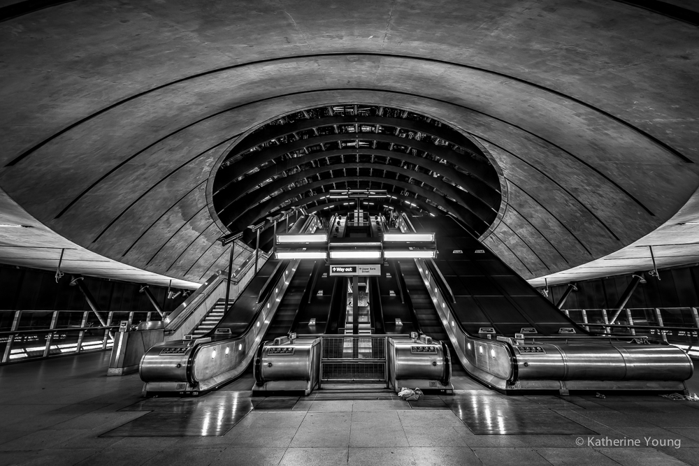 Save
SaveSymmetry needs an anchor, not only a center line
A symmetrical frame can feel organized, but centering the camera is only the beginning. Look for the point where the lines lead. In the station pictures, escalators rise toward a rounded opening. That opening provides an anchor; without it, the rails might simply send the eye out of the frame. Study how the circle, the dark recess, and the bright metal edges fit together.
When you practice, make one central composition and then a slightly off-center version. The central image may feel calmer. The second may show more depth or make a reflection more useful. Compare them without assuming symmetry is always the winner. Repeated shapes are powerful because they build expectations. A small interruption can add interest, while an accidental interruption can make the whole picture feel unsettled.
Inspect the foreground with extra care in a wide composition. A nearby rail or floor joint can occupy a surprising amount of the frame. If it points toward your anchor, it helps. If it cuts across the picture or leans awkwardly against the border, it may weaken the arrangement. Make these decisions in a safe place. Do not stop on a moving escalator or block a station route to refine a picture.
 Save
Save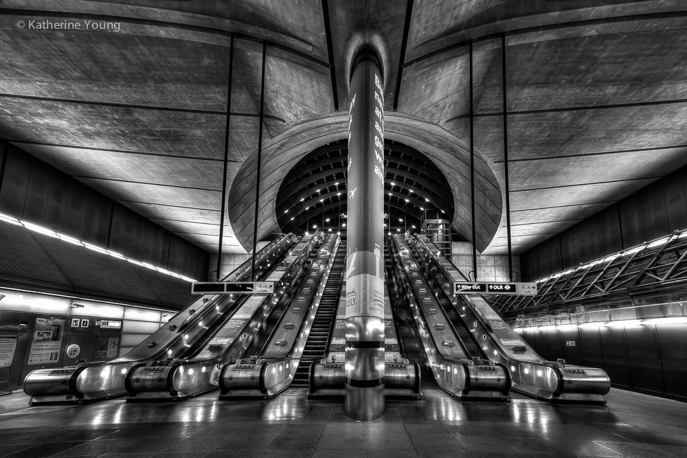 Save
SaveLet color earn its place
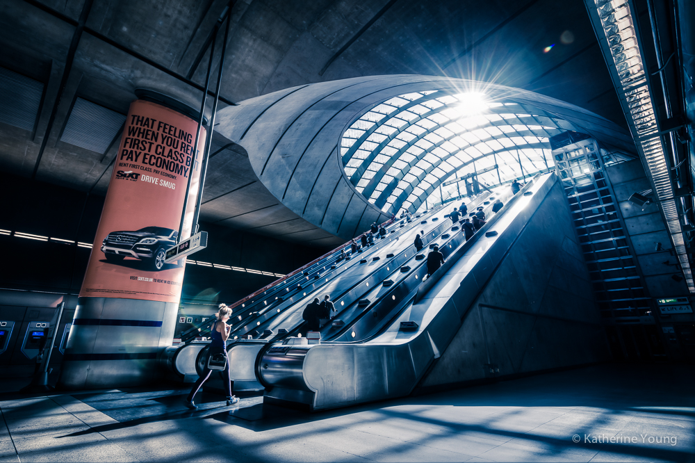
The blue and gold pictures belong beside the monochrome work because they do something different. In the riverfront frame, the wet pavement holds warm reflected light against a cooler sky. The tower acts as a vertical anchor while the light trails stretch sideways. Removing color would change those relationships. Color is useful when it explains how the scene is organized, not only when it makes the thumbnail brighter.
A scene at dusk can contain several different light sources. Watch the transition between bright lamps, reflected pavement, and the sky. Keep important highlights from becoming featureless when your exposure and scene allow it. If you bracket a still architectural scene, inspect the resulting blend for moving people, traffic, or clouds that do not line up. The finished picture should not contain obvious artifacts simply because a technique promised more range.
The gallery does not supply a complete exposure or editing log. Light trails can suggest a longer exposure, but we cannot name the shutter speed from their appearance. Likewise, a detailed reflection does not prove a particular HDR process. Use what you can see as a direction for your own tests. Keep actual settings notes so your experiments produce knowledge instead of guesses about someone else’s files.
 Save
Save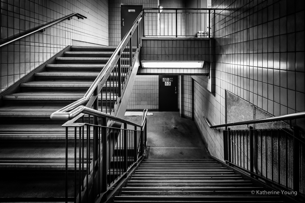 Save
SaveBuild a small architecture series
A good series needs more than twelve versions of the same upward view. Change the scale of your attention. Begin with a setting, move to a facade, then look for a detail or an interior you are permitted to photograph. Use repeated ideas to connect the pictures, but give each frame a job. This gallery moves between towers, reflections, escalators, and stairs while returning to line, shape, and contrast.
On a practice walk, choose one visual question: how curved structures meet straight ones, how windows catch light, or how a bright opening sits inside a darker space. Make a small set and review it together. Remove photographs that repeat without adding anything. Keep a quieter frame if it gives the sequence room to breathe. The strongest single picture does not always need to appear first.
Record the real location and access conditions. Check current rules with the property or transport operator before photographing inside buildings or using a tripod. A publicly accessible interior can still have restrictions. Do not infer permission from these historical photographs or from another photographer’s presence. Keep equipment out of routes, respect staff instructions, and choose a different viewpoint when the shot would inconvenience other people.
 Save
Save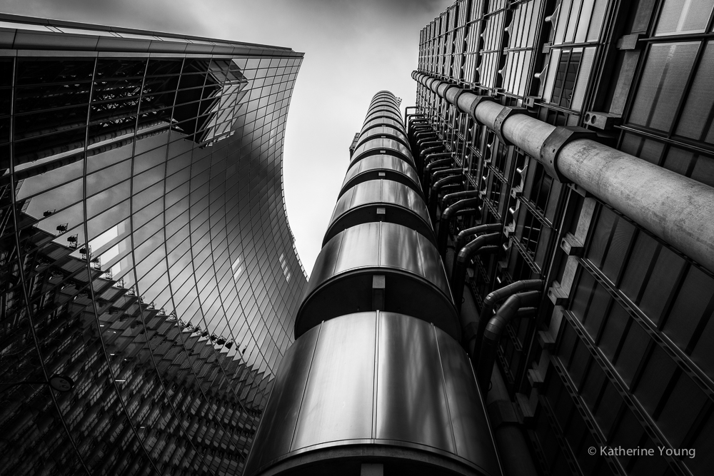 Save
SaveA practical workflow for your next architecture walk
Start with the camera you have. Nikon School notes that a telephoto lens can be useful for details while a wider view suits larger structures. The goal is not to copy the historical D800 kit. Decide whether you need the whole building or a small relationship within it, then choose a focal length and position that serve that decision. A more expensive body does not decide what stays inside the border.
At home, back up the originals, make your first selections, and edit those before processing everything. Compare the photographs at the size you expect to publish. Check perspective, tone, borders, and caption accuracy. Keep a record of which location and date belong to each image. An organized archive makes it easier to revisit a project without having to reconstruct its history from filenames.
For a stronger foundation in composition, light, and choosing your final pictures, explore the Shut Your Aperture Academy. Understanding why a frame works is more useful than collecting settings. You can take that understanding into a city street, a permitted interior, or a close study of one building surface.
Frequently asked questions
Who is Katherine Young?
Katherine Young is the photographer featured in this original July 2015 gallery. The historical profile describes her travel and architecture interests; later IPA and Dodho features discuss her architectural work.
Are these photographs by Edin Chavez?
No. The twelve original photographs belong to the Katherine Young feature. The expanded text offers editorial analysis and practical photography tips.
What camera did the original profile name?
The 2015 profile names a Nikon D800 acquired in 2012. That is historical equipment context, not a claim about her current kit or the exact settings of each photograph.
Should I correct all converging vertical lines?
No. Correct them when a neutral architectural view needs it, or keep them when an upward angle supports the photograph. Leave cropping room if you plan perspective adjustments.
Is black and white better for architecture photography?
Neither treatment is automatically better. Choose monochrome when tone and shape carry the frame; keep color when it helps explain reflections, light, or the relationship between surfaces.
Source note: Original gallery and 2015 profile; later context from International Photography Awards and Dodho; practical equipment and perspective guidance from Nikon School.


