
Updated October 2026
Lightroom update 7.4 was a June 2018 release, not the latest Lightroom download. Its useful story is workflow: hide preset groups you do not use, simplify the Profile Browser, mark folders with color labels, and keep HDR or panorama source frames beside the merged result. Those are small changes that can make a large photo library easier to work with.
This article preserves the original June 2018 update while turning it into a practical guide. I care more about finding the right photograph and finishing it well than about collecting another panel of settings. The workflow below explains what changed in Lightroom Classic CC 7.4, what belongs to the separate Lightroom CC release, and how to apply the organizational ideas without confusing an old screenshot with your installed version.
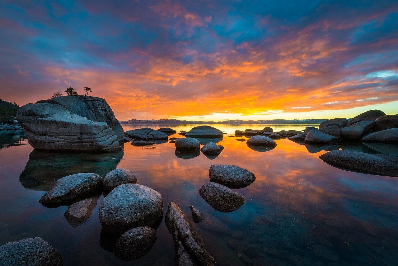
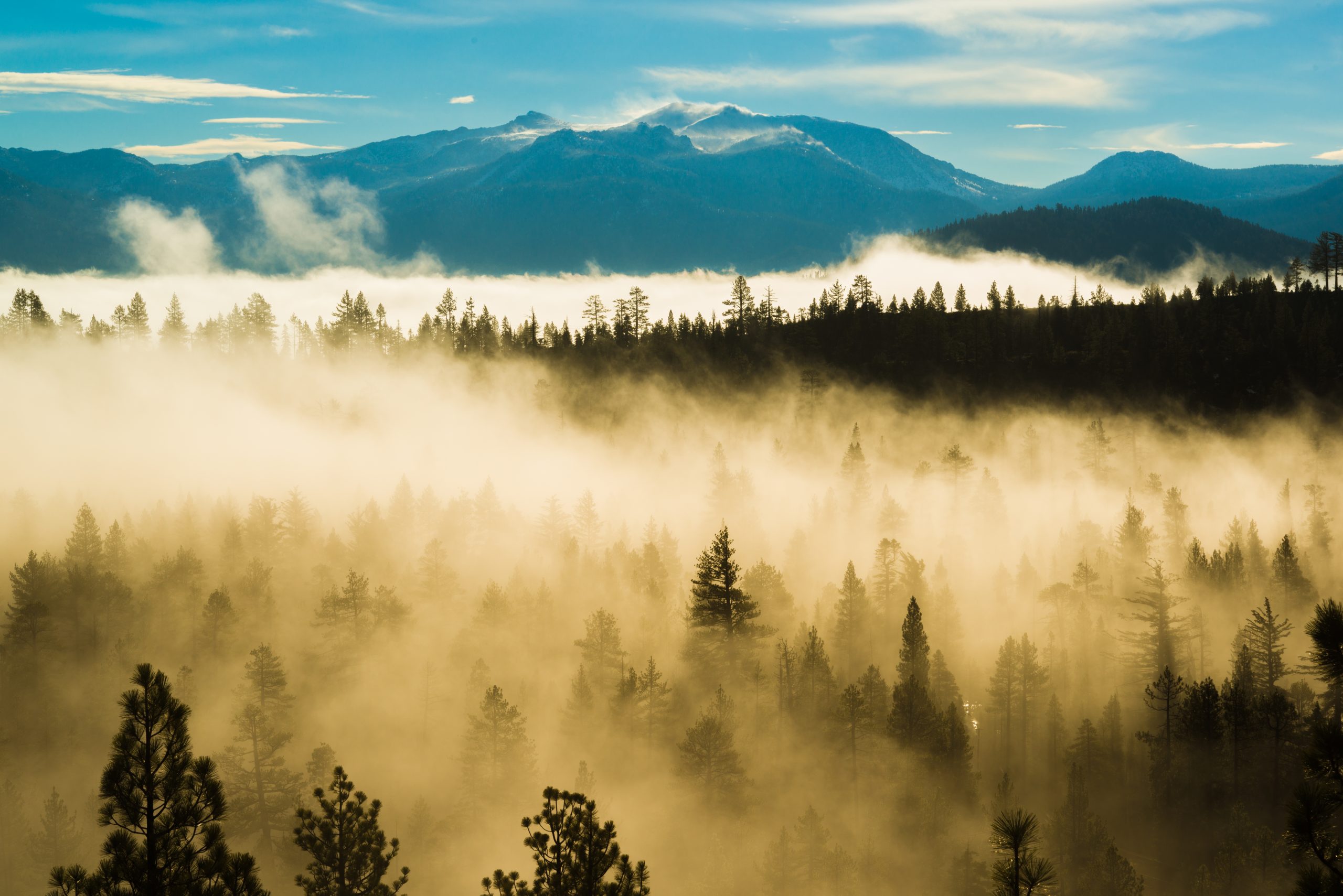
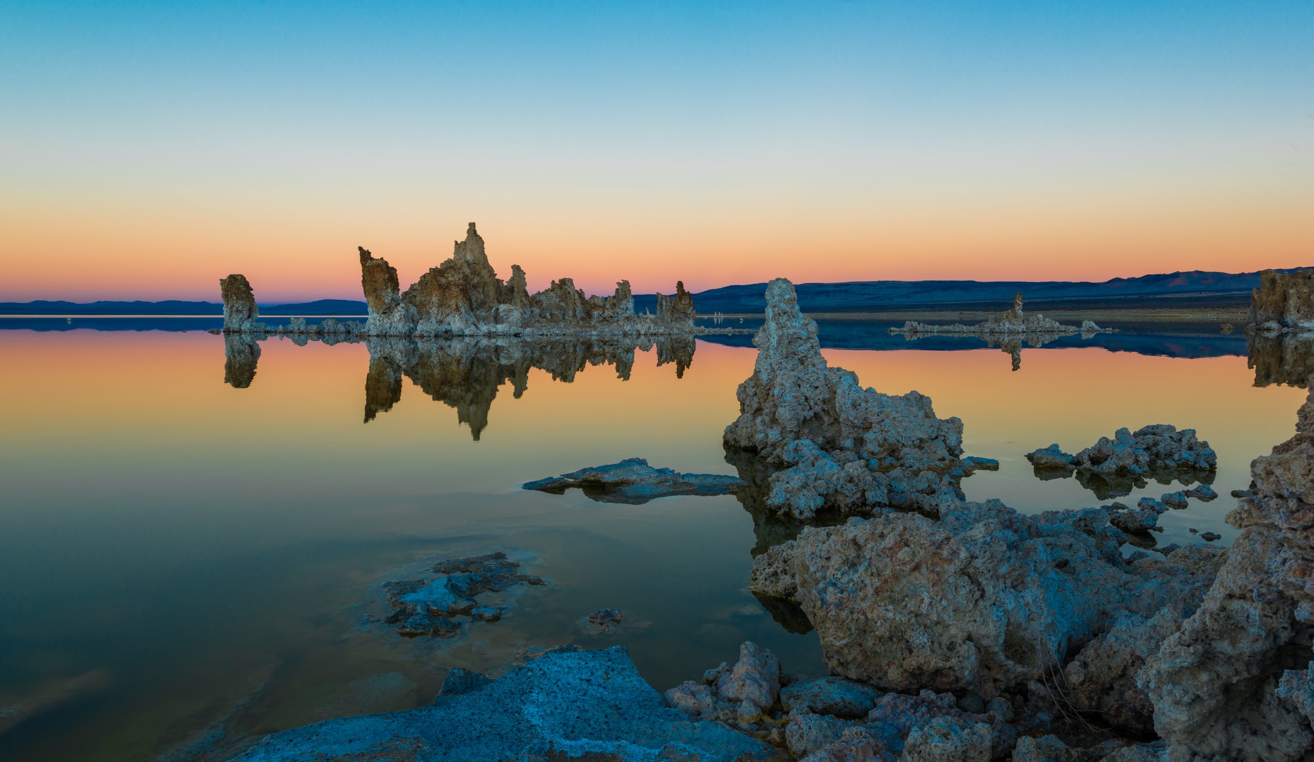
The original interface screenshots remain as historical examples. The Lake Tahoe photographs are real photographs from my fine-art collection, used to illustrate different editing decisions. They are not a test of version 7.4, a preset comparison, or proof that a particular feature produced the finished image. Treat them as pictures to think about, not software benchmarks.
What Lightroom Classic 7.4 actually changed
Adobe announced the June Lightroom releases on June 19, 2018. For Lightroom Classic CC, the highlighted changes included preset and profile management, faster searching in folders, color labels for folders, and automatic stacking when merging HDR images or panoramas. Contemporary release coverage also discussed bug fixes and support for additional cameras and lenses. This page concentrates on the workflow features rather than reproducing an obsolete compatibility list.
The large preset preview already existed in version 7.3. Version 7.4 added a preference to turn that hover preview off. That distinction corrects an easy misunderstanding in older tutorials: the update did not invent every feature shown in its screenshots. Some changes were refinements to behavior introduced earlier. A useful release guide should explain the difference rather than attach every visible control to the same version number.
Do not install a 2018 release just to follow these ideas. If you use a current supported Lightroom Classic version, consult its own help and check the available controls there. Older menu labels can be useful clues, but they are not a promise of identical placement. Keep the version number visible in your troubleshooting notes so support advice and tutorials refer to the application you actually have.
Lightroom Classic and Lightroom CC were not the same update
In Adobe’s June 2018 announcement, Lightroom CC and Lightroom Classic CC had separate feature sections. Preset and profile synchronization across the Lightroom CC ecosystem was a headline for the cloud-oriented Lightroom CC release. Lightroom Classic received the organization and merge-workflow changes described here. Do not read that announcement as a promise that every Classic preset group automatically synchronized everywhere.
This matters when you move between desktop and phone. Before spending time fixing a missing preset, identify which application you are using and how you imported it. A similarly named tool in another Lightroom app can have a different location or workflow. The relevant support page is the one for that application, not simply the first search result containing the word Lightroom.
For the same reason, avoid treating an old article as current subscription or upgrade advice. This is a record of a historical release and a set of editing habits, not a live price list or an offer to obtain version 7.4. Adobe’s current product information owns those decisions. The organizational benefit does not depend on pretending an eight-year-old update is new.
Manage preset groups without deleting your options
A crowded Presets panel makes it harder to choose deliberately. The 7.4 change let photographers control which groups were visible rather than deleting everything they did not use. Current Adobe Lightroom Classic help still describes Manage Presets: in the Develop module, open the Presets panel, select its Add control, choose Manage Presets, select the groups you want shown, and save your choice.
Hiding a group and deleting a preset are different decisions. Begin by hiding groups that distract from the work in front of you. Keep useful alternatives available for another project. A landscape edit does not need every portrait look in view, and a black-and-white series does not need a long list of aggressive color effects. The point is a smaller working set, not a contest to have the fewest presets.
Choose your working groups by purpose. You might keep a restrained color starting point, a black-and-white starting point, and a group you are actively evaluating. Those are examples, not a prescribed file structure. Name your own groups so you can recognize them later. A label that makes sense during an import should still make sense when you return to the project months after delivery.
 Save
When testing a preset, compare the result with the original at a useful image size. Check exposure, white balance, skin or foliage where present, and the brightest part of the frame. A preset can include settings that were appropriate for its creator’s example but are excessive for yours. You are choosing a starting point, not handing the final decision to a thumbnail.
Preset hover previews: useful when they help, optional when they distract
The large hover preview lets you see a possible preset look without committing it. Contemporary 7.4 coverage identifies a checkbox in Preferences, on the Performance tab, named “Enable hover preview of presets in Loupe.” Turning it off was the new option. That historical path is useful when interpreting the archive screenshots; verify the equivalent control in your current version before following it literally.
Use previewing with a clear question. Are you testing a warmer color relationship, a different contrast curve, or a monochrome direction? If you simply sweep the mouse through dozens of looks, the changing image can make it harder to remember what you liked about the photograph. Pause on one candidate, compare, and decide whether it supports the subject.
If large previews make your particular workflow feel slow, disabling that behavior may help you work more calmly. It is not a guaranteed cure for all performance problems. File size, hardware, catalog condition, and other settings can matter. Change one preference at a time and compare with the same files rather than drawing a speed conclusion from two unrelated editing sessions.
 Save
Profiles are a foundation, not the same thing as presets
Adobe describes profiles as controls for how colors and tonality are rendered. In its current Lightroom Classic help, the Profile area of the Basic panel provides a starting point or foundation for editing. A preset, by contrast, applies a set of adjustment settings. The names may sit close together in tutorials, but they do different jobs and should not be treated as interchangeable.
The 7.4 release added ways to control profile visibility. Contemporary documentation describes opening the Profile Browser, using a group’s context menu, and choosing Manage Profiles. The historic dialog allowed groups to be shown or hidden. That is organization, not a command to change every photograph’s rendering. Keep the groups relevant to your current work visible and check the installed version’s controls if the old path does not match.
 Save
Choose a profile early enough that you understand its effect on later adjustments. Compare alternatives before building a complicated edit on top. A change in the starting rendering can alter the balance you have been correcting. The goal is not to find a universally correct profile; it is to make a conscious choice for the photograph and then evaluate the complete result.
For a monochrome image, judge separation between important forms rather than merely removing color. Trees in fog need enough tonal difference to read without destroying the atmosphere. A useful foundation may let you keep the mist gentle while retaining the nearby tree silhouettes. If the edit becomes hard and contrasty everywhere, reduce the treatment instead of assuming the strongest profile must be the best.
 Save
Folder color labels: define a small system you will remember
Adobe’s 2018 announcement says photographers could assign a color label to a folder and filter folders by those labels. Contemporary release coverage shows the Folders panel context menu: right-click a folder, choose Add Color Label, and choose a color. The Folders search filter could then show labeled folders. These labels apply to folders, so do not confuse them with ratings, flags, or labels applied to individual photographs.
The software supplies colors, not your meaning for them. Decide what each color means before marking a whole library. For example, one color might identify work awaiting review and another might identify a finished project. Those meanings are your choices; Adobe does not require that particular system. Write a short key somewhere you can find it, especially if someone else will work with the catalog.
Keep the system simple enough to use consistently. If every folder needs a different interpretation of the same color, the label stops helping. If a project changes stage, update its label deliberately. A color is a quick visual cue, not proof that files were backed up, a client approved the pictures, or an export was actually delivered.
 Save
Use folder search and labels together when you already know what you are looking for. A recognizable folder name plus a consistent color can reduce browsing. Do not rename or move original folders casually outside the catalog just to make the panel look cleaner. File organization should preserve the connection between your catalog and the photographs, not introduce missing-file problems in pursuit of tidy colors.
Auto-stack HDR and panorama results beside their sources
The June 2018 release added a Create Stack option to the HDR and panorama merge tools. Adobe says it groups the ingredient photographs with the merged output, cleaning up the grid. Contemporary coverage describes the merged image appearing at the top. This is the practical advantage: the finished merge and its source frames are easier to recognize as a related set.
A stack is an organizational grouping. It does not delete the original exposures, prove the merge succeeded, or replace a backup. Expand it when you need to inspect the sources. Adobe’s current stacking documentation explains that collapsing a stack hides its other members from the grid while leaving the top image visible. That makes the grid easier to scan, but it also means you should expand the group before making decisions about hidden photographs.
After an HDR merge, inspect the important highlight and shadow areas, subject edges, and any movement. After a panorama, inspect joins, straight lines, the horizon, and the crop. A clean stack can contain a flawed merge. Organization and image quality are separate checks, and both matter before you mark the project complete.
Do not infer that every wide photograph is a stitched panorama. The Lake Tahoe examples on this page illustrate landscape editing decisions, not merge source sets. If you want to practice the stack workflow, use your own related source frames and the resulting merge so you can see exactly which files belong together. Labeling an unrelated wide image as a feature demonstration would teach the wrong thing.
A complete workflow from import to finished output
Begin with a project you can finish, not your entire archive. Import or open the relevant files, confirm their folder location, and choose a clear working set. Use flags or ratings for individual image choices if those are already part of your process. Use folder color only for the broader stage it represents. Mixing all of those signals into one meaning makes the library harder to read.
Choose a profile foundation, then test a restrained preset only if it saves a useful step. Compare the whole frame before refining local details. For a reflective shoreline, watch how water and trees relate in brightness and color. For fog, preserve depth rather than forcing every distant shape to be as crisp as the foreground. Those are visual choices, not version-specific tricks.
 Save
If the project includes a merge, keep the result with its source frames and inspect it before hiding the stack. Make the final crop and output decisions for the intended use. A small web image and a large print deserve their own checks. Export a test, open the actual file, and confirm that the finished output looks as expected rather than trusting only the Develop preview.
Finish by making the archive understandable. Keep source files, useful merged outputs, and finished exports distinct enough that you can return to them. Record what you actually completed before changing a folder label to your finished color. A tidy panel is satisfying, but the real reward is being able to find the photograph, understand the edit, and produce the right file without starting over.
Back up the photographs as well as the catalog
Folder colors and stacks live inside an organizational workflow; neither creates another copy of your photographs. Do not erase cards or remove working files merely because the grid looks orderly. Keep an independent copy of important source files, and understand which files your catalog backup process actually covers. A catalog record and an original camera file are not the same item.
A portable drive can hold a working or transfer copy, but one external drive alone is not a complete backup plan. Check the copy before relying on it, keep a separate copy for important projects, and use names that identify the job. When a storage problem appears, a simple, verified archive is more useful than a complicated color system that only you remember.
Build a stronger editing eye
Software organization should give you more attention for the photograph. Once the panel is less crowded, spend that attention on light, composition, and the relationship between forms. The Shut Your Aperture Academy is a place to build those photography skills and make more deliberate decisions in the field and at the editing desk. Look at the current training options and choose the direction that fits your work. A better starting photograph makes every workflow more useful.
 Save
Frequently asked questions
Is Lightroom update 7.4 the latest version?
No. Lightroom Classic CC 7.4 was a June 2018 release. This is a historical feature guide updated with practical workflow advice, not a current download or version recommendation.
Did Lightroom 7.4 introduce large preset hover previews?
No. Contemporary release coverage says the large preview was introduced in 7.3. Version 7.4 added an option to disable preset hover previews in Loupe.
Does hiding a preset group delete the presets?
Manage Presets controls group visibility. Hiding a group is different from deleting presets; use visibility management first when you want a less crowded panel.
What does Create Stack do after an HDR or panorama merge?
It groups the source photographs with the merged output. The grouping makes the grid easier to navigate, but it does not delete sources, verify image quality, or create a backup.
Did the Lightroom Classic 7.4 update sync all presets to mobile?
Do not assume that. Adobe’s June 2018 announcement described preset and profile synchronization under the separate Lightroom CC ecosystem section, while Classic received its own workflow changes.
Can I still use my old presets after updating Lightroom Classic?
Yes. An application update does not delete user presets or custom profiles. Presets carry forward, and the 7.4 preset management options only change which groups are visible in the panel. As with any software update, having a current backup of your catalog and presets folder before updating is the safe habit.
Do profiles or presets change my original raw files?
No. Profiles and presets are non-destructive instructions stored with the catalog or as sidecar metadata. The original raw file is never altered, and you can remove or change a profile or preset at any time without damaging the photograph.
Sources: Adobe June 2018 release announcement, Adobe preset management, Adobe profile guidance, Adobe stacking help, and contemporary 7.4 release coverage.