Updated October 2026
A photograph should give you a reason to stop. Not because the colors are louder than everything around it, and not because the place is famous. It should hold your attention after that first glance. A line keeps pulling you into the frame. A quiet space changes how the room feels. Light turns a familiar landscape into something you want to spend time with. That is where fine art photography starts for me.
I am Edin Chavez, and Edin Fine Art is the gallery for that side of my work. It brings together landscapes, seascapes, city scenes, and photographs made while traveling. The subjects change, but the question stays useful: what makes this frame worth returning to? This article is an invitation to look through the gallery with that question in mind, whether you are choosing a print or building a more intentional photography practice.
You do not need an art degree to know when a photograph moves you. You do need time to look. Start with the picture that catches your eye, then stay with it long enough to understand why. The best choice for your wall is not necessarily the most dramatic thumbnail, and the best photograph in your own archive is not necessarily the one that got the most likes.
What makes a photograph fine art?
For this discussion, fine art photography means photographs chosen and presented for their visual and expressive purpose. The image does more than tell you that a bridge, canyon, or lake exists. Its framing, light, color, timing, and presentation create a particular way of seeing that subject. Two photographers can stand in the same place and make entirely different pictures because they are paying attention to different things.
That does not require a strange effect or a complicated concept. A straightforward landscape can have a strong point of view. A city photograph can feel quiet. A small part of a canyon can carry more weight than a complete view. What matters is the relationship between the choices and the finished image. If every decision helps the viewer see what matters, the photograph has direction.
The print is part of that direction. A picture on a phone is a small illuminated object. A photograph on a wall has scale, a surface, and a relationship with the room. It can be seen from across the space and examined up close. Thinking about those different experiences changes how you select work. You are choosing something to live with, not merely something to scroll past.
Meet the gallery through four different ways of seeing
The public galleries let you explore by place and subject rather than squeeze every photograph into one mood. That is a useful way to begin. Compare a broad coastal view with a tightly framed canyon. Compare color with black and white. Notice whether you are drawn to distance, texture, motion, geometry, or a feeling of stillness.
The four photographs here are my own work from those public collections. They are not stock illustrations or invented examples. I am discussing what you can see in them, rather than supplying camera settings or a behind-the-scenes story that the image alone cannot prove. The practical tips are yours to apply when looking, photographing, or selecting a print.
Seven Mile Bridge: give the eye a path
 Save
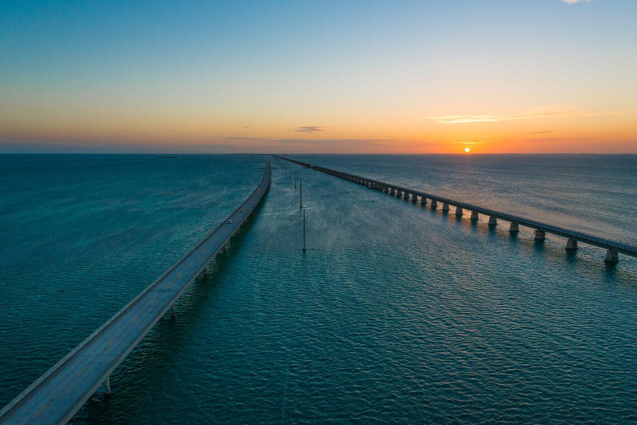
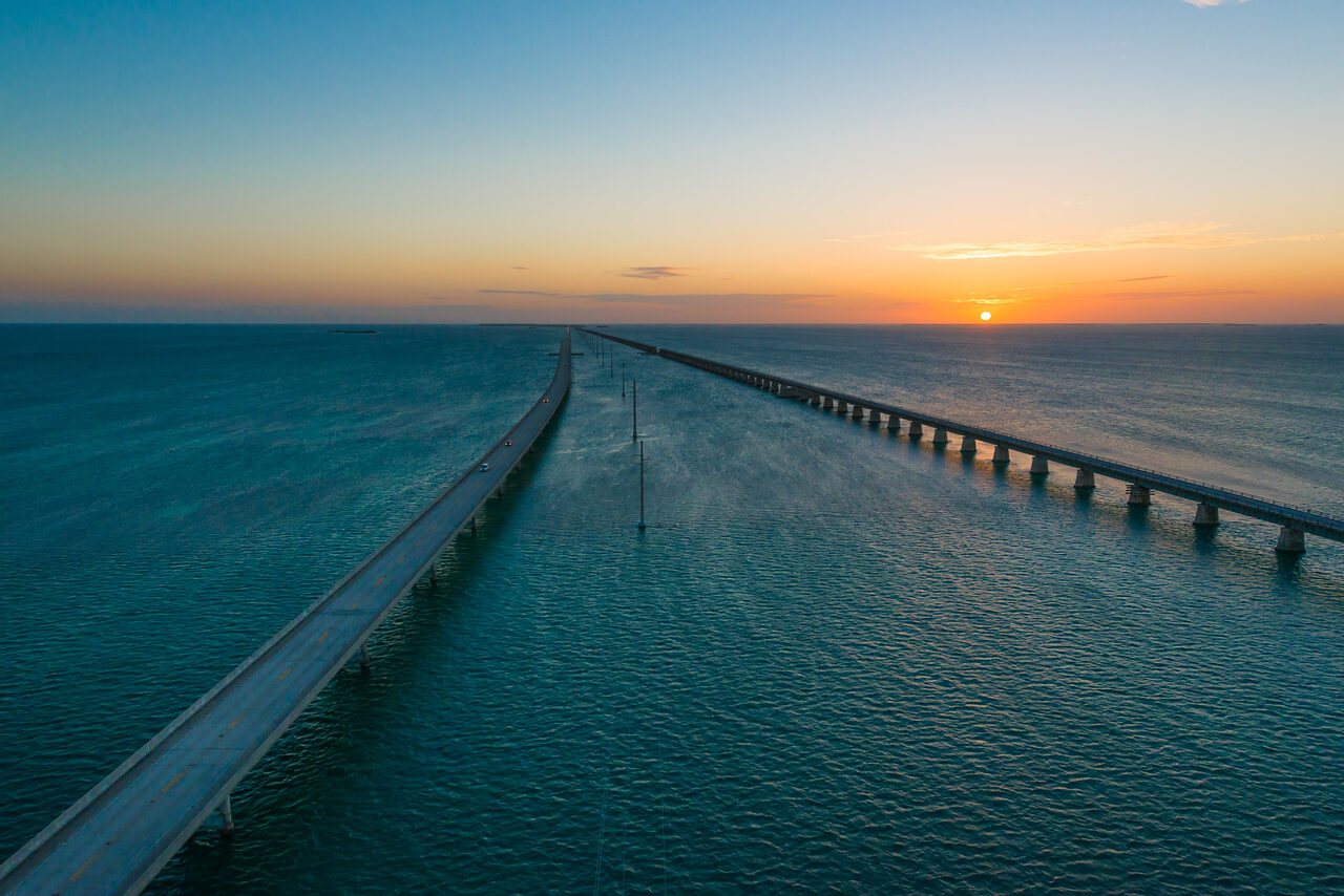
SaveThe Seven Mile Bridge gallery is a good starting point if you like a photograph with a clear sense of direction. In this frame, the spans lead out through the water and toward the horizon. The lines are strong, but the open sea gives them space. Warm light sits above a cooler field of blue, so the frame has both structure and atmosphere.
Look at the empty water as carefully as the bridge. That space is doing real work. It keeps the lines readable and prevents the image from becoming a crowded record of infrastructure. The photograph gives your eye somewhere to go and enough room to get there. For a wall, that can make a strong statement without requiring every part of the image to shout.
Tip: when photographing a leading line, check where it begins, where it ends, and what surrounds it. A road or bridge does not automatically make a good composition. Its position needs to help the viewer move through the picture. Change your framing if the line runs into an awkward corner or competes with a brighter distraction. Never seek a dangerous position simply to force a more dramatic perspective.
For collectors, ask whether that sense of movement suits the space. A long sightline in the photograph may work well in a room where you want depth and openness. Test the image from the distance where you will usually see it. The detail that catches your eye on a screen may be less important than the broad arrangement of blue, warm light, and lines on the wall.
Miami fog: simplify a city with tone
 Save
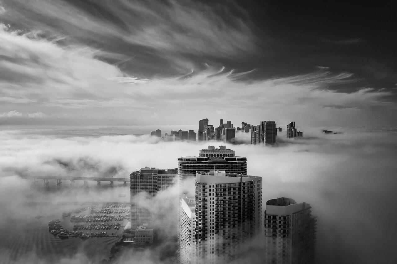
SaveThe Miami Fog collection changes the language. Here, the city is not a mass of competing signs and colors. Fog separates visible buildings from the space around them, and black and white turns the picture toward tone, shape, and distance. The skyline feels different because some information has been removed rather than added.
The near building gives the image a strong anchor. Farther buildings sit within a broader pale layer, and the sky adds another range of tones above them. Your eye can move between those layers without needing every structure explained. This is one reason a monochrome print can feel spacious even when the subject is a dense city.
Tip: do not convert to black and white only because the color version feels weak. Look for a reason in the structure. Can you separate the subject from its background through brightness? Do the clouds or buildings create useful shapes? If the tones collapse into one gray mass, conversion alone will not fix the picture. Start with a frame whose relationships remain readable without color.
For a room, black and white offers a different kind of presence from a saturated landscape. It can draw attention through contrast rather than color matching. Try it beside the actual wall, furniture, and nearby artwork. A monochrome photograph is not automatically neutral; strong dark and light areas can be just as commanding as a warm sunset.
Antelope Canyon: let a small frame carry a big idea
 Save
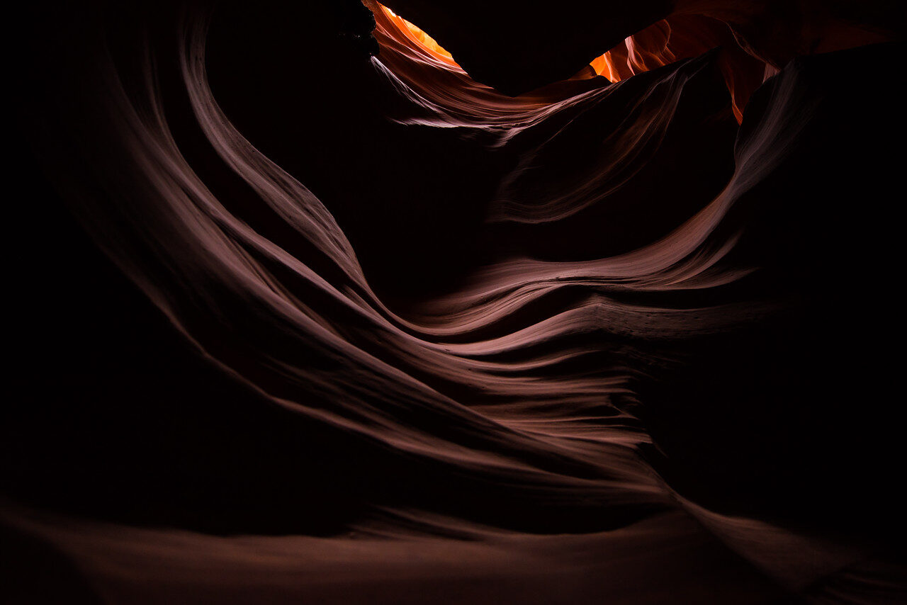
SaveIn the Antelope Canyon collection, the subject can be a relationship between curves, light, and shadow rather than a complete description of the canyon. This photograph leaves much of the frame dark. The lit edges and layered sandstone forms give you a route through it. You do not need every surface opened up to understand the movement.
That restraint is important. Brightening everything would change the picture. The darkness gives the illuminated shapes weight and lets the curves feel connected rather than itemized. The frame sits between landscape and abstraction: you can recognize rock, but you can also enjoy it as a sequence of flowing forms.
Tip: make a tighter photograph before assuming you need a wider lens. Look for a repeated curve, an edge of light, or a simple relationship between two shapes. Exclude whatever does not support that idea. A small portion of a place can tell a stronger visual story than a complete view crowded with competing details. Respect access rules and other visitors while working; a clean frame is not worth disrupting a protected place.
When selecting a print with deep shadows, ask how the room is lit. Consider where reflections from windows or fixtures will land and whether you will be able to see the subtle darker shapes. The correct choice is not just an image you love on a bright phone. It is an image whose character you can enjoy in the space where it will live.
Mono Lake: color can be quiet
 Save
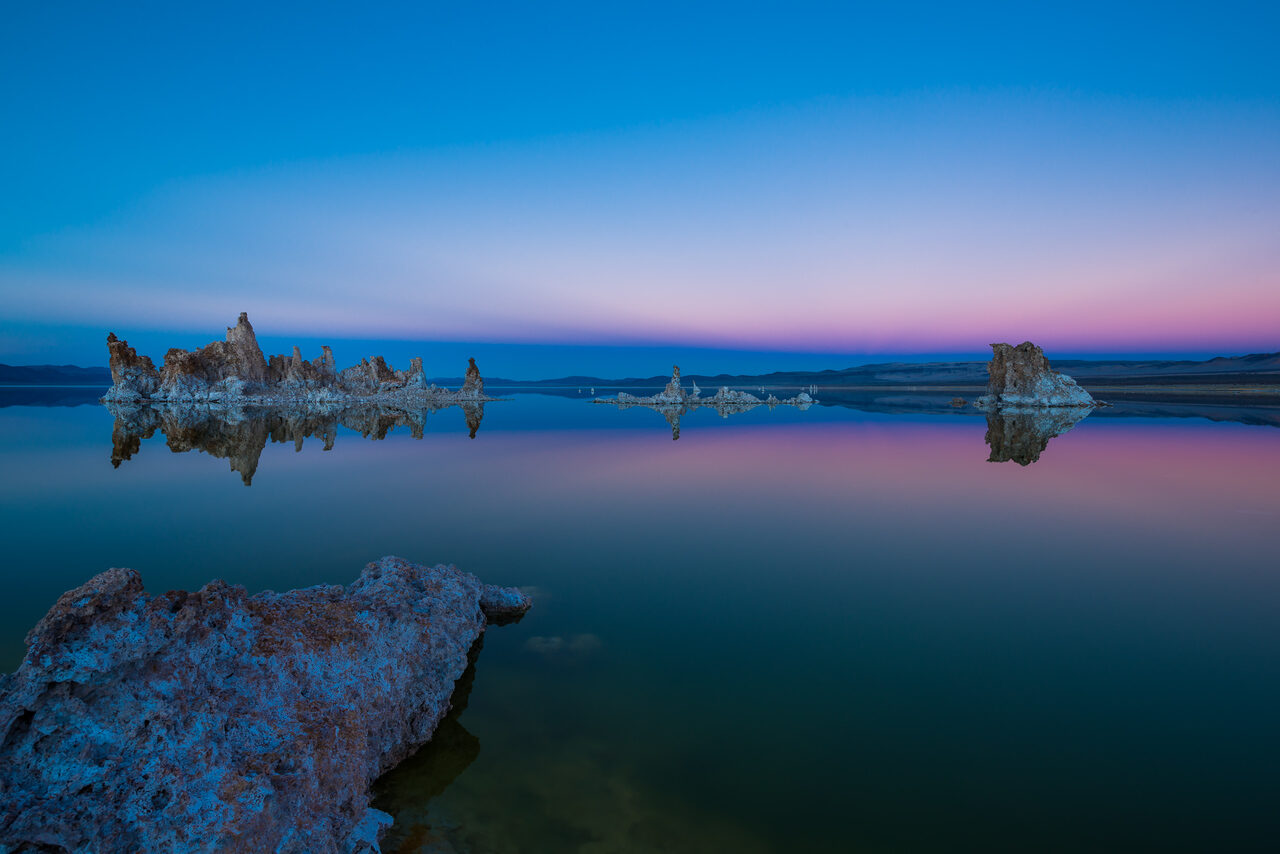
SaveThe Mono Lake collection brings color and stillness together. In this frame, tufa formations sit across calm water, while the sky shifts between blue and pink. The reflection extends the color into the lower half. A foreground shape anchors the image, but the photograph still leaves a large amount of open space.
Notice that the color does not require a busy scene. The picture has room for small changes in tone. The formations provide enough detail to hold the space, while water and sky do much of the emotional work. This is a different route to impact from filling the frame with action or pushing every color to maximum intensity.
Tip: when water reflects the sky, judge the two regions together. Strong edits above the horizon can look disconnected from the reflection below. Keep the relationship believable and check the whole frame after each change. You are building one photograph, not separately polishing a sky, lake, and foreground until they no longer belong together.
For a wall, a quiet color photograph can bring a place into the room without turning it into a theme park. Look for the palette you want to spend time with, then check the composition behind it. If the image only works because one color matches your sofa, it may not hold your attention when the room changes. Choose a photograph whose structure you enjoy as well.
How to choose a fine art photograph for your wall
Begin with the image, not the empty rectangle above the furniture. Find the photograph you want to return to, then ask how it can fit the room. What draws you in? Is it an open horizon, a warm band of light, the rhythm of a city, or the movement of a rock face? A clear answer helps narrow the choice without reducing art to decoration.
Next, measure the actual space. Mark the approximate outer dimensions with a reversible method that will not damage the wall. Include the frame or mounting border if you plan to use one. Stand back at your normal viewing distance. A size that looks generous in a product menu can feel small across a large room, while a large print can crowd a narrow wall.
Consider orientation and crop. A horizontal scene and a vertical subject occupy space differently. Do not assume every available size preserves the same shape. Ask about the image area and any cropping when choosing dimensions. Important edges, reflections, and breathing room are part of the composition. A trim that removes them can change the photograph you thought you were buying.
Finally, check the light. Look at the wall in the morning, afternoon, and evening if possible. Notice direct sunlight and glare from nearby fixtures. Ask the gallery about suitable display and care for the exact print and framing option. A thoughtful placement protects the work and makes it easier to enjoy, instead of turning the chosen photograph into a surface full of reflections.
Print questions worth asking before ordering
The gallery is the place to check current print options for the photograph you want. Do not assume that a size, surface, edition type, frame, or price applies to every image. Product choices can differ. Check the specific work and confirm the finished dimensions, what is included, and how it will arrive before you commit.
If you are interested in a limited edition, ask about the edition for that exact photograph and size. Understand what is counted, whether documentation is included, and how the gallery describes the edition. A limited edition is not a promise that an artwork will rise in value. Buy a photograph because you want it, and treat any market prediction with care.
If you are comparing materials or framing, ask how the options change surface appearance, handling, and display. There is no need to pretend that every room or photograph wants the same finish. Tell the gallery where the work will hang and what kind of light the space receives. Useful details lead to a better conversation than simply asking for the most expensive version.
You can explore the current print collection or contact the gallery with the image and dimensions you have in mind. Keep the decision concrete: this photograph, this wall, this finished size, these print details. That is how a beautiful image becomes a considered choice rather than a rushed purchase.
Build a body of work instead of chasing isolated hits
For photographers, the gallery is also a reminder that a body of work has relationships. One image may rely on geometry, another on tone, another on a quiet palette. They can still belong to the same practice when the selection feels deliberate. You do not need to use one preset on every photograph to create consistency.
Review your archive with a small set of questions. Which frames hold up without a long explanation? Which subjects keep drawing you back? What do you include too often, and what are you missing? A tighter edit can make the work stronger. Keeping ten almost-identical pictures may show effort, but it does not always help someone understand your point of view.
Make a small test print of an important image before treating the screen version as finished. Look at the tonal relationships, the crop, and the way the picture reads from a distance. Keep notes on what you want to change. The print gives you another way to see the photograph, not simply a final box to tick after editing.
Useful gear supports the work; it does not define it
Start with equipment you can control and files you can keep safe. A more expensive camera does not create a point of view, and a full editing toolbox does not tell you when to stop. For a growing fine-art archive, dependable file storage is a practical investment because it lets you revisit the source images and develop a coherent collection over time.
Keep learning, and keep looking
If you want to build the skills behind a more intentional photograph, explore the Shut Your Aperture Academy. Work on composition, exposure, and editing decisions so the tools serve the image. Then spend time with real photographs, including prints, and notice what makes you stay. Technical control and visual attention belong together.
And if you want to bring one of my photographs into your space, begin at Edin Fine Art. Browse the collections, compare the images, and choose the one you want to live with. The gallery is the destination; the room and the relationship you build with the photograph are the point.
Fine art photography FAQ
Where can I see Edin Chavez’s fine art photography?
Browse EdinFineArt.com for public galleries, selected work, print options, and gallery contact information. The collections include landscapes, seascapes, city scenes, and travel photographs.
What makes a photograph fine art?
In this article, fine art photography means work selected and presented for its visual and expressive purpose. Framing, light, color, timing, and presentation create a way of seeing beyond a simple record of the subject.
How do I choose a print size for my room?
Measure the wall and consider normal viewing distance, orientation, framing, and any cropping. Confirm the finished outer dimensions and image area with the gallery before ordering.
Are all photographs available in the same edition and finish?
Do not assume that one option applies to every image. Check the current choices for the specific work and ask the gallery about edition details, materials, framing, shipping, and care.
Can I learn fine art photography with the camera I already own?
Yes. Begin with composition, light, editing judgment, and a deliberate selection of your work. Equipment can support the process, but it does not replace visual attention or a clear point of view.
Photographs and collection links: the public Edin Fine Art galleries. Confirm current print, edition, framing, and shipping details for the specific work with the gallery.