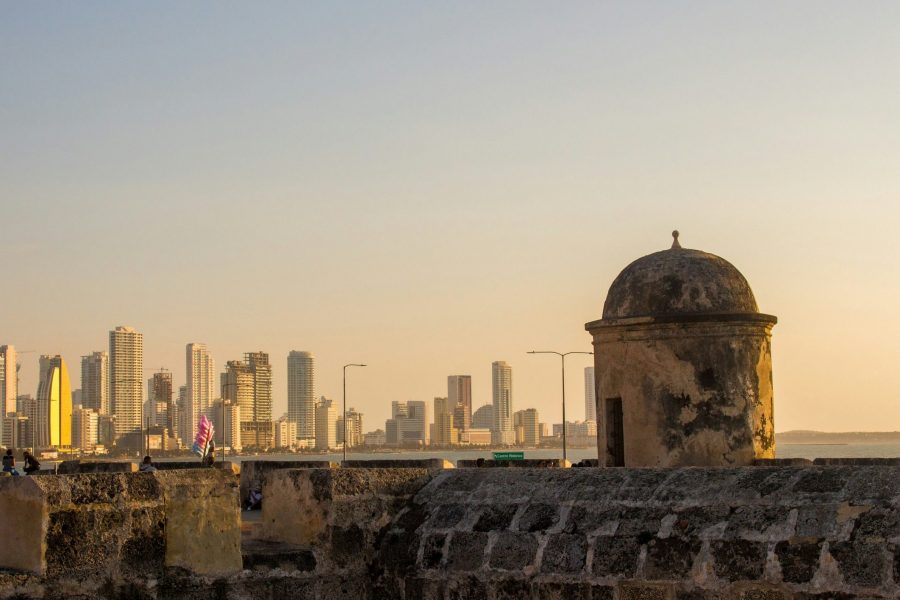
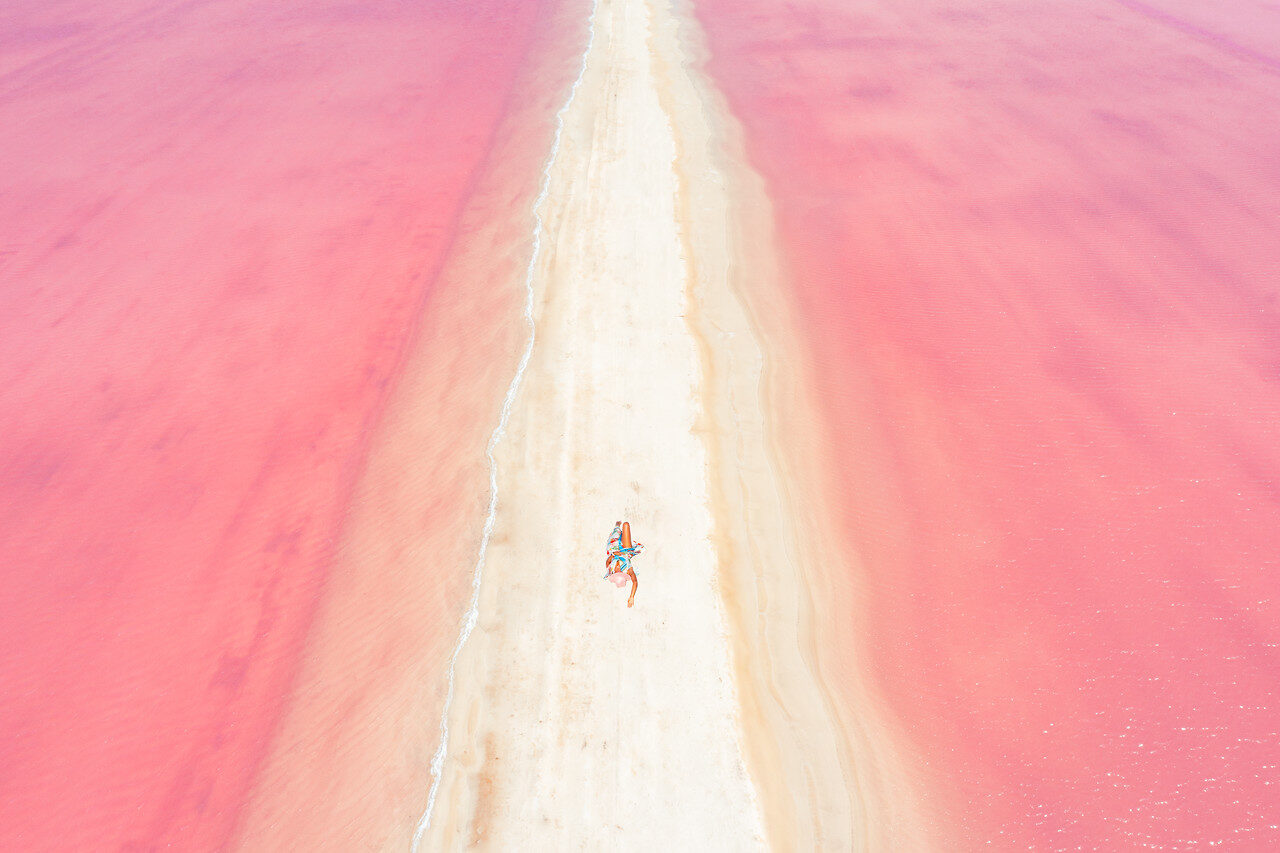
Fine art photography starts before you touch a slider. It starts with a reason to make the picture. A place can be beautiful and the photograph can still say nothing. The light can be wild, the camera can be expensive, and the file can be sharp enough to count every leaf. None of that tells the viewer why you stopped.
I want a photograph to hold your attention after the first hit of color. That means making decisions all the way through: what belongs in the frame, what you leave out, which image survives the edit, and how the finished print feels away from a glowing screen. This guide walks through that process. You can see my photographs together in the Edin Chavez Favorites gallery, then use the same questions to look harder at your own work.
What makes fine art photography different?
For this workflow, think of fine art photography as a photograph shaped by an intention, rather than a photograph made only to record what was there. That is a working approach, not a rule that excludes documentary pictures, portraits, or landscapes. A photograph can describe a real place and still carry a personal point of view. The difference is in the choices and the finished work, not the category on the website.
Do not get stuck trying to prove that your photograph is art before you make it. Give yourself a specific problem instead. Maybe you want a city to feel quiet. Maybe you want a broad landscape to feel enclosed. Maybe color itself is the subject. Write one sentence that names the feeling or relationship you want to explore. You can change it later, but it gives your decisions somewhere to go.
A dramatic edit is not an intention. Neither is a famous location. If you photograph the same landmark as everyone else, ask what changes in your version. Is the subject the building, the people around it, the distance between them, or the small patch of light that makes the scene feel different? Your answer should affect where you stand and when you press the shutter.
Start with one idea you can actually photograph
Make the idea small enough to finish. “The beauty of the world” is too broad to help you choose a frame. “Warm light against a cold city” gives you something to look for. “A person made small by a landscape” gives you a relationship to build. A clear idea does not make the photograph easy. It makes it easier to tell whether the photograph belongs.
Try writing three short notes before a shoot: the subject, the feeling, and the visual tool. Subject might be a shoreline. Feeling might be isolation. Tool might be a low horizon and a large area of empty sky. That is a starting point, not a contract. If the weather gives you something better, use it. The point is to arrive with attention rather than a shopping list of landmarks.
Keep access and safety separate from the creative idea. A frame that would look better from a closed area is still a frame you cannot make there. Do not climb barriers or approach wildlife to fix a composition. Work with the place you can legally and safely reach. Constraints often force a cleaner decision than another hour searching for a perfect viewpoint.
Use light to support the idea, not replace it
Light changes the relationships inside a picture. A hard edge can become the subject. A shadow can remove an area you do not need. A quiet sky can let the foreground speak. Before you change exposure, look at what the light is doing to the shapes. Does it strengthen the idea you wrote down, or are you only reacting because the color is exciting?
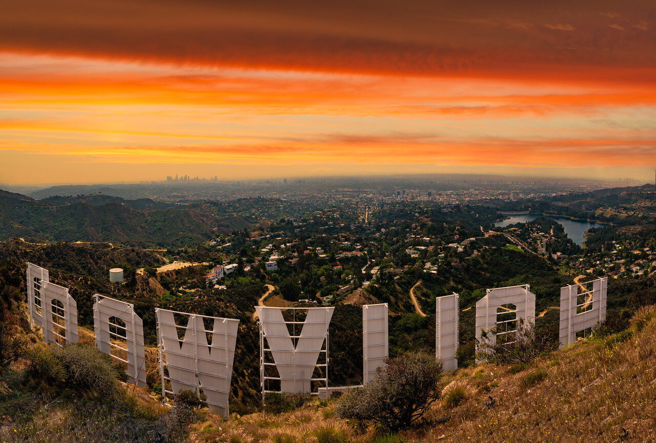
In this Hollywood photograph, the warm band of sky is set against the darker hills and the large letters in the foreground. You do not need the capture settings to read that relationship. Start there when studying an image: where does the eye go, where does it pause, and what makes it move again? The picture can teach a visual decision without pretending to be a gear test.
 Save
SaveMake a few frames that solve the scene differently. Try a wider view, a tighter view, and a version with less foreground. Do not make fifty nearly identical pictures because you are afraid to choose. Give yourself options with a real difference. Then review whether the light is carrying the subject or competing with it.
Fog makes that light-and-shape question especially clear. These two photographs from my Miami Fog gallery use a limited set of tones while leaving the buildings recognizable. Compare how much weight each tower carries and how the fog removes competing detail. Do not assume the same settings would make a different morning look like either photograph.
 Save
Save Save
SaveCompose around a relationship
Composition is more useful when it describes a relationship than when it names a rule. Think bright against dark, small against large, curved against straight, or still against busy. Those relationships give the viewer a way into the picture. A grid overlay can help organize the frame, but it cannot decide which relationship matters.
Look around the edges before you finish. A bright corner, a half-cut shape, or a line that exits awkwardly can pull attention away from the subject. Move your position before relying on a crop. Sometimes a small shift changes the overlap between two forms and makes the entire frame easier to read. Our fine art gallery introduction studies several different ways of organizing attention in my work.
Leave room for something quiet. Every part of the frame does not need detail. A blank area can make the detailed part feel stronger. It can also give a print room to breathe. If you are deciding between two compositions, ask which one makes the idea clearer, not which one contains more of the location.
Look at these three views in the Seven Mile Bridge gallery. The long line is consistent, but the angle, horizon and amount of water change its weight. Study those choices before you study equipment. There is no need to invent a flight story or a capture recipe to see why the lines work.
 Save
Save Save
Save Save
SaveMake color and black-and-white versions for a reason
Color can be structure. In the Santorini photograph, warm lights and the sunset sky sit against cooler buildings and water. Removing that contrast would change the way the image works. Before converting a photograph to black and white, ask what color is contributing. If it connects the important parts of the frame, it may be worth keeping.
 Save
SaveBlack and white can make another relationship clearer: shape, texture, distance, or the weight of a dark area against a light one. It is not a repair button for a weak photograph. If the frame lacks a subject in color, desaturating it does not automatically create one. Make the conversion, compare it honestly, and keep the version that serves the idea.
The monochrome Hollywood view below has a different emphasis from the color frame earlier. The sign, hillside texture, and layered distance carry more of the picture. These are portfolio examples, not a before-and-after pair or a claim about the editing steps used to make either file.
 Save
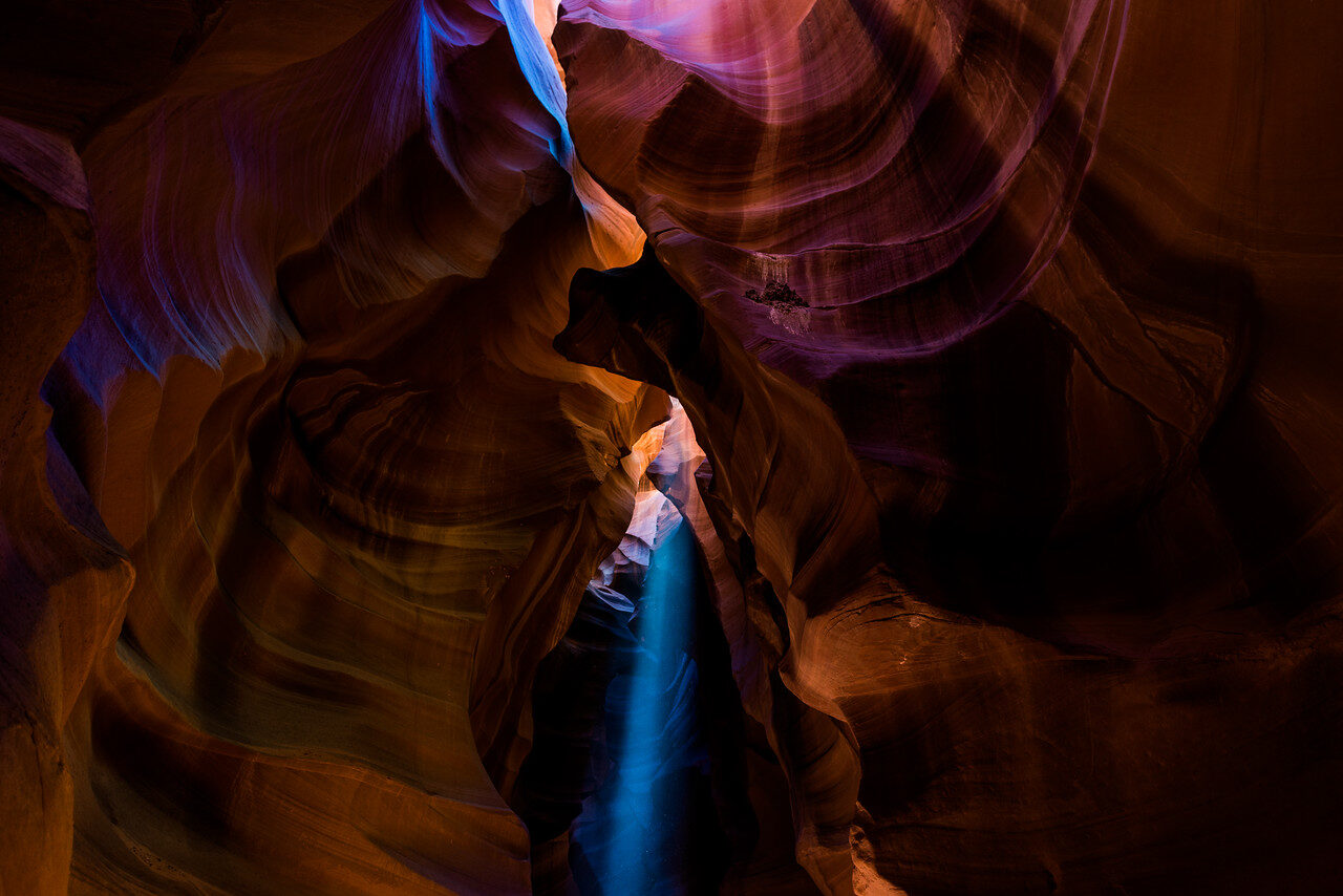
SaveThe sandstone photographs in my Antelope Canyon gallery give another way to study that choice. In color, warm and cool areas organize the frame. In monochrome, curves and tonal separation carry it. The three files below are separate photographs, not evidence of a single before-and-after conversion. Let the actual frame decide.
 Save
Save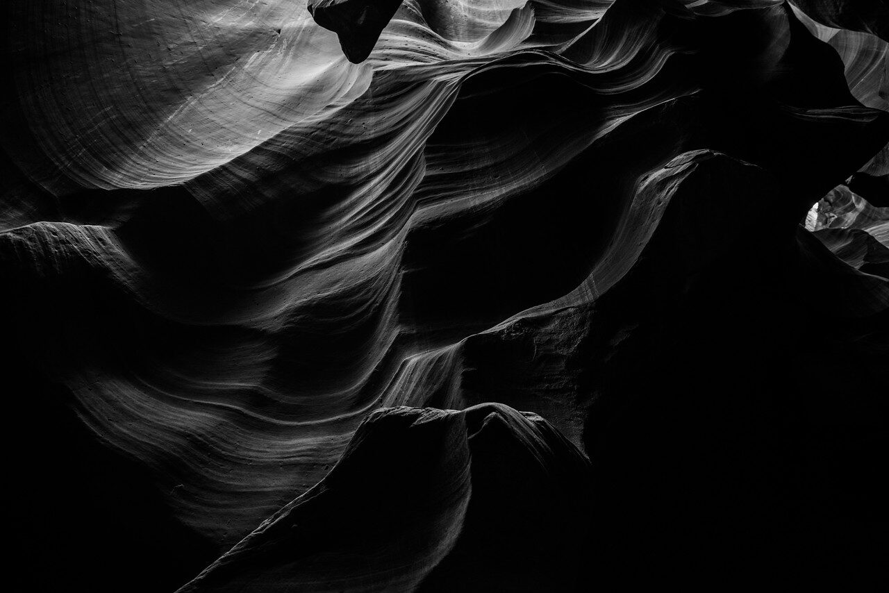 Save
Save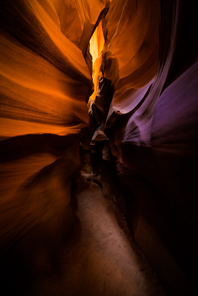 Save
SaveSelect the photograph before polishing it
Editing begins with choosing, not with exposure correction. Put your strongest candidates next to one another at the same viewing size. Ask which image has the clearest center of attention. Ask which one still works when the thumbnail is small. Then inspect the details that matter: focus on the subject, motion that helps or hurts, clipped areas you need, and distractions you missed in the field.
Do not let the hardest photograph to make win automatically. The climb, the wait, and the early alarm are part of your experience, but the viewer does not receive them with the print. Judge what is in the frame. A simple image made close to home can be more convincing than a complicated image from a trip you spent months planning.
For a small series, try selecting five photographs and writing one sentence about what connects them. Then remove the weakest one. If the series becomes stronger, keep it out. If an image needs a long explanation to fit, it may belong in another project. A consistent series does not require the same subject in every frame; it needs a reason for the images to share space.
A pair can also carry a relationship without making every picture look alike. These two Cuba gallery photographs use classic cars in different ways: one anchors a street reflection, the other sits inside a wider waterfront scene. Ask whether the subject repeats for a reason or whether you are only keeping both because you like the cars.
 Save
Save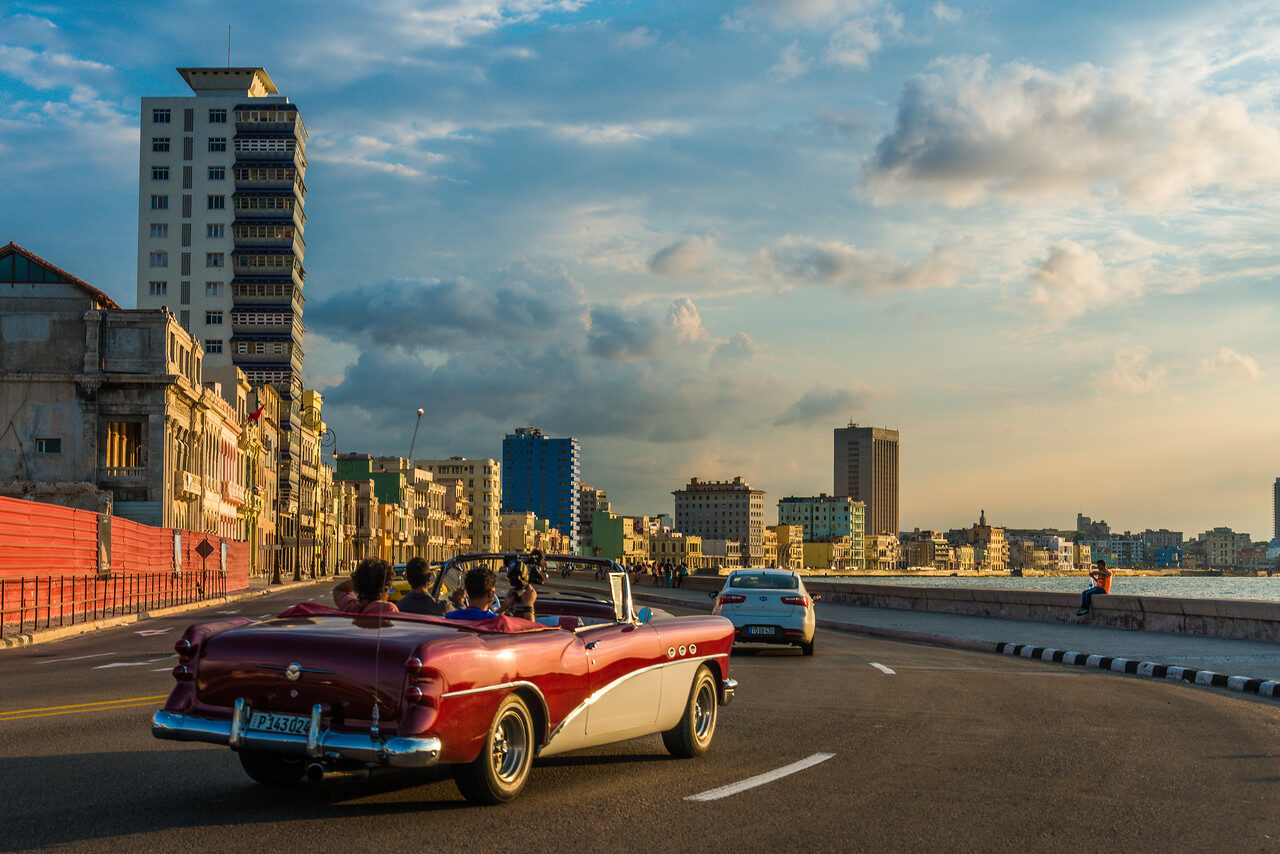 Save
SaveEdit in an order that keeps you honest
Work from broad decisions toward small ones. Establish the crop and overall balance first. Correct a color cast if it fights your intention. Set the main tonal relationships, then use local adjustments to guide attention. Leave sharpening and output decisions until you know where the image is going. This is a practical order, not a fixed recipe that every editor must follow.
Compare with the original often. It is easy to adapt to an edit and keep pushing it because yesterday’s change no longer feels strong. Look for bright outlines, muddy dark areas, uneven skies, strange color transitions and repeated retouching patterns. Step away and return before calling it finished. An image can be expressive without making every surface look aggressively processed.
For a separate editing example, see how to make colors come to life in Photoshop. Keep the color choices tied to the photograph rather than treating stronger color as the goal.
Keep an editable master and your source files. Make output versions separately so a web crop or print-specific adjustment does not erase the version you may need later. Name files in a way that tells you the project and output purpose. A folder full of “final-final” versions is not a system you can trust when someone asks for a different size.
Get the screen and the print into the same conversation
A screen emits light. Paper does not. That alone should make you cautious about promising an exact match. A bright display can make a file look lively while hiding how dark the eventual print feels. Display calibration and profiling help make the screen a more dependable reference, but they are not a guarantee that every paper, printer and viewing light will look identical. If you are researching a calibration device, the Calibrite Display Pro HL at B&H is one option to check against your display and software.
Adobe’s Lightroom Classic Develop documentation describes soft proofing as a way to preview output and reduce surprising tone and color shifts. In Lightroom Classic, use the Soft Proofing controls, choose the relevant output profile, and inspect the display and output gamut warnings. Use a profile appropriate to the actual printer and paper or the lab’s specified process, not a random profile because its preview looks good.
Adobe also describes Create Proof Copy, which makes a virtual copy you can adjust for that output. Simulate Paper & Ink is available with some profiles, not every profile. Treat the simulation as information for a decision, not as a replacement for a physical proof. If the intended output changes, revisit the proofing setup rather than assuming one set of adjustments serves every finish.
Order a proof before committing to a large print
A physical proof answers questions that a screenshot cannot. Look at the detail you care about, the darkest useful areas, the transitions in a smooth sky and the color relationships. View it in the kind of light where the final print will live. A photograph can feel different under warm room light than it does beside a bright window.
Do not choose a paper only because a name sounds expensive. Compare the surface, contrast, reflections and feel against the photograph. Ask the lab what file, color profile, dimensions and sharpening they require. Follow the lab’s actual instructions. There is no single export preset that makes every image correct for every paper and size.
The Panama image is a useful reminder that shape matters too. A tall picture can feel spacious at one size and awkward in a crop designed for a wide frame. Decide whether the original composition is part of the idea before forcing it into an available frame. If you crop, recheck the balance rather than treating the new edge as a minor detail.
 Save
SaveA simple fine art photography workflow
- Write one sentence about what you want the image to explore.
- Choose a subject and a safe, legal way to photograph it.
- Make different compositions, not only repeated frames.
- Select the strongest image before investing in detailed editing.
- Finish an editable master, comparing with the source along the way.
- Choose the actual output and check the lab’s requirements.
- Soft proof where useful, then inspect a physical proof.
- Keep the source, master and final output versions organized.
For more examples, spend time with the Favorites gallery on Edin Fine Art. Look at one photograph before scrolling to the next. Name its strongest relationship and one thing it leaves out. That is a better exercise than collecting presets and hoping one of them gives you a point of view.
If the editing stage is where your process falls apart, my Complete Lightroom Editing Course at ShutYourAperture Academy offers instruction for building a repeatable workflow and making deliberate color decisions. It is a Lightroom course, not a promise that a preset will turn every photograph into art. Build the skills, then use them to support your own idea.
Fine art photography questions
Do I need an expensive camera for fine art photography?
Start with a camera you can control. A clear idea, deliberate composition and careful selection matter before a gear upgrade. Check that your file quality suits the output you want.
Does fine art photography have to be black and white?
No. Color can carry the idea, while black and white can emphasize shape and tone. Keep the version that makes your intention clearer rather than following a category rule.
How much editing is too much?
There is no universal slider limit. Compare the edit with your intention and source, and inspect for halos, strange color transitions and distracting retouching. Keep an editable master.
Is soft proofing the same as ordering a test print?
No. Soft proofing is an onscreen simulation for a selected output profile. A physical proof shows the actual paper, print and viewing-light result. Use both when the output matters.
Where can I see Edin Chavez fine art photography?
Browse the Favorites gallery on Edin Fine Art and the linked Miami Fog, Seven Mile Bridge, Antelope Canyon and Cuba galleries in this article.
How should I prepare a file for a fine art print?
Choose the actual output first, then follow the lab’s file, color-profile, dimensions and sharpening requirements. Keep the source/master separate and inspect a proof before committing to a large print.
Fine art workflow gear: a more dependable display
The Calibrite Display Pro HL (CCDIS3HL) is a monitor-calibration and profiling device. Calibrite lists support for LCD, mini-LED, OLED and Apple XDR displays. Check the current software, operating-system and display compatibility before buying. It helps you work from a measured display; it does not guarantee an exact match to every paper, printer or room light. This is a researched option, not a claim that I tested it for these photographs.
Affiliate disclosure: I may earn a commission through the Amazon and B&H links at no extra cost to you. As an Amazon Associate, I earn from qualifying purchases. Photographs: Edin Chavez, from the linked Edin Fine Art galleries. The photographs illustrate visual choices; they are not before-and-after editing tests or gear tests. Workflow advice is editorial; software and device details were checked against Adobe and Calibrite documentation. No paper, shipping, edition, price or longevity promise is made here.