Original date June 11, 2015. Updated November 2026.
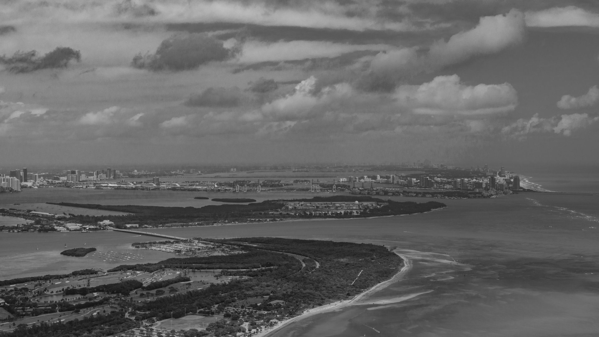
Black and white suits a city skyline. Color can distract from shape, and a busy scene of glass, concrete, clouds and light often looks cleaner and stronger once the color is gone. In June 2015 I made a black and white image of the Miami skyline in Adobe Lightroom and offered the preset for it free on this site. This page is a guide to the thinking behind that kind of edit, with Miami frames of my own to show what a city offers a photographer, in color and in monochrome.
The free preset for that picture is available from its product page on this site, Miami Cityscape B&W Preset. It is a Lightroom Develop preset in a ZIP file, made in 2015 for the Lightroom of that time. A preset built for one picture is only a starting point for another, and the advice below works with it or without it.
Why Convert a Cityscape to Black and White
A skyline photograph usually contains many competing colors. Signs, lit windows, a colored sky and reflections in water all pull the eye in different directions. When you remove color, the viewer sees shape, line, contrast and texture. The tall towers become simple forms against the sky, and moving clouds become a graphic element instead of a backdrop.
Black and white also hides problems. A mixed color cast from different kinds of lighting, a dull sky or a distracting neon sign can all be calmed by the conversion. That is not an excuse for a weak picture, but it is a useful way to rescue a frame that has a good shape and poor color.
Not every city scene works in monochrome. Pictures that depend on color, such as a sunset over a harbor or a row of brightly painted buildings, may lose their point. The best candidates have strong shapes, clear tonal range and some drama in the sky.
 Save
Choosing the Right Photograph
Start with the picture, not the filter. Look for a frame with a clear subject, a good sense of depth and a range of tones from dark shadow to bright highlight. A flat, gray scene will still be flat in black and white. A scene with bright clouds, dark glass and a clean horizon has plenty to work with.
Long exposures are a good match for city monochrome. When the camera is on a tripod and the shutter stays open for seconds or minutes, clouds stretch into streaks and water goes smooth. In a black and white edit those streaks become soft lines that lead the eye across the picture. If you are new to the technique, our night photography guide covers the basics of long exposures and low-light settings.
Shoot in raw if your camera allows it. A raw file keeps the full range of tones, which gives you more room when you convert and adjust. It also lets you choose the conversion later, so you can try more than one version of the same picture.
Converting in Lightroom
Lightroom has a Black and White option in the Basic panel and a Black and White Mix section where you can control how each color is turned into a gray tone. These menus and names can change between versions, so look for the equivalent in the version you use. The general approach is the same in any editor.
Start from a neutral base
Before you convert, correct the exposure and white balance. A picture that is too dark or has an odd color cast will give you a muddy result. Set the black and white points so the darkest areas are truly dark and the brightest areas are bright without losing detail.
Use the color sliders as tone controls
In a black and white conversion, each color slider controls the brightness of the areas that were that color in the original. Blue areas, such as the sky, become darker if you lower the blue slider, which makes clouds stand out. Orange and yellow tones in a building become brighter if you raise those sliders. Move them one at a time and watch the picture, not the numbers.
Shape the contrast
Black and white pictures usually need more contrast than their color versions. Use the contrast control, a tone curve or the separate highlight and shadow controls to add depth. Add contrast gradually, and watch for pure white or black areas that lose detail. A gentle S-shaped curve is a classic way to add punch without crushing the picture.
Work on the sky separately
The sky is often the most important part of a cityscape in monochrome. A graduated filter or a brush lets you darken the sky or lighten parts of the clouds without changing the buildings. Keep the changes smooth so the picture does not look artificial. If you use a long exposure, the sky usually already has a lot of motion, and a small adjustment is enough.
Add finishing touches
A small amount of sharpening brings out the edges of buildings. A light vignette can pull attention toward the center. Grain is a matter of taste. A small amount can add a classic look, but too much can hide the clean lines that make a city picture work. Keep the changes modest and look at the picture at full size before you finish.
 Save
Using a Preset Wisely
A preset applies a stored set of settings to your picture in one click. That makes it a quick way to see a style and a good way to learn what the settings do. It is also a starting point and not a finished edit. A preset made for one picture is built around the light, the contrast and the tones of that picture. When you apply it to a different one, you should expect to adjust the exposure, the highlights and the shadows.
After you apply a preset, open the panels and look at what it changed. That is one of the best ways to learn. If you like a result, save your own version of the preset with a new name, so you keep the original and have a version tuned to your style. Keep notes about which changes you made and why.
A preset should never replace judgment. If the picture looks wrong, change it. The goal is a good photograph, not a faithful copy of a setting.
Seeing Miami in Color First
The frames on this page are my own Miami pictures. They show what a city gives you before you decide whether to use color or black and white. Most of the photographs on this page are in color, the lead picture is in black and white, and each has a different kind of strength.
Light on the water
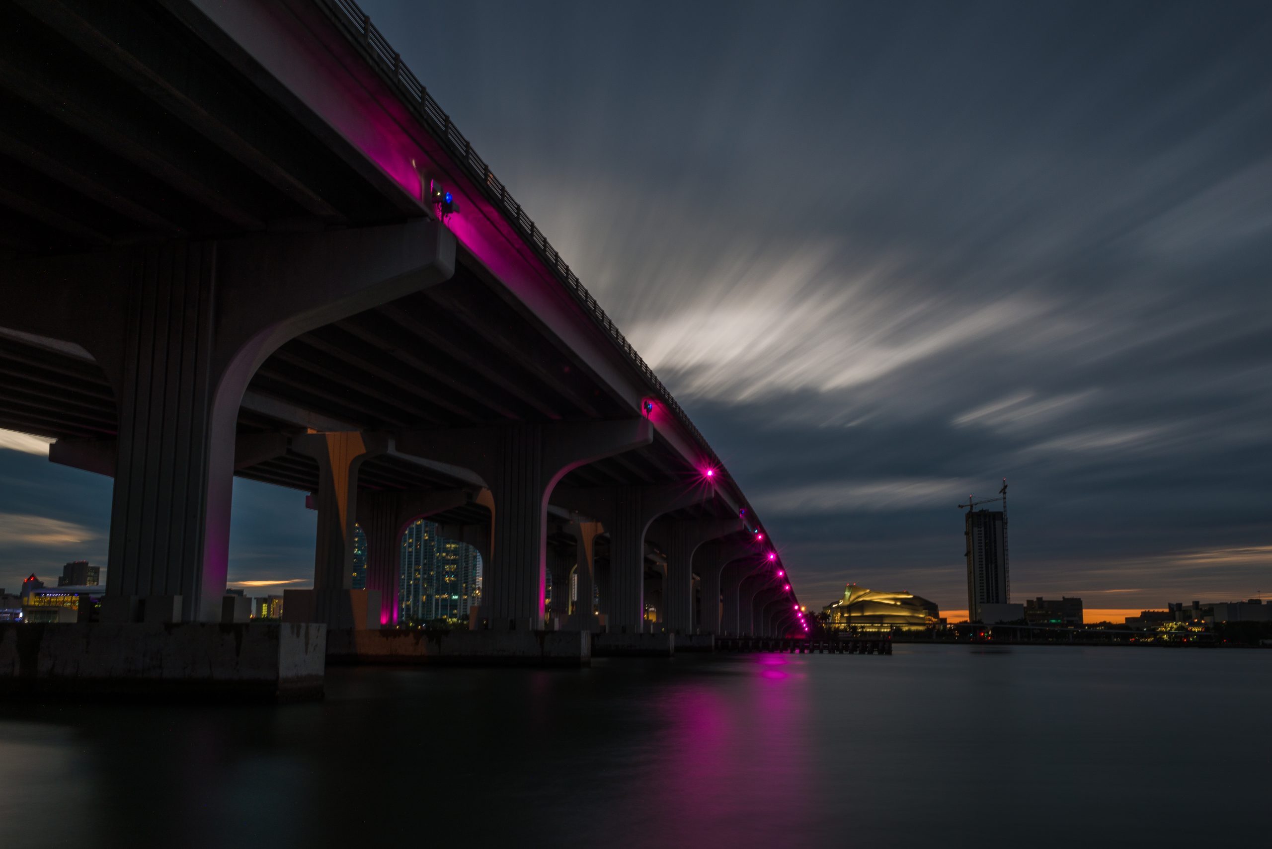
A bridge or a causeway at dusk, with colored light on the water, is a color picture. The magenta glow on the water in one of the frames below is the point of the image, and you would lose it in black and white. Still, the shape of the bridge and the streaks in the sky would make a strong monochrome version, and it is worth trying both.
Distance and atmosphere
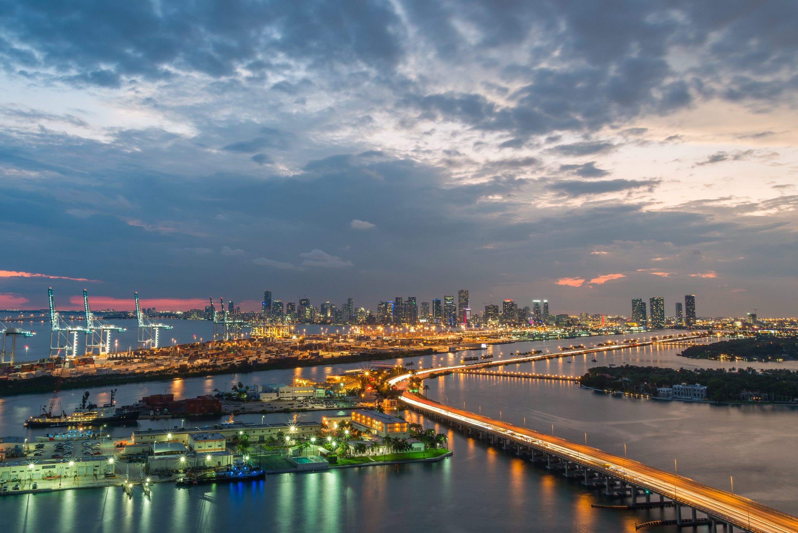
A wide view of a port and a skyline at dusk is a good example of a picture that needs color. The warm sky and the cool water set the mood. A black and white version would put more weight on the lines of the causeway and the clouds.
Looking up
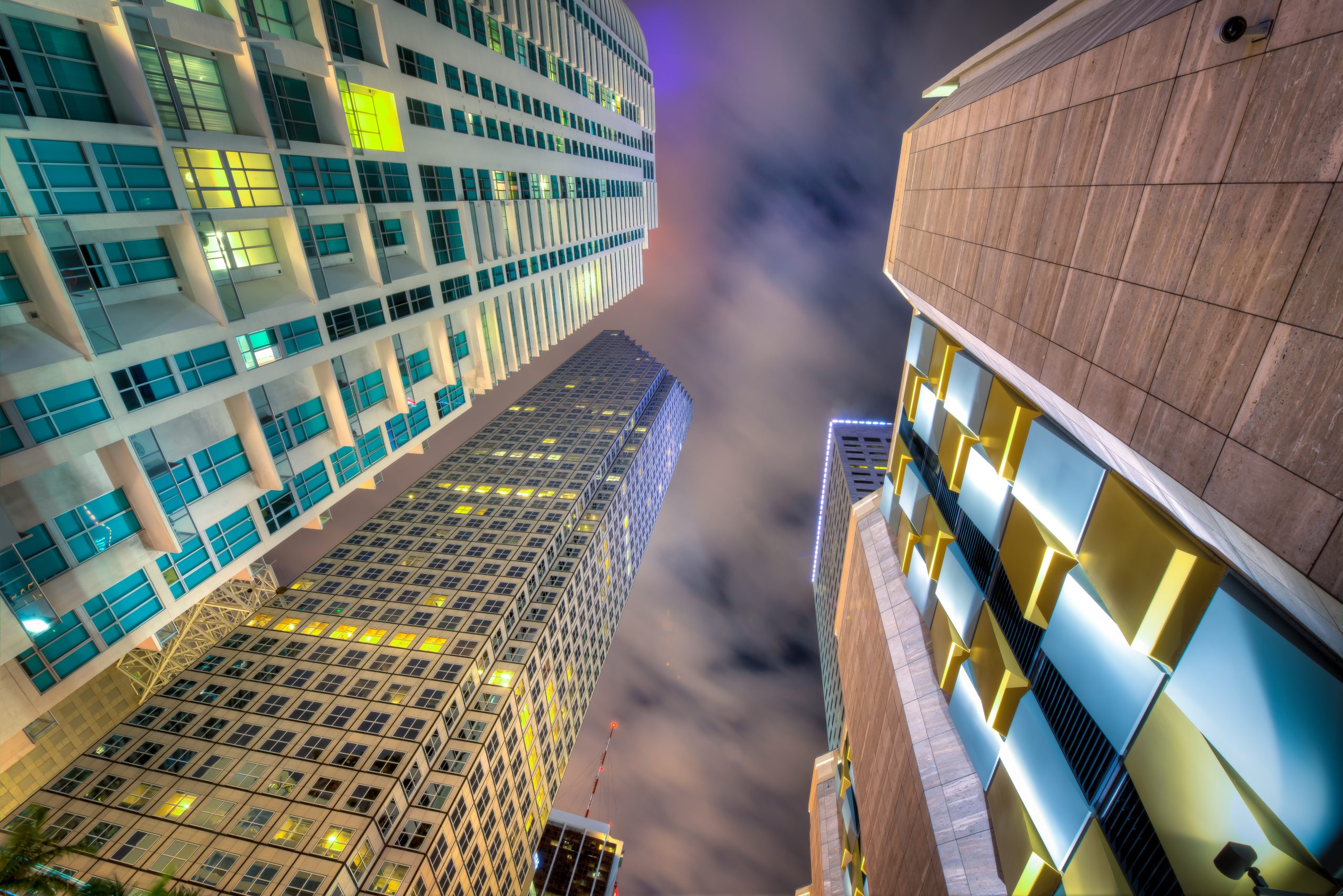
A picture taken by looking up between towers gives you converging lines and a small piece of sky. In color, the windows and the glass add interest. In black and white, the pattern of the building faces becomes the main subject. This is one of the best kinds of frames for a conversion, because it depends on lines and tone.
Seen from above
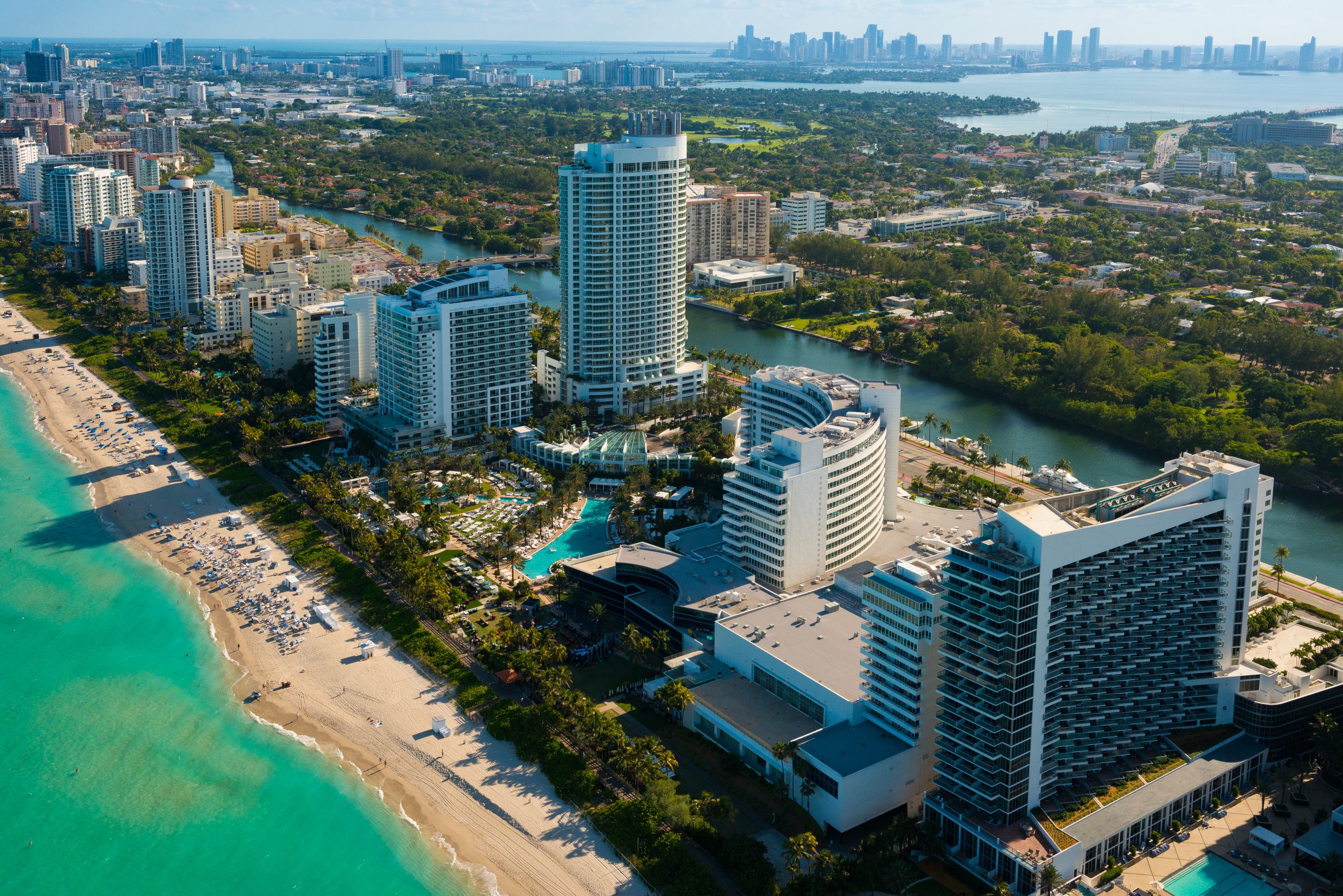
A high viewpoint turns a city into a pattern. In the aerial frame below, the shoreline, the towers and the water make bands of color that would turn into bands of tone in black and white. The lead picture at the top of this guide shows a similar view in monochrome, and comparing the two kinds of view is a useful exercise. From a height, look for the lines that divide the picture, such as a beach edge, a road or a river, and decide where to place them.
 Save
Composition Ideas for City Skylines
Look for a strong foreground. A rooftop, a road or a stretch of water gives the viewer a way into the picture. A skyline with nothing in front of it can feel flat. A foreground with a line, a curve or a reflection adds depth.
Use the clouds. A sky with movement or drama adds to a black and white picture. Wait for a day with interesting clouds, and use a long exposure to turn their motion into soft lines.
Watch the verticals. Tall buildings can lean when you point the camera up. You can correct this in Lightroom with the transform tools, or you can use the lean as part of the design, as in a picture that looks up between towers. Decide on purpose, and do not leave it to chance.
Keep the horizon level. A tilted horizon is easy to spot in a skyline, and it takes attention away from the picture. Use a level or the grid in your viewfinder, and check again when you edit.
 Save
Separate the Skyline from the Sky
Before pushing the contrast, decide which edge needs to be clearer. A dark tower against a dark cloud can disappear even when the rest of the photograph looks dramatic. Look at the outline of the buildings from left to right. If the skyline runs into the background, try a small local change instead of making the whole picture brighter. The aim is separation, not a glowing border around every roof.
In current Lightroom Classic, local adjustments live in Masking. Adobe lists Sky, Brush and Linear Gradient among the available selections. Use whichever selection fits the area you need to change, then inspect its coverage. An automatic sky selection still needs checking around antennas, cranes and gaps between towers. Show the overlay while checking the selection, then hide it to judge the photograph. Make a small exposure adjustment and compare the edge before and after.
Keep the direction of the light believable. If the left side of a tower is already in shade, brightening that face until it matches the sunlit side can flatten the building. A useful test is to step back and ask where the light appears to come from. If the answer becomes less clear after the adjustment, reduce it. A little separation is usually more convincing than a heavy outline.
Check the Water and the Small Highlights
The water does not need to match the sky. In a Miami cityscape, a smooth bay can give busy buildings room to breathe. Watch what happens to the reflection when you darken the lower part of the frame. If it turns into an empty black strip, bring the adjustment back until the water has a reason to be there. Let the reflection support the skyline rather than compete with it.
Next, look for the small bright things: windows, lamps, boats and thin strips of cloud. View the whole frame first and notice where your eye goes. A bright patch near a corner can pull attention away from the main subject even when it occupies very little space. Try a restrained local adjustment before changing the exposure of the entire frame. Do not erase every bright point; some of them describe the city and its scale.
Then inspect the same areas close up. Look for hard transitions where a mask ends, pale rims along buildings, and patches of water that suddenly lose texture. Toggle the adjustment off and on. If the change announces itself before the scene does, it is probably too strong. This check is about making the edit feel connected, not forcing every surface to hold the same amount of detail.
Make a Final Comparison Before Export
Put the color original and the monochrome version next to each other. Ignore the preset name and ask a simpler question: which version makes the subject easier to read? If the color version has a clear warm sky against cool water, monochrome may remove something useful. If the colors scatter attention across the frame, black and white may bring the picture together. Keep both versions when each says something different.
Check the edit at two sizes. At a fit-to-screen view, judge the balance between the skyline, sky and foreground. At a close view, inspect edges and the areas you adjusted most. A picture can look punchy as a small preview yet feel rough when enlarged. It can also look technically tidy close up but lack a clear subject when you step back. Both checks matter.
Finally, open the exported file rather than assuming the editing preview tells the whole story. Check the crop, horizon and overall brightness at the size you intend to share. Keep a separate copy for that output instead of overwriting your original. Name the version clearly so you can find the color edit, the monochrome edit and the file you actually delivered without guessing later.
Practice Plan
Choose three pictures from your own library: one with strong clouds, one with strong lines and one with a wide range of tones. Convert each to black and white with a basic setting, then adjust the color sliders until the picture looks the way you want. Save each version, and compare them to the color originals. You will find out quickly which kinds of pictures work well and which do not.
Then try a preset on the same pictures. Look at the changes it makes and adjust them. Repeat this on a different picture, and compare the results. Over a few sessions you will develop a feel for the tonal range you like, and you will be able to build your own presets with confidence.
Keep your originals. Make your edits in a way that lets you go back, such as using virtual copies. A black and white version is one way of showing a picture, and the color version may be the better one a year from now.
Final Thoughts
A good black and white cityscape comes from a good frame, a thoughtful conversion and a light touch. A preset can speed things up and teach you, but it is only a starting point. Use the ideas on this page with your own pictures, look at the settings that change, and keep what works. The Miami frames here show what a city offers a photographer, in color and in black and white.
Frequently Asked Questions
Why convert a cityscape to black and white?
Black and white removes color distractions and puts the focus on shape, line, contrast and the sky. It works best on pictures with strong forms and a wide range of tones.
Do I need a preset to make a black and white edit?
No. A preset is a quick starting point, but you can make the same adjustments by hand with the black and white controls, the color sliders and the tone controls.
What is a Lightroom preset?
A preset is a saved set of editing settings that you can apply to a picture in one click. It is a starting point, and you will usually need to adjust it for each photograph.
Should I shoot in raw for black and white?
Raw files keep the full range of tones, which gives you more room to convert and adjust. It also lets you try different conversions later.
What kind of city picture works best in black and white?
Pictures with clear shapes, strong lines, dramatic clouds and a wide tonal range tend to work best. Pictures that depend on color usually do not.
How do I avoid halos around a skyline?
Inspect the sky selection around rooflines, antennas and gaps between towers. Reduce the local adjustment if it creates a bright rim, and compare the edge with the adjustment switched off.
Should I keep the color version as well?
Yes. Keep the original and a separate monochrome edit. Compare both at a whole-image view and close up, then choose the version that makes the subject and mood clearer.
Options for travel and landscape photography, not gear used for these illustrative photographs. No prices listed here – check current pricing and availability at the retailer links.
Affiliate disclosure: this article contains Amazon and B&H affiliate links. If you buy through them we may earn a commission at no extra cost to you.