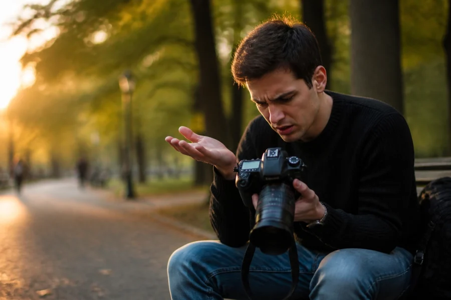
We’ve all been there. You spend all day out in the field, nail the composition, find the perfect light, and come home with a memory card full of potential. You sit down, open your favorite software, maybe you’re using Luminar or Lightroom, and you start sliding those bars. An hour later, you look at the screen and realize the photo looks… well, kind of terrible.
It’s over-processed, the colors look like a radioactive wasteland, and the skin tones resemble a plastic mannequin. Editing is supposed to enhance your vision, not bury it. If you’ve ever felt like your post-processing is doing more harm than good, you aren't alone. Even the pros at Edin Studios had to learn these lessons the hard way.
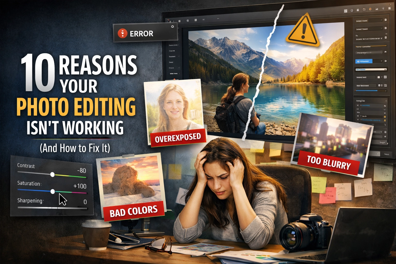
Post-processing is a skill that takes years to master, much like learning manual mode 101. But most of the time, the "bad" results come down to a few very specific, very fixable mistakes. Let’s dive into the 10 reasons your photo editing isn't working and how you can turn things around today.
1. The Neon Grass Syndrome (Oversaturation)
This is the number one mistake beginners make. It’s tempting to crank that saturation slider to 100 because, hey, colors are pretty, right? Wrong. When you over-saturate, you lose all the subtle transitions between tones. Grass turns a neon green that doesn't exist in nature, and the sky becomes a heavy, electric blue that hurts the eyes.
How to fix it: Instead of grabbing the global saturation slider, use the Vibrance slider. Vibrance is "smarter": it boosts the muted colors while leaving the already-saturated ones alone. Better yet, dive into the HSL (Hue, Saturation, Luminance) panel. This allows you to target specific colors. If the greens are flat, just bump the greens. If the sky is dull, just touch the blues.
A pro tip I often share with the team at ProShoot.io is to walk away from your computer for ten minutes. When you come back with fresh eyes, you’ll immediately see if you went too far. If it looks "loud," dial it back.
 Save
Save
2. Relying Too Heavily on Presets
Presets are like salt. A little bit enhances the flavor; too much makes the dish inedible. We love presets because they’re fast. They give you that "one-click" magic that social media loves. But if you just slap a preset on and call it a day, your photos will lack individuality. You’ll end up with a portfolio that looks exactly like everyone else's.
Worse, presets don't account for your specific lighting. A preset designed for a moody sunset will look absolutely horrific on a bright afternoon portrait at the beach.
How to fix it: Treat a preset as a starting point, not the finish line. Once you apply it, go back to your basic adjustments. Tweak the exposure, fix the white balance, and adjust the contrast to fit that specific image. If you’re looking for a consistent style, check out some photography tutorials to learn how to build your own custom look from scratch.
3. The "Crunchy" Look (Over-Sharpening)
We all want sharp photos. But there is a massive difference between a sharp lens and over-sharpening in post. When you push the sharpening slider too far, you start to see "halos" around high-contrast edges: like where a building meets the sky. You also introduce a lot of digital noise into the smooth areas of the photo.
How to fix it: Always view your image at 100% zoom when sharpening. If you see white lines appearing around edges, you’ve gone too far. Use a masking tool to apply sharpening only where it’s needed (like the eyes in a portrait or the textures in a landscape) while leaving the sky and skin alone. If you're using Luminar, their AI-driven sharpening tools are great at identifying where detail is actually needed without adding that unwanted "crunch."
4. The "Uncanny Valley" (Over-Smoothing Skin)
In the quest for "perfect" skin, many editors accidentally turn their subjects into wax figures. If you remove every pore, wrinkle, and natural texture, the human brain recognizes that something is "off." It’s a fast track to making a beautiful portrait look like a creepy CGI character.
How to fix it: Stop using the "clarity" slider in reverse to soften skin. Instead, look into techniques like Frequency Separation or Dodge and Burn. These allow you to fix blemishes and uneven skin tones while keeping the actual texture of the skin intact. If you’re using a brush to smooth skin, keep the opacity low: around 20-30%. You want to reduce the "distractions," not erase the person’s face. For more advanced retouching tips, Shut Your Aperture has some fantastic deep dives.
 Save
Save
5. Awkward Cropping and Composition
You can have the best colors in the world, but if your crop is bad, the photo will feel "off." Common mistakes include cutting people off at the joints (never crop at the knees or elbows!), leaving too much "dead space" above a head, or centering the subject in a way that feels static and boring.
How to fix it: Go back to the basics. Use the Rule of Thirds or the Golden Ratio. Give your subject "room to breathe": if a person is looking to the left, leave more space on the left side of the frame for them to "look into." Don’t be afraid to crop tight to remove distractions, but be intentional about it. If you’re into real estate, check out how cinematic techniques use framing to create a sense of space.
6. Ignoring the White Balance
White balance is the foundation of your edit. If your white balance is off, every other adjustment you make: contrast, color, saturation: will be working against a flawed base. An image that is too "warm" (orange) or too "cool" (blue) can make your subject look sickly or the environment look unnatural.
How to fix it: If you shot in RAW (which you absolutely should be doing), fixing white balance is easy. Use the "eyedropper" tool and click on something in the photo that should be a neutral gray or white. This will instantly snap the colors back into reality. From there, you can add a "creative" tint if you want, but always start from a neutral place. For more on current color trends, see what’s happening in photography trends for 2026.
7. The Heavy-Handed Vignette
Vignetting is a great tool to draw the viewer’s eye toward the center of the frame. However, if the corners of your photo look like they were dipped in black ink, you’ve gone too far. A heavy vignette looks dated and amateurish. It creates a "tunnel" effect that distracts from the actual content of the image.
How to fix it: Subtlety is key. A good vignette is one that the viewer doesn't even realize is there. When applying a vignette, increase the "feathering" to the max so the transition is incredibly smooth. Also, try moving the midpoint further out so the darkening only affects the very edges of the frame. Sometimes, a "white" vignette can work for ethereal imagery, but use it sparingly!
8. Pulling Shadows Up Too Far
Modern cameras have incredible dynamic range. It’s tempting to drag that "Shadows" slider all the way to +100 to see every single detail in the dark areas. But here’s the thing: shadows are important. They provide depth, contrast, and a sense of three-dimensionality. When you remove all the blacks from an image, it looks flat, muddy, and full of digital noise.
How to fix it: Keep your blacks black. Look at the histogram on your screen: if there’s no data on the far left side, your image will lack "punch." Instead of boosting global shadows, use a radial filter to selectively brighten just the subject. This maintains the mood of the scene while still letting the important parts shine. If you want to see how shadows can be used effectively, take a look at the portfolio on Edin Fine Art.
9. The "Waxy" Noise Reduction Look
We all hate grain (noise), especially in low-light shots. But aggressive noise reduction is just as bad as over-sharpening. It smudges the details together until the whole image looks like an oil painting gone wrong. This is particularly noticeable in hair, grass, and fabric.
How to fix it: Don't be afraid of a little grain! A bit of luminance noise is much better than a blurry, waxy mess. When using noise reduction, focus on "Color Noise" first: this gets rid of those ugly purple and green dots. Then, apply "Luminance Noise" reduction very carefully. Usually, a setting between 10-25 is plenty. If you need more help, Edin Chavez's personal blog at blog.edinchavez.com often covers gear and tech that helps minimize noise at the source.
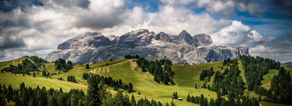
10. The HDR Nightmare
HDR (High Dynamic Range) was the "it" trend for a long time, but it’s easy to overdo. When you push HDR effects too hard, you get "halos" around objects, glowing edges, and a strange "dirty" look to the clouds. It makes a photo look like a video game from 2005. It flattens the depth and makes everything look equally bright, which isn't how the human eye perceives the world.
How to fix it: Aim for a "Natural HDR" look. Use local adjustments to bring back detail in the sky and shadows separately rather than applying a global HDR filter. The goal should be to represent what your eyes saw, not to create a surrealist painting (unless that’s your specific intention). Less is almost always more here.
 Save
Save
Putting it All Together
Editing is a conversation between you and the RAW file. You’re trying to bring out the best version of that moment. If you find yourself struggling, remember that the best edits are often the ones that are barely noticeable.
If you’re feeling overwhelmed, start by focusing on just one of these fixes at a time. Maybe this week you focus on getting your white balance perfect. Next week, you master the art of the subtle vignette.
Photography is a journey, and your editing style will evolve as you grow. Keep experimenting, keep learning, and most importantly, keep shooting. If you want to keep up with everything we’re doing here at Shut Your Aperture, make sure to check out our sitemap for a full list of tutorials and guides to help you on your way.
Editing shouldn't be a chore, and it definitely shouldn't ruin your photos. By avoiding these ten common pitfalls, you’ll be well on your way to creating images that aren't just "fixed" in post, but truly elevated.
Now, go open up Luminar and see what you can create with these new tips in mind! Keep it simple, keep it clean, and don't be afraid to hit that "reset" button if things get a little too crazy. Happy editing!
Skylum’s Luminar Neo runs as a Lightroom plugin and adds AI-powered sky replacement, portrait retouching and noise reduction to your existing workflow. Tagged as affiliate per FTC.