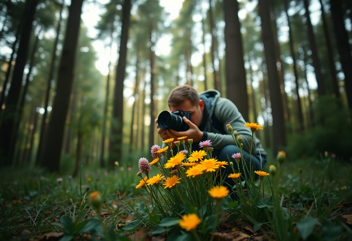
Theory and practice go hand in hand when it comes to photography, especially when considering how color influences visual storytelling. By understanding the fundamentals of color theory, you can elevate your photography, creating images that captivate and communicate emotion. This blog post will guide you through key concepts in color theory, helping you to make intentional choices about color palettes, contrasts, and harmonies that draw your viewers in and enhance the impact of your work. Discover how to infuse your photography with the vibrancy and emotion that color has to offer.
 Save
Save
The Emotional Impact of Color Combinations
Color combinations can trigger a variety of emotions in your photography, influencing how viewers perceive your images. Warm hues like reds and oranges often evoke feelings of passion and energy, while cooler colors such as blues and greens can bring about calmness and serenity. By deliberately choosing certain color pairings, you can create a specific mood or atmosphere in your photos, allowing your work to resonate on a deeper emotional level. Understanding these emotional implications equips you with the tools to tell more compelling visual stories.
How Colors Evoke Feelings
Each color carries its own set of psychological associations that can shape how viewers feel when looking at your photographs. For instance, yellow can signify happiness, while purple is often linked to luxury and creativity. By using these associations, you can design photographs that not only catch the eye but also elicit specific emotions, unlocking the full potential of your visual storytelling.
The Role of Contrast in Effective Storytelling
Contrast plays a significant role in your photography by highlighting differences between elements to create interest and draw attention. High contrast—such as pairing light and dark colors—can amplify emotions, making scenes feel more dramatic. Conversely, low contrast presents a softer mood, often perceived as peaceful or harmonious. Consider how contrasts in color, tone, and light can enhance your narrative, making important subjects stand out while guiding the viewer’s eye through the composition.
Utilizing contrast effectively can transform an ordinary image into an engaging visual narrative. When you place a bright focal element against a darker background, the subject becomes undeniably prominent, eliciting an emotional response from the viewer. For example, a vibrant red rose against a shadowy green backdrop not only captures attention but also conveys a sense of love and passion. Experimenting with contrasts in color and light can reveal new dimensions in your photography, allowing you to emphasize the stories you want to tell and creating a memorable experience for your audience.
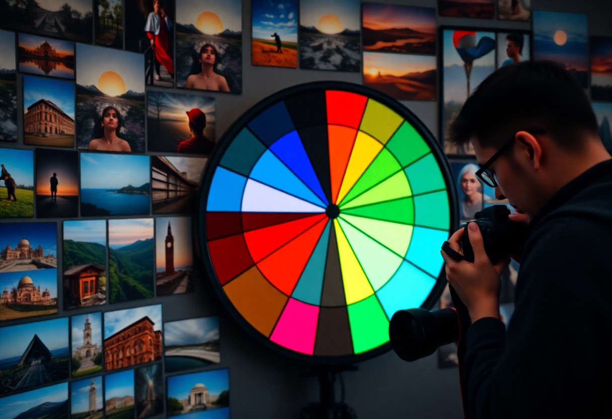
Decoding the Color Wheel: Building Blocks of Composition
The color wheel serves as the foundation for understanding how colors interact and complement one another in your photography. By mastering its structure, you can elevate your compositions, draw attention to focal points, and convey moods effectively. It categorizes colors into primary, secondary, and tertiary groups, highlighting their relationships and offering a framework for selecting color schemes that enhance your visual storytelling.
Primary, Secondary, and Tertiary Relationships
Primary colors—red, blue, and yellow—are the building blocks of the color wheel. Mixing these colors yields secondary colors like green, orange, and purple. Tertiary colors arise from mixing a primary and a secondary color, resulting in shades like red-orange or blue-green. Understanding these relationships allows you to mix and match colors harmoniously and create striking contrasts that can captivate your audience.
Complementary vs. Analogous Color Schemes
Complementary colors sit opposite one another on the color wheel, such as blue and orange, creating striking contrasts that can add drama to your images. In contrast, analogous colors are adjacent on the wheel, like blue, blue-green, and green, offering a more harmonious and visually pleasing palette. Both schemes have unique applications in photography, depending on whether your goal is to evoke energy or tranquility within your compositions.
Choosing between complementary and analogous color schemes hinges on the mood you aim to capture. Complementary palettes generate visual tension, often highlighting subjects and drawing the viewer’s eye directly to important details. Use this technique in dynamic scenes, such as street photography or action shots. Conversely, analogous schemes foster a soothing, cohesive appearance, perfect for landscapes or portraits where you want to invoke calm and connection. Experimenting with both approaches in your work can provide you with a versatile toolkit to enhance your storytelling capabilities through color.
Crafting Visual Narratives Through Color Palette Selection
Color palette selection can change the entire story your photograph tells. By intentionally choosing a palette that resonates with your intended message, you guide your audience’s emotions and perceptions. For instance, using warm hues can evoke feelings of warmth and comfort, whereas cooler tones may convey a sense of calmness or detachment. Experimenting with combinations that reflect your story ensures that each image packs a punch, directing the viewer’s attention to focal points while enriching the overall narrative of your art.
Creating Mood with Monochromatic Schemes
Monochromatic color schemes unify images by using variations of a single hue, enhancing mood consistency. This approach simplifies your composition, allowing the viewer to immerse themselves in emotional subtleties. For example, a series of blue tones in a landscape can evoke tranquility, while a red palette in a portrait might convey passion or intensity. By working within a limited spectrum, you create striking visuals that resonate deeply with your audience.
Leveraging Color Gradients for Depth
Color gradients add a layer of depth to your photographs that can transform flat compositions into dynamic experiences. By blending hues smoothly, you introduce a sense of dimension and visual interest, guiding the viewer’s eye across the scene. This technique can emphasize the foreground, creating a striking contrast with the background or evoke movement through gradual transitions. For instance, a sunset gradient can draw the viewer in, enhancing the emotional impact while framing your subject beautifully.
Implementing color gradients effectively requires an understanding of how colors can blend and interact. Consider a photograph of a mountain range at dusk, where the sky transitions from deep indigo to softer pinks and oranges. Using gradients in your composition can create a natural flow, leading the viewer’s gaze from the silhouetted peaks down to the illuminated landscape below. Such techniques enhance storytelling by evoking time of day, mood, and atmosphere, making your images not just visually appealing but also rich in narrative depth.
Practical Techniques to Enhance Photographic Expression
Elevating your photography through color theory involves applying practical techniques that resonate visually and emotionally. Start by considering color harmony in your compositions; using complementary and analogous colors can evoke certain feelings and dynamic interactions. Experiment with lighting to adjust color perception and mood, such as golden hour for warm tones. Additionally, focus on your subject with contrasting colors in the background, drawing the viewer’s attention where you want it most. These techniques amplify the storytelling aspect of your images by strategically guiding the viewer’s eye and enhancing emotional depth.
Color Correction and Post-Processing Essentials
Effective color correction in post-processing can transform an ordinary image into a compelling visual narrative. Utilizing tools like Adobe Lightroom or Photoshop allows you to adjust hues, saturation, and contrast, ensuring your images reflect the emotion and atmosphere you intend to present. Start by correcting any color casts and adjusting white balance to achieve natural skin tones or vibrant landscapes. Explore the HSL sliders to fine-tune individual colors, enhancing the overall impact of your photograph while staying true to your creative vision.
Tools and Apps for Color Theory Application
Leveraging technology can significantly enhance your application of color theory in photography. Various apps and software exist to simplify your creative process, including Adobe Capture, which identifies color palettes from images, and Color Palette Generator, helping you discover harmonious combinations. Tools such as ColorSnap can assist you in sampling colors from your surroundings to create customized palettes tailored for your shoots. These resources can inspire new ideas, ensuring your color choices complement your subject matter effectively.
By incorporating tools and apps into your workflow, you can streamline your approach to color theory. Experimenting with resources like Canva Color Palette Generator or Coolors lets you generate palettes quickly, while photography-specific platforms, such as 500px, provide a visual database for color inspiration based on trending styles. Harnessing these digital tools not only enhances your creativity but empowers you to make informed decisions, refining your photography through the strategic application of color theory.
The Influence of Cultural Perceptions on Color in Photography
Your photographs can evoke powerful emotions, but the person experiencing your art may interpret color differently based on their cultural background. Various cultures assign distinctive meanings to colors, which can shape the viewer’s emotional response or the overall message of the photograph. For example, while red signifies love and passion in many Western cultures, it may represent luck and prosperity in Eastern traditions. Understanding these nuances allows you to communicate more effectively through your imagery.
Global Perspectives on Color Meaning
Adapting Color Usage for Diverse Audiences
Conclusion
Conclusively, by embracing the principles of color theory, you can elevate your photography to new heights. Understanding the emotional impacts of hues and how they interact allows you to create more compelling and visually stunning images. Experiment with complementary colors, utilize color contrast, and pay attention to the mood you wish to convey. As you refine your skills in color application, you will not only captivate your audience but also express your unique artistic vision through your photography.