
By Edin Chavez
Updated October 2026
Black and white is not a rescue button. If the photograph has no clear idea, removing the color will not give it one. But when the expression, shape, texture, and light are already working, monochrome can cut the noise and make the frame hit harder.
The trick is deciding what color was doing before you take it away. Was it separating skin from clothing? Was it creating warmth? Was a bright object stealing the whole photograph? Those answers tell you whether black and white helps, and what you need to rebuild in tone.
This guide is for adult boudoir photographs you are authorized to edit and use. It focuses on that conversion decision, tonal separation, texture, and a finished export. For the broader foundation, read our black-and-white photography guide. Here, the goal is a boudoir image with a reason to be monochrome, not another folder of randomly desaturated files.
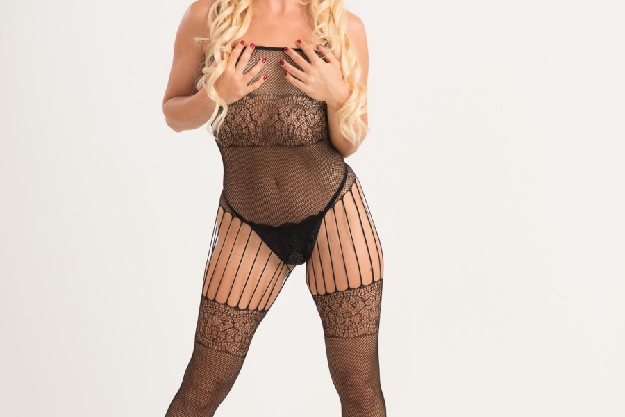
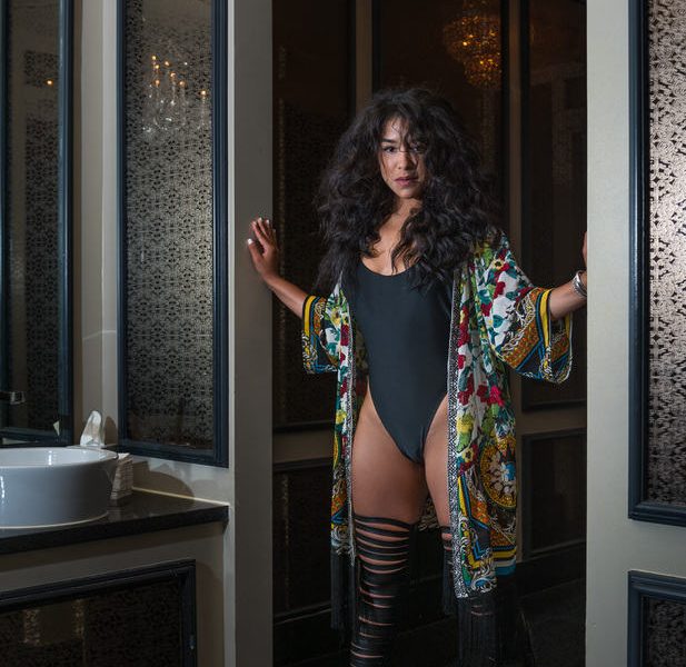
The lead diptych is a color-to-tone decision example, kept whole with its original watermark. It is not a documented black-and-white conversion or a before-and-after comparison.
Ask what the photograph is about
Before touching a slider, say what holds the frame together. An expression? A quiet gesture? The line between lit fabric and a dark background? If you cannot identify the center of attention, start with the composition rather than the conversion.
Color may support that idea. A warm room can feel intimate because of its color relationships. Clothing can separate clearly from skin because the hues differ. Removing color might strengthen the gesture, or it might flatten everything into the same gray.
Compare a restrained color edit with a monochrome version. Do not compare an unfinished color file against a heavily polished black-and-white file and pretend that is a fair test. Give both versions enough attention to show what they can actually do.
Keep the participant’s agreed preferences in the decision. Some people want a color gallery; others want selected monochrome images. A dramatic treatment is still your choice to propose, not a reason to ignore what was requested.
Read the frame as areas of tone
In monochrome, hue no longer does the separating. Look at the face, clothing, bedding, wall, and background as light and dark areas. Where does one merge into the next? Where is the brightest patch? What can you still read at small size?
A small thumbnail is useful here. It strips away details that can distract you during close editing. If the face vanishes into a bright wall, or a white sheet becomes the only thing you notice, the tone structure needs attention.
 Save
SaveDo not assume every surface must be separated by a huge contrast jump. Some photographs work because tones blend gently. The question is whether that blending feels intentional and whether the subject still reads. Subtle is different from muddy.
You are not trying to rank bodies or make skin lighter by default. You are organizing an image. Brighten or darken an area because it supports the photograph, not because one skin tone is supposedly more desirable than another.
Preserve a color starting point
Keep the color original and make a separate working version for monochrome. In Lightroom Classic, a virtual copy can hold a different edit without requiring a second original file. Keep your naming or labeling clear enough that you do not export the wrong version.
Before conversion, correct major exposure and white balance problems. The color starting point helps you understand which surfaces are contributing to the resulting tones. It also gives you a useful comparison when a channel adjustment changes skin or fabric in an unexpected way.
Avoid destructive habits that make the decision hard to reverse. You may discover that a warm color image belongs in the final set even after working on a monochrome version. That is a good decision, not a failure to commit.
For an exercise, choose three authorized images: one where color supports the mood, one where color distracts, and one where similar tones make separation difficult. Work on all three. The point is to learn the decision, not to prove that black and white wins every time.
Choose a conversion, not only zero saturation
In Lightroom Classic, a black-and-white treatment gives you tools for managing the relationship between original colors and resulting gray tones. Adobe documents monochrome profiles and the B&W controls. That is a more useful starting point than blindly pulling saturation down and hoping.
Try a restrained monochrome profile first. Look at how it handles skin, fabric, and deep shadows. Some profiles bring a strong contrast style. If that style damages the expression or destroys detail you care about, choose another starting point instead of spending twenty minutes fighting it.
 Save
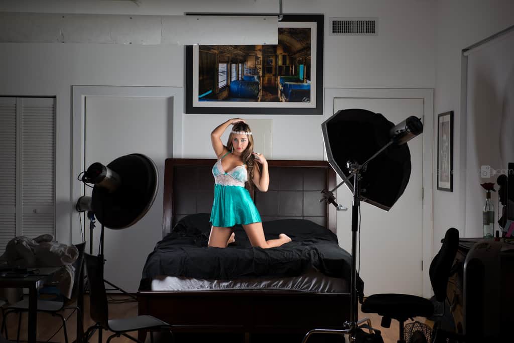
SaveThis studio photograph is a color decision example. Look at the dark equipment, pale room, and bright clothing as separate tonal areas. It is not a before image from a documented conversion test, and no hidden lighting setup or conversion result is claimed.
Once you choose the starting treatment, adjust overall exposure and the broad tonal range. Keep your attention on the photograph. A profile name does not tell you whether its effect belongs in this particular frame.
Use the B&W mix with a specific goal
The B&W mix changes how original color ranges contribute to monochrome tone. That can help separate surfaces that were different in color but become similar in gray. Think of it as a targeted tone relationship, not a collection of sliders you must all move.
Make one small change, then inspect everything it affects. A change aimed at skin may also affect fabric or a wall. A change aimed at clothing may touch another part of the photograph. The color range does not know which object you had in mind.
Watch for uneven patches or exaggerated differences across skin. Large channel moves can make a natural color variation look like a tonal stain. If you need a huge adjustment to fix one small area, a local correction may be a better choice.
Compare at normal viewing size and a close view. Look around lips, cheeks, fabric seams, and places where colors transition. Undo the adjustment when its side effects outweigh the benefit. Separation is useful only when the resulting image still feels believable.
Set your brightest and darkest important details
Decide which details must survive. A highlight on fabric, an eye in shadow, or the shape of a hand may be important. An empty dark corner may not need to show every object that was in the room.
Use the histogram and clipping indicators as information, not as an order to remove all clipping. A small specular highlight is different from a large featureless patch across an important surface. Look at where the loss happens and whether it damages the picture.
Do not drag shadows up until the whole room becomes gray. That can take a photograph with depth and turn it into a flat inventory of surfaces. Equally, do not crush every dark area because the result seems more dramatic for the first five seconds.
A good monochrome edit has a controlled range. It can be soft or bold, but it should not feel accidental. Compare your edit with the starting version. If the only improvement is “darker,” keep working on the relationships rather than the overall intensity.
Keep local contrast away from the skin-smoothing trap
Black and white makes texture visible in a different way. Fine lines, lace, hair, and skin can all become stronger when color is removed. That is often part of the appeal. It does not mean you should sharpen every surface equally.
Texture and Clarity can change the way small and local contrast reads. Use them with restraint. A large positive move may make skin look harsher than intended. A large negative move may remove the delicate transitions that made the light beautiful.
 Save
SaveCheck the entire body of the image, not only the face. A softly treated face beside strongly sharpened arms can look disconnected. Fabric can hold more visible texture than skin without requiring a hard processing boundary between them.
Keep permanent features and agreed retouching preferences in mind. Monochrome conversion is not permission to erase scars, reshape a body, or rewrite someone’s appearance. If additional retouching was not agreed, leave that decision out of the conversion.
Dodge and burn for attention, not anatomy
Small local exposure changes can guide attention. You might reduce a bright corner that competes with the face, or gently open a shadow that hides an important gesture. Name the reason before adding the mask.
Inspect the mask overlay and refine the boundary. Lightroom Classic lets you add to and subtract from selections. Use that control rather than accepting a selection that spills onto bedding, hair, or the wall.
Check for halos after local changes. A glowing outline around a shoulder is a sign to reduce or refine the edit. Look at a smaller view too. Sometimes a correction seems subtle up close but turns into an obvious bright patch when the whole photograph fits on screen.
Do not use dodge and burn as a hidden body-shaping step. Guiding the viewer through the light is one thing. Changing the participant’s apparent proportions without agreement is another. Keep your purpose visible and your intervention modest.
Decide when color should stay
Some photographs are stronger in color. That is worth saying clearly because the easiest way to ruin a good frame is to force it into a style that does not suit it. The warmth of a room or a deliberate clothing color may carry part of the story.
 Save
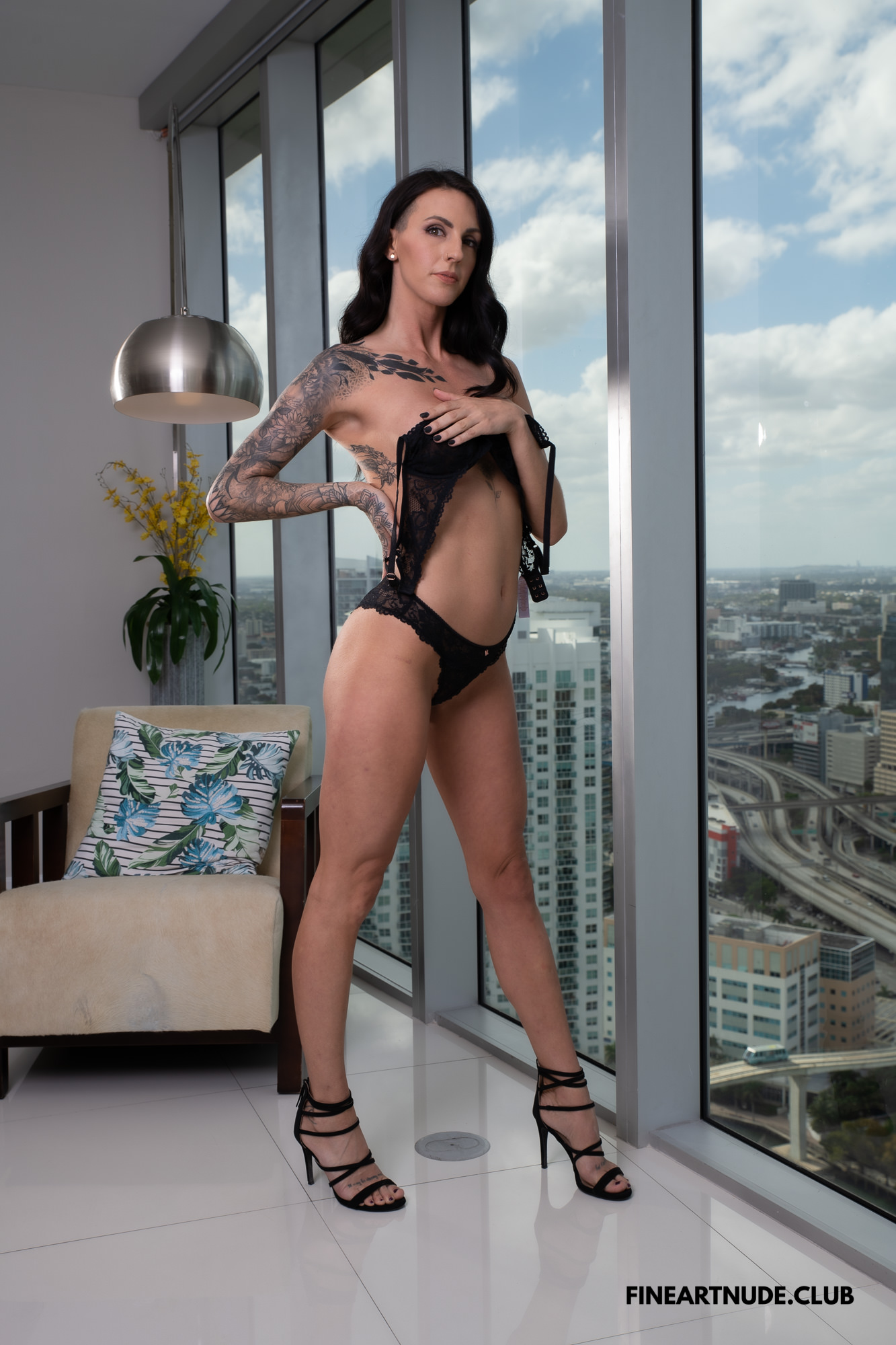
SaveThis window-side color photograph is a decision example, not an invented before-and-after pair. Consider whether the clothing, skin, room, and city view would remain distinct without hue. Removing color may simplify the frame, but tonal separation still needs to carry the person.
If the monochrome version needs aggressive channel changes just to keep the person readable, revisit the color edit. If color is the main distraction but the tone structure is already clear, monochrome may be the cleaner choice.
A final set can contain selected black-and-white photographs without converting everything. Keep the selection deliberate. Repeating every frame in both treatments can make a gallery harder to navigate unless that is what the recipient actually wants.
Match a small monochrome set without making it identical
Choose an anchor image for the style. Decide on the overall contrast, treatment of highlights, and depth of shadows. Those choices can connect the set. But different photographs still need their own exposure and local attention.
Do not copy a B&W mix across every image without checking the underlying colors. Different clothing or a new background can change what the same sliders do. Similar processing values do not guarantee similar results.
View the set together at a useful size. Look for one photograph that is much flatter, one with unusually bright skin, or one with crushed detail that the others retain. Fix the outliers while preserving the differences created by the actual light.
If a color frame belongs beside the monochrome set, give the transition a reason. You might group the monochrome selection separately rather than scattering it randomly. Presentation is part of the edit, and a clear sequence makes the choice feel deliberate.
Inspect the real export, especially for print
Export the finished version and open that file outside Lightroom. Check that the intended treatment, crop, dimensions, and filename are correct. It is surprisingly easy to export a color copy while admiring the monochrome version in the catalog.
For common browser use, a JPEG in sRGB is a practical starting point. A monochrome image may still be delivered in an RGB file. Follow the destination’s requirements rather than assuming every black-and-white file needs a grayscale workflow.
For print, ask the lab about its supported file settings and monochrome process. A printer, paper, and viewing light can change how tones appear. If the result matters, inspect a test print before approving a large order. Do not promise perfect neutral gray from a universal preset.
Keep export sharpening appropriate to the destination. Check fine fabric and hair for crunchy edges. Also inspect metadata and delivery access, because a beautiful conversion is not ready if the wrong identifying information travels with it.
Troubleshooting without wrecking the frame
If skin and bedding merge, first look at the overall exposure and the original colors. Try a small B&W mix adjustment, then a restrained local change if necessary. Do not immediately add heavy contrast everywhere.
If skin looks patchy, reduce large channel moves and review the local masks. The problem may come from your conversion rather than the original photograph. If a mask edge shows, refine the selection and reduce the strength of the correction.
If everything feels gray, choose which highlights and shadows should anchor the image. A flat file often needs clearer tonal priorities, not more of every detail slider. If everything feels harsh, return to a gentler profile and rebuild the range before touching texture.
If color still wins after a fair comparison, keep color. The successful outcome is a better photograph, not loyalty to a treatment.
Questions and answers
Is black and white better for every boudoir photograph?
No. It can simplify distracting color and strengthen tone, gesture, and texture. It can also remove useful separation or warmth. Compare a finished color version with a restrained monochrome version before deciding.
Why does skin look patchy after conversion?
Large B&W mix changes can exaggerate differences in the original color ranges. Reduce those changes, inspect masks, and check at normal and close viewing sizes. Use local correction only when it solves a clear problem.
Should I use one B&W preset across the gallery?
Use it as a starting point for a shared style. Check exposure, color-range effects, and local masks on each image. Different clothing and backgrounds can respond differently to the same settings.
Do I have to export a grayscale file?
No. A monochrome image can be delivered as an RGB file. Follow the gallery or print lab’s requirements for color space, format, size, and sharpening, then inspect the actual export.
Can I brighten skin using the B&W mix?
You can adjust the tones contributed by its original color ranges, but inspect everything affected. The goal is a useful tonal relationship, not automatically lighter skin. Avoid large changes that create patches or erase natural variation.
Recommended tools and next steps
Some links are affiliate links. If you buy through them, we may earn a commission.
Keep your color originals and finished variants organized on reliable storage. The Samsung T7 Shield 1TB at B&H is one storage option for a planned backup workflow. A drive alone does not provide privacy or a complete backup.
For the general editing skills, the Shut Your Aperture Lightroom course covers color, masking, detail, and export. It is not a boudoir-specific class.
Conversion and masking tools follow Adobe’s Lightroom Classic documentation. Photographs illustrate visual decisions only; no before-and-after results or lighting recipes are claimed.
Continue through the boudoir series: Complete boudoir guide, Lightroom editing, Photo privacy and delivery.