The promise of a preset is one click to a finished image. The reality is more useful: a well-built real estate preset delivers a strong starting point, about 70 to 80 percent of the way there in under a second, so your editing time goes to the 20 to 30 percent that is specific to each room. Understanding exactly what a preset changes, and why, is what makes you fast at that last stretch. Here are the four most common real estate scenarios, before and after.
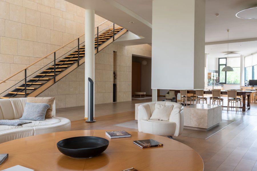
Scenario 1: Bright Living Room, Blown Windows
The classic interior problem: the room is exposed correctly for walls and furniture, but the windows are pure white rectangles with no view. Before the preset, the histogram shows clipped highlights and auto white balance sits slightly warm around 4800K.
 Save
SaveAfter the preset: highlights pulled to -70, which recovers partial window detail and kills most of the blown look; exposure lifted +0.3 to compensate; white balance nudged toward 5000K so walls read neutral without going cold; shadows lifted +25 to open corners and the floor under furniture.
What the preset cannot do: full window recovery when the view is far brighter than the interior. That takes a second exposure or a luminosity mask on the window area. The preset makes windows better; complete window blending is a per-image technique.
Scenario 2: Dark Kitchen, Warm Tungsten Light
Incandescent-heavy kitchens produce files where off-white walls read orange, white cabinets go golden, and a modern room photographs as dark and dated. Before the preset, color temperature sits near 2800K and everything white looks cream or tan.
After the preset: white balance moved to roughly 4200K, a workable compromise; orange desaturated about -20 with hue shifted slightly toward yellow so walls stop reading as pumpkin; orange luminance raised +15 to open the wall tones; exposure lifted +0.5. The kitchen reads warm and inviting instead of dark and orange.
The per-image step that remains: sampling white balance off something actually white, a dishwasher door, a countertop appliance, a paper towel roll. Ten seconds of that beats any preset’s guess, because every kitchen’s bulbs are a little different.
Scenario 3: Exterior in Harsh Midday Sun
Agents book shoots at their convenience, not the light’s. Midday exteriors mean deep shadows under eaves and trees, a washed sky, and a flat facade. Before the preset: high contrast between lit wall and shadow, pale sky, and shadow areas gone muddy.
 Save
SaveAfter the preset: highlights at -60 recover sky and roofline; shadows at +40 open the eaves and landscaping; blacks at -20 keep depth so the image does not go flat; clarity +15 restores definition in siding and windows. The frame shows range the original capture seemed to lack.
The honest limit: shadows sitting three to four stops below the facade still look muddy after recovery. When a property goes into deep shadow at midday, a different shoot time is the real fix. A preset can only work with the data the ISO and aperture captured.
Want to go further? The ShutYourAperture Academy’s Architectural & Interior Photography (8 modules, 32+ lessons) is built to help you compose with steel, glass and light the way architects do.
Scenario 4: Bathroom, Mixed Daylight and Artificial Light
Bathrooms combine a small cool window, warm vanity bulbs, and often a cool recessed overhead. No single white balance serves all three. Before the preset: blue-gray near the window, orange at the vanity, maybe a green cast in the mirror, and white towels changing color across the frame.
After the preset: white balance at 4500K splits the difference; HSL brings orange and yellow toward neutral; aqua desaturated slightly for the cool surfaces; exposure and shadows balanced so the uneven light reads as depth rather than color cast.
Bathrooms are where presets do the least complete job and masking earns its keep: a graduated filter warming the window side, a radial filter cooling the vanity, about ninety seconds of work. The preset handles the global correction; the masks handle the geography.
The pattern across all four: a good preset clears the predictable problems fast, leaving you time for the room-specific work no preset can anticipate. If you want to see that pattern on your own files, the Real Estate Preset System runs 88 presets across these exact scenarios, and the free starter pack in our Lightroom presets guide is the zero-cost way to test the workflow first.
Keep originals for the before-and-after comparison
A Samsung T7 Shield 1TB portable SSD in black, model MU-PE1T0S/AM, is one storage option for original real estate files and separate edited exports. Keep the comparison at the same output size and check that your copies open before clearing a card. Verify the computer connection and capacity for your files. One external drive is not a complete backup. It does not apply a preset, recover clipped window detail or fix mixed lighting. Keep a separate checked copy of files you cannot replace. Compare the current retailer specifications; no hands-on test, price or stock promise is being made here.
Compare Samsung T7 Shield 1TB Black MU-PE1T0S/AM on Amazon | Check Samsung T7 Shield 1TB Black MU-PE1T0S/AM at B&H
Affiliate disclosure: We may earn a commission from qualifying purchases through these gear links at no extra cost to you. As an Amazon Associate, Shut Your Aperture earns from qualifying purchases.